
The “View” tab sets how the Elbuz chat looks on your site: button position and color, light or dark window, button and price colors, product display. The site picks up changes itself, with no code edits.
When you need this:
- The chat button covers “Buy” on phones — move it to another corner.
- Keep the chat open on the side — a desktop sidebar sits next to the catalog.
- Not your brand colors — one accent color paints the launch button, header, buttons and hints.
- Discounts don't stand out — separate colors for the sale price, “−N%” badge and old price.
Where to start: “View” tab → “Button position”.
What you can configure
- Chat button — screen corner and shape.
- Sidebar — the chat open on the side of the page on desktop.
- Dark mode — an always light, always dark window, or following the site.
- Appearance — the color of the launch button, buttons and accents, corner rounding.
- Element colors — the “Add to cart” button, the send button, prices, shopper messages.
- Product list — cards, a table or a carousel.
Every change is saved right away and appears on the site when a visitor opens or reloads the page. AI hints and embedding the chat in a page, which are on this tab too, are covered separately: AI hints on pages.
The chat button: where it sits and how it looks
| Setting | Options | Default |
|---|---|---|
| “Button position” | four corners, “Center left”, “Center right”, “Hidden”, three sidebar options | “Bottom left” |
| “Button theme” | “Round” — an icon; “Pill” — an icon with a caption (in English, “Need help choosing?”); on screens up to 768 pixels it turns round | “Pill” |
On desktop the button sits 20 pixels from the screen edge; on phones it's closer to the edge and higher from the bottom. “Hidden” removes the button from the site, and with it the AI hints next to the button and the AI blocks on pages — just like the “Show AI chat” switch turned off (what's the difference). A chat embedded in a page by rules stays.
The card has no separate button color choice: the launch button is painted by “Button and accent color”.

1
Hidden2
Sidebar3
Button theme4
Dark mode- No button on the site; the AI hints are turned off too.
- The chat is open at the side of the page on desktop.
- “Pill” is an icon with a caption.
- The default is “Always light”.
A sidebar instead of the button
The “Sidebar - right”, “Sidebar - left” and “Sidebar - auto (right unless the site already has a widget there)” options show the chat not as a button but as an open panel the full height of the screen, 320 pixels wide.
- The site isn't covered but shifted: the page narrows by the panel's width.
- A side tab, “Online assistant”, collapses and expands the panel. The shopper's browser remembers a collapsed panel.
- The cross in the panel also collapses it rather than closing it.
- You can't drag the window or resize it in the panel; there's no 3D mascot in it.
- “Sidebar - auto” puts the panel on the right, or on the left on sites with right-to-left script. If another site widget (a call button, a cart) is pinned at the bottom of that edge and the opposite edge is free, the panel goes to the free side.
The panel works on screens wider than 768 pixels. On phones the regular floating button replaces it.
Light or dark window
“Dark mode” has three options; the default is “Always light”.
- “Always light” and “Always dark” — the chat window looks this way on any site and device.
- “Auto (match the site, otherwise the device)” — the widget first looks at the site itself: whether the page is marked as dark and how dark the background is. If the site gives no clue (the page background is transparent), it uses the shopper's device theme. On a site with a light background, the window is light whatever the device theme.
Accent color and corner rounding
The “Appearance” card is the same as in the smart search window, so it's easy to make search and chat match.
- “Button and accent color” — the chat launch button, window header, buttons, quick replies and highlights. “Default” keeps the widget's colors, and the launch button stays the color chosen for it earlier (black for a new widget). Pick from the swatches or set your own color with the eyedropper. On a light accent, the widget makes text dark so it stays readable.
- “Corner rounding” — “Sharp” for nearly square corners, “Normal” (the default), “Soft” for strongly rounded ones. It applies to the window, product cards and buttons.
To the right of the settings is “Preview”: the header, messages, a product with prices, the “Add to cart” buttons and the input field. It's approximate: it has no dark mode, launch button, product list view or font. The exact look is on the site.

1
Button and accent color2
Corner rounding3
Preview- “Default” keeps the widget colors; a swatch or your own color paints the header, buttons and hints.
- Sharp, normal or soft.
- An approximate look: there is no dark mode or launch button here.
The “Add to cart” button and colors of individual elements
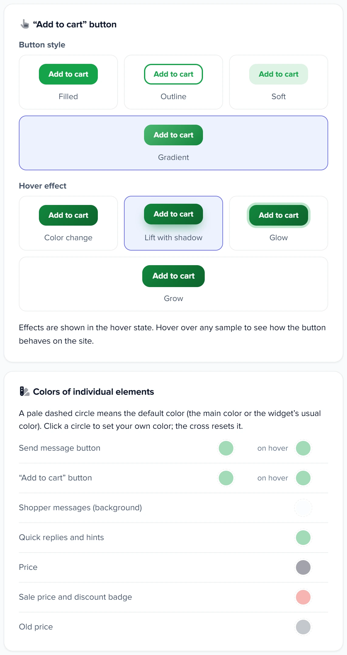
The ““Add to cart” button” block sets the look of the button on product cards in the chat:
- “Button style” — “Filled”, “Outline”, “Soft” or “Gradient” (the default);
- “Hover effect” — “Color change”, “Lift with shadow” (the default), “Glow” or “Grow”. Hover over a swatch to see how the button will behave on the site.
“Colors of individual elements” — for when one accent color isn't enough:
| Row | What it paints |
|---|---|
| “Send message button”, “on hover” | the send button next to the input field |
| ““Add to cart” button”, “on hover” | the buy button on product cards |
| “Shopper messages (background)” | the shopper's message bubbles |
| “Quick replies and hints” | quick reply and option buttons |
| “Price”, “Sale price and discount badge”, “Old price” | prices on product cards and on the page's product card, the “−N%” discount badge; “Price” also in comparison |
A pale circle with a dashed outline is the default color. Click it to set your own; the cross restores the previous state. If you set a button color but not “on hover”, the button darkens slightly on hover by itself. The widget picks the text color on buttons itself.
1
Button style2
Hover effect3
Element colors4
Sale price- Filled, outline, soft or gradient.
- Hover over the sample: that's how the button behaves on the site.
- A pale circle is the default color; the cross restores it.
- The color of the new price and the “−N%” badge.
How shoppers see products
“Product list view in chat” — “Cards”, “Table” (the default) or “Carousel”. When the AI shows two or more products, three buttons appear above the list, and shoppers switch the view themselves.
The browser remembers the shopper's choice, and from then on it overrides your setting: if you change the view later, shoppers who have already switched it see their own.
Font, answer rating, orders, shopping buttons
| Checkbox | What it does | Default |
|---|---|---|
| “Use the site font (when off, the widget font Manrope is used)” | the chat uses your site's font; when cleared — the widget's Manrope font | cleared |
| “Show AI response rating box for each message” | 👍 and 👎 and the “AI may make mistakes” note under every reply; a second click removes the rating. Ratings appear in chat analytics, the “Chat quality” tab, the “Feedback” chart | cleared |
| “Placing orders in chat” | the AI collects the name, phone, delivery and payment and places the order in the conversation; when cleared, the AI sends the shopper to check out on the site (orders from the chat) | on |
| “Show shopping buttons” | “Compare”, “Wishlist” and “Cart” buttons with counters in the chat window; they open these lists in the smart search window, so they work only when search is installed on the site | cleared |
Scenarios
The chat in your brand colors
What to set up. “Button and accent color” — your brand color from the swatches or with the eyedropper.
What you get. The launch button, window header, buttons and hints in one color. If the site has smart search, set the same color there.
The consultant always next to the catalog
What to set up. “Button position” — “Sidebar - right”.
What you get. On desktop the conversation is open on the side and the site narrows to fit it; the shopper can collapse the panel with the tab. On phones — a regular button.
Discounts should catch the eye
What to set up. “Sale price and discount badge” — red, “Old price” — gray.
What you get. On discounted cards, the new price and the “−N%” badge stand out in red and the old price in gray. Which prices to show at all — sale, old price and RRP.
What to do when the chat looks wrong
| What you see | Why | What to do |
|---|---|---|
| The launch button doesn't match the site's color | “Button and accent color” is “Default” | Set an accent color (appearance) |
| There's no sidebar on phones | The panel works on screens wider than 768 pixels | Nothing: on phones a button replaces it |
| The window is dark on a light site | “Auto”, a dark theme on the shopper's device, and the page background is transparent and not marked with a theme | Choose “Always light” (theme) |
| You changed the product list view but still see the old one | Your browser remembered how you switched the view | Check in a private (incognito) browser window |
| Shopping buttons don't appear | The site has no smart search | Install search or clear the checkbox (checkboxes) |
FAQ
Can I show the chat button only on phones?
No, there's no device choice. On phones the button is just smaller: the pill turns round, and a button replaces the sidebar (sidebar).
Can I give the chat button my own color instead of a swatch?
Yes: “Button and accent color” has a “Custom color” eyedropper, and it paints the launch button (appearance).
Why does the chat use a different font from the site?
By default the chat uses the Manrope font. Turn on “Use the site font” (checkboxes).
How do I restore an element's default color?
Click the cross next to the circle in “Colors of individual elements” — the color goes back to the default right away.
Can I fine-tune the look further with my own CSS?
Yes, in the “JS, CSS settings” card on the “Setup” tab (custom CSS).
Where to find it and who has access
- Menu
- Directories → Categories → “Catalog tools” → “Widget settings - Smart Assistant” → “View” tab
- Prepare
- your site's brand color in #rrggbb format
Related topics
- If you need the big picture of chat settings — how to set up the chat widget on your website.
- If you need question hints next to the chat button — AI hints on pages.
- If search on the site should look the same — smart search appearance.
- If you need a video consultant instead of a button — avatar on the site.