
The Elbuz smart search window adapts to your site design. Size and theme, button color, list view, filters, popular blocks and card fields are set on one tab and work once you save and the page reloads.
When you need this:
- The search window clashes with your site — set the color, corners and “Buy” button to your brand.
- Results are cramped below the search bar — a full-screen window fits more.
- Shoppers need filters and popular items — blocks are turned on separately.
- You need search on the page, not in a drop-down — an embedding rule places it anywhere.
Where to start: the “View” tab → “Search window”.
What you can set on the “View” tab
- Window and theme — full screen or below the search bar, light or dark.
- Colors — main color, corners, card size, style and effect of the “Buy” button, price colors.
- Results — pages, grid or list, Enter, AI hints, font.
- Buttons and blocks — what appears on the product card and in the window.
- Embedding — search on the page without a drop-down window.
- Your own code — styles and scripts before the window opens and after it closes.
Everything on this tab takes effect on the site after saving, as soon as the shopper reloads the page: the form saves itself, and you don't need to rebuild the index. The exception is “Show product reviews”, see below.
How to choose the window type and theme
The “Search window” card.
- “Search window display”: “Inline window below the search bar” (default) — results drop down below your site's search box; “Full-screen window” — search opens over the page in full screen. On phones the window always opens in full screen.
- “Dark mode”: “Auto (match the site, otherwise the device)” (default), “Always light” or “Always dark”. In “Auto” the window follows the site: dark if the site is marked as dark or has a dark background, light if the background is light. The shopper's device theme applies only when the site says nothing about itself.

1
Window type2
Theme3
Main color4
Corners and card size5
“Buy” button6
Preview- Below the search bar or full screen.
- “Auto” follows the site, otherwise the shopper's device.
- Buttons, selected filters, links and highlights.
- Compact cards fit more products on screen.
- The button look and the hover effect.
- Changes instantly but approximately; the exact look is on the site.
How to pick colors and the “Buy” button
The “Appearance”, “Buy” button and “Colors of individual elements” cards. On the right, a “Preview” of two product cards changes instantly but shows only an approximate look. The exact look is on the site after saving.
| Setting | Options | What it affects |
|---|---|---|
| Button and accent color | “Default” (blue), 24 ready-made colors or your own | buttons, selected filters, links and highlights in the window |
| Corner rounding | Sharp, Normal, Soft | corners of the window, cards and buttons |
| Product card size | Regular, Compact — more products on screen | spacing, photos and text on cards |
| Button style | Filled (default), Outline, Soft, Gradient | the “Buy” button on the card |
| Hover effect | Color change (default), Lift with shadow, Glow, Grow | how the button reacts to the cursor |
“Colors of individual elements” set your own color for: the “Buy” button and its hover color, rating numbers and counters, the price, the sale price and discount badge, the old price, and items marked “Wishlist” and “Compare”. A pale dotted circle means the default color; click it to choose your own, and the cross resets it.
If the cart isn't set up on the site, the “Details” button stands in place of “Buy”, and the color and style apply to it. How to connect the cart — cart, wishlist and comparison.
How to show results
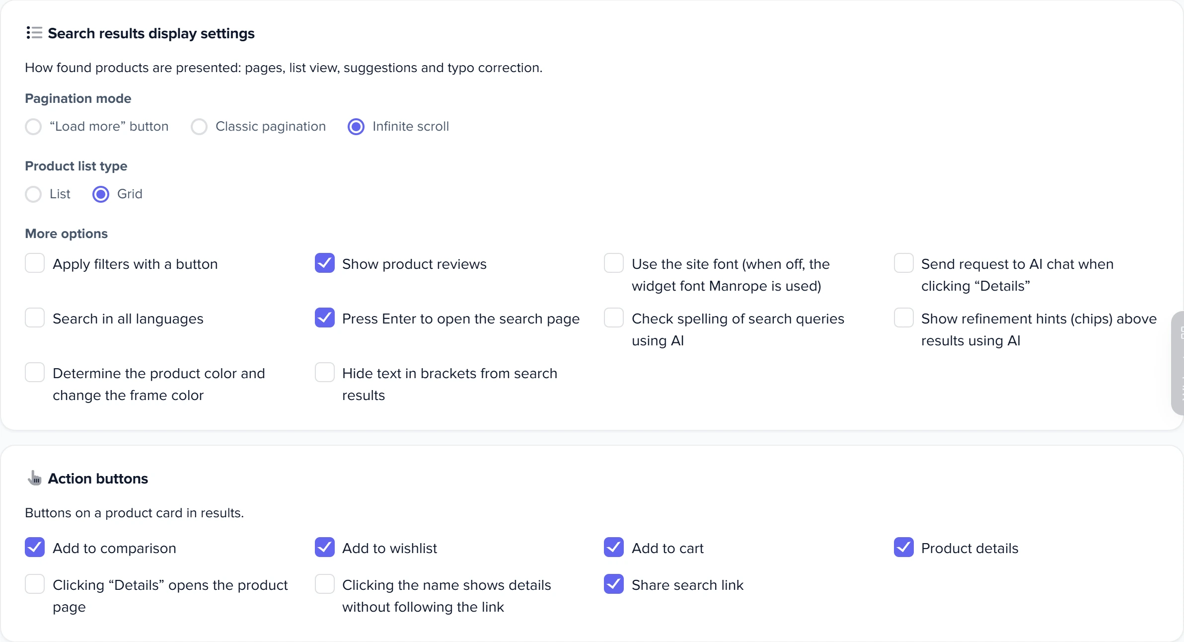
The “Search results display settings” card.
- “Pagination mode”: “Infinite scroll” (default) — products load as the shopper scrolls; “Load more” button; “Classic pagination” — page numbers.
- “Product list type”: “List” (default) or “Grid”. Whether shoppers can switch it themselves is controlled by the “Change product list view” block, see below; the shopper's choice is remembered and overrides the setting. On phones products are always shown as a list.
“More options” checkboxes:
| Checkbox | What it does |
|---|---|
| Apply filters with a button | results are rebuilt when the shopper clicks the apply button, not after every checkbox. On phones, filters are applied with a button in the slide-out panel anyway |
| Show product reviews | rating and reviews on the card. Reviews get into search when the index is built: after turning this on, rebuild the index. Only published reviews from Elbuz are shown |
| Use the site font | the window uses your site's font; when off, the Manrope widget font |
| Send request to AI chat when clicking “Details” | when the shopper opens a product, the AI assistant in the search window receives this product, the query and the filters. Works only if the chat is embedded into the search window |
| Search in all languages | the query is searched in all catalog languages — details |
| Press Enter to open the search page | Enter leads to your site's results page — requires the “Search URL template” |
| Check spelling of search queries using AI | the “Did you mean:” hint; paid — what's paid |
| Show refinement hints (chips) above results using AI | chips that narrow the query; paid |
| Determine the product color and change the frame color | if the name contains a color («чорний», “red”), the card frame is painted that color. Out-of-stock products aren't painted |
| Hide text in brackets from search results | removes a code in brackets from the end of the name: “Dell Laptop (XPS-9530)” is shown as “Dell Laptop”. The name in the catalog doesn't change |
1
Result pages2
List or grid3
Filters by button4
Enter opens the site page5
Go to the product page- Infinite scroll, a “Load more” button or page numbers.
- How products are shown by default.
- Results are rebuilt by the button, not after every checkbox.
- Requires the search page link on the “Links” tab.
- “Details” leads to the site instead of the expanded card.
Which buttons, blocks and fields to show
Buttons on the product card
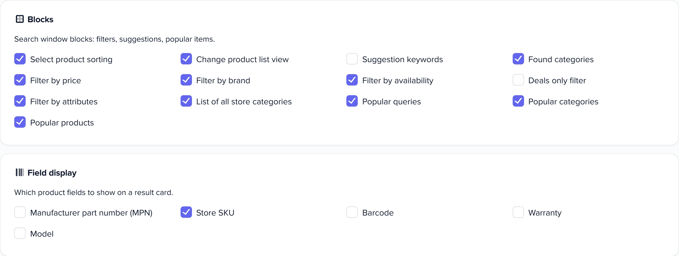
The “Action buttons” card. By default all buttons are on except the two navigation modes.
- “Add to comparison”, “Add to wishlist”, “Add to cart” — buttons on the card. For the product to go into your site's cart, you need code: how to connect the cart.
- “Product details” — an expanded card right in the search window: attributes, description, photos, videos, files, delivery, payment, warranty, store contacts.
- “Clicking “Details” opens the product page” — instead of the expanded card, “Details” leads to the product page on your site.
- “Clicking the name shows details without following the link” — a click on the name opens the expanded card, not the product page.
- “Share search link” — a button above the results, next to the view switch, that copies an address opening the same search with the same filters.
Search window blocks
The “Blocks” card. Everything is on by default except “Suggestion keywords” and the “Deals only” filter.
| Block | What the shopper sees |
|---|---|
| Select product sorting | by relevance, cheapest first, most expensive first, newest |
| Change product list view | a “list / grid” switch |
| Suggestion keywords | query suggestions while typing |
| Found categories | categories with product counts; a click narrows the results |
| “Deals only” filter | a switch that keeps only discounted products in the results: with a sale price lower than the regular price, or with an old price. Only prices whose display is turned on in the “Prices” tab count. Off by default; takes effect after the index update |
| Filter by price, brand, availability, attributes | filters beside the results, on phones in a slide-out panel. The attribute filter requires “Search by attributes” on the “Setup” tab; the availability filter appears only when “Search only for products that are in stock” is off |
| List of all store categories | a “Catalog” button with the category tree |
| Popular queries, Popular categories, Popular products | shown until the shopper types anything |
Fields on the product card
The “Field display” card: “Manufacturer part number (MPN)”, “Store SKU”, “Barcode”, “Warranty”, “Model”. All are off by default. A field is shown if it's filled in for the product.
1
Sorting2
Query suggestions3
Filters4
Deals only5
Popular6
Card fields- Relevance, price, new arrivals.
- Off by default.
- Beside the results; on phones, in a slide-out panel.
- Keeps only discounted products; off by default.
- Shown until the shopper types anything.
- Shown if the field is filled in for the product.
How to embed search into a page
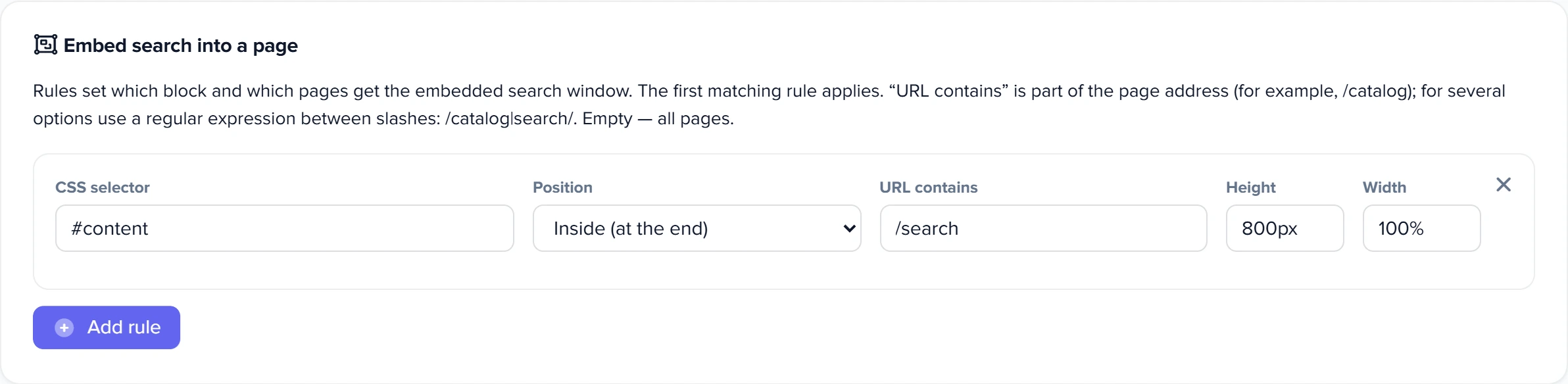
The “Embed search into a page” card places the search window right into a site page — for example, into the “Search” page or an empty category. The “Add rule” button adds a rule with these fields:
- “CSS selector” of the page element where search will go;
- “Position”: “Inside (at the end)”, “Inside (at the start)”, “Before the element”, “After the element”, “Replace the element”;
- “URL contains” — part of the page address, for example
/catalog. For several options, use a regular expression between slashes:/catalog|search/. Empty — on all pages; - “Height” and “Width” of the block, for example
600pxand100%.
1
Where search goes2
Position3
Which pages4
Block size5
Another rule- The page element next to which the search window is embedded.
- Inside, before, after the element or instead of it.
- Part of the address or a /regex/; empty means all pages.
- The height and width of the search block.
- The first matching rule wins.
A new rule is saved when you close the form window. Rules are checked in order, and the first one whose address matches and whose element is found wins. Search is embedded as a separate frame with the full search interface, while the site's regular search box keeps working as before. To remove a rule, click the cross in its corner.
Your own CSS and JS
The “JS, CSS settings” card — for what checkboxes can't do.
- “CSS Styles” — added to the search window styles on your site.
- “JS code” — runs on the site together with the widget.
- “Run JS code before opening” and “Run JS code after closing” — for example, to hide and bring back the theme's floating buttons that cover the window.
Choosing “CMS ID” and “CMS theme” on the “Setup” tab fills these fields with the styles and code the theme needs, and asks before replacing your code — what choosing a CMS fills in. “Run JS code before opening” fires before the search window appears on screen.
What the shopper sees in the search window
- Window with no query — the shopper's search history (5 latest queries), popular queries, categories and products; if “Link to promotions” is set, a “Promotions” chip.
- While typing — results change with every letter; pale autocomplete text is accepted with Tab, arrows switch between suggestions, Esc closes the window.
- Product card — photo, name, attributes, rating, price, old price, discount, availability and the selected fields.
- Banners above the results — “Showing results for …”, “No exact match — showing similar products”, “The products found are currently out of stock”, “Nothing found” with a “Reset filters” button and, if the promotions link is set, “View promotions”. When each one appears — how search understands typos.
- Voice search — a microphone button, if turned on in the “Setup” tab.
- Phone — filters in a slide-out panel, comparison, wishlist and cart buttons at the bottom of the screen.
Scenarios
The search window must use brand colors
What to do. In “Button and accent color”, choose your color; for the “Buy” button, choose “Filled” and “Lift with shadow”. Check the “Preview”, then the window on the site.
What you get. Buttons, selected filters and highlights are in your brand color.
Large catalog, shoppers are cramped below the search bar
What to do. Choose “Full-screen window”, “Grid” and “Compact” cards, keep the filters.
What you get. More products on screen, with filters alongside.
A separate search page on the site
What to do. Add an embedding rule: the selector of the page content area, position “Inside (at the end)”, “URL contains” — part of the search page address, for example route=product/search, height 800px. Close the form window so the rule is saved.
What you get. On the search page, the search window sits in the page content; on other pages there's the regular search box.
What to do when the window looks wrong
| What you see | Why | What to do |
|---|---|---|
| The preview doesn't match the site | the preview is approximate; on the site, theme styles and “CSS Styles” also apply | check on the site |
| Theme buttons or menus cover the window | the theme has its own elements on top of the page | hide them with code “before opening” and bring them back “after closing” |
| No attribute filter | “Search by attributes” is off on the “Setup” tab | turn it on and rebuild the index |
| No reviews on cards | reviews didn't get into the index | turn on “Show product reviews” and rebuild the index |
| Embedded search didn't appear | the rule isn't saved, the address didn't match, or the page has no element matching the selector | close the form window, check “URL contains” and the selector |
FAQ
How do I show results in full screen instead of below the search bar?
In “Search window display”, choose “Full-screen window”.
How do I stop results from rebuilding after every filter checkbox?
Turn on “Apply filters with a button”: results are rebuilt when the shopper clicks the button. On phones, filters are always applied with a button.
Why is the font in the search window different from the site?
“Use the site font” is off, so the window uses the Manrope widget font. Turn the checkbox on.
Why is the window light in “Auto” mode when my system is dark?
“Auto” looks at the site first: if it has a light background, the window stays light. The system theme applies only when the site says nothing about itself.
Where it is and who has access
- Menu
- Directories → Categories → the “Widget settings - Smart search” tile → the “View” tab
- Access right
- the “Smart product search widget” window in “Group permissions”
- Prepare
- a widget already connected to the site
Related topics
- For the big picture — smart search on your website: what it does and where to start.
- If the buttons are there but the product doesn't go into the site cart — how to connect the cart, wishlist and comparison.
- If you need to change which price the card shows — prices and currency.
- If the widget isn't on the site yet — how to connect smart search.