Design for an online store: the best trends and useful tips
-
Larisa Shishkova
Copywriter Elbuz
Colors, shapes, fonts - all the design elements of an online store that fit together like a mosaic, creating a unique atmosphere and attracting the eye of every visitor. It's like a secret that only successful entrepreneurs know, and today I'm going to tell you about it. In this article, you will learn about the latest trends in online store design, as well as important rules and useful tips that will help you create an effective design for your online store. Are you ready to learn all the secrets of successful design? Then let's begin this exciting journey into the world of online shopping!

Glossary
- Online Store: A website or platform that offers goods and services for purchase online.
- Design: The process of creating and designing the visual and interactive look of a website or application.
- Trends: popular trends and styles that change over time and influence the design of online stores.
- Rules: recommendations and principles that help create an effective online store design.
- Useful tips: recommendations and practical tips to help improve your online store design.
- Golden ratio: proportions that are considered the most harmonious and attractive to the human eye.
- Rule of Thirds: A rule for arranging objects on a web page according to a grid divided into nine equal parts.
- Home page: the main page of the online store, which presents products, promotions, brands and other important information.
- Product card: a page with a detailed description and images of the product, where users can view its characteristics and order.
- CTA button: “Call to Action” is an interface element that calls the user to take a specific action, for example, “Buy now.”
- Online shopping cart: a page or block where users can view and manage the items they have added to their shopping cart.
- A few final tips: final useful tips and tricks for online store design to improve user experience and increase conversions.
This glossary will help you better understand the key terms used in the online store design article and provide clarity when reading the text.
Basic rules for online store design
Hello friends! Today I will tell you about the most important rules of online store design. This is a topic that worries many online business owners. When I was faced with the need to create an effective store design, I did a lot of research and tried many approaches. Now I decided to share with you my experiences and best practices.
Convenience for the visitor
We all know that convenience is one of the key factors influencing purchasing activity. Today, the trend is UX/UI design, which is made in order to make the client’s life easier and help him complete the desired action, such as purchasing a product or providing contact information during registration. To create a user-friendly design, you need to think through many details: a clear menu, convenient product categories, working links, a visible shopping cart and bright checkout buttons. All of these elements should be logical and easy for customers to understand. Using my store as an example, I realized that it is important to create a smooth path from point A to point B: from the menu to the product card, then from the product card to the cart and back to the site. This is the only way the user can easily navigate through pages and get to the main thing.

Beauty and rigor
Speaking about the design of online stores, we cannot fail to mention visual component. Immersing the customer in the atmosphere of your store is what can be more effective in attracting and retaining customers. Fashionable and stylish websites always lead to successful sales. How to achieve this beauty? My solution is to use white space on the page, use no more than three colors, pure tones and shades, simple, clear fonts and friendly typography. These little things make your website stylish and elegant. Don't forget that the main goal of your store is to highlight useful and selling information. Therefore, it should be clearly visible, and not get lost in the bright design.
Corporate Identity
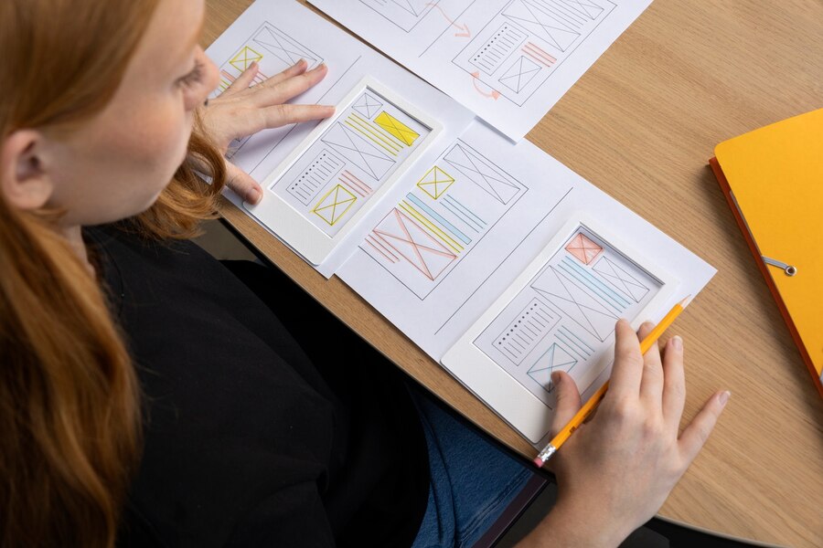
If you really want to make your online store stand out from your competitors, you need to develop a corporate identity. It may seem like a daunting task at times, but I am convinced that it is worth every hour you put into it. My own experience has shown that having a corporate identity is the key to recognition, customer trust and the right investment in advertising. Don't be afraid to be unique!
So, we looked at the basic rules of online store design: convenience for the visitor, beauty and rigor, as well as corporate identity. Don't forget that every business is different, so you may have to adapt these rules to suit your niche and target audience.
Useful and not so useful
| What to do | What not to do |
|---|---|
| - Create easy navigation and clear menus - Use minimal colors with clean shades - Keep visual elements simple and clear, including text - Make your site recognizable with corporate identity | - Use of complex and unreadable fonts - Page overload and confusion in navigation - Multi-step ordering process - Lack of quality and high-conversion product photos |
That's all, friends! I hope you found this section on online store design rules helpful and informative. If you apply these tips to your business, you are sure to see positive changes. Good luck to you and prosperity to your store!
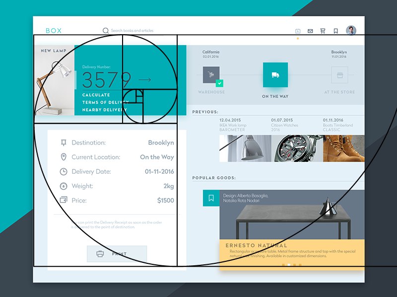
Golden ratio
Golden ratio is one of the most important rules in online store design. This rule has been known since ancient times and is successfully applied in modern web design. I can confidently say that it is an integral part of creating an effective and attractive design for your online store.
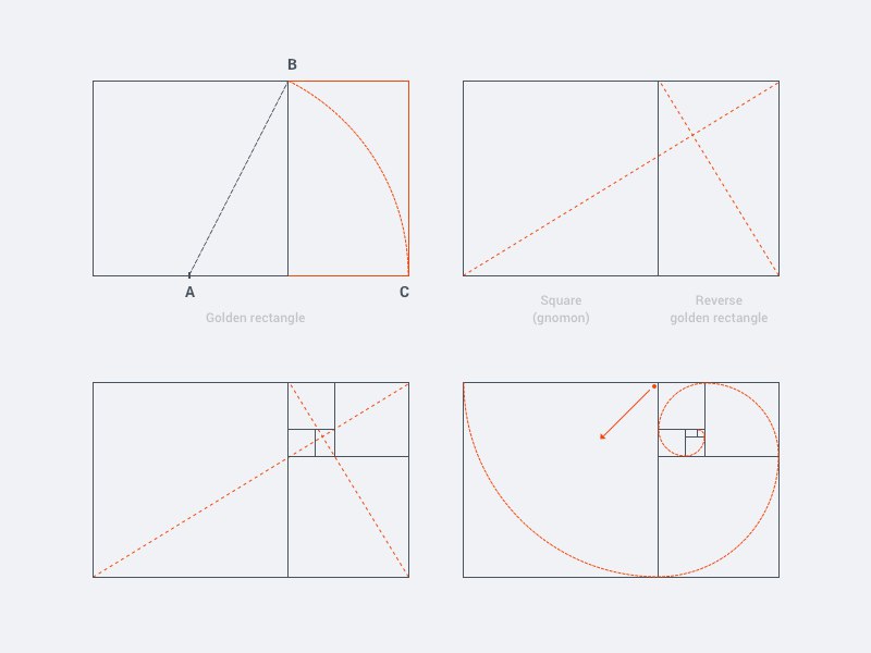
The proportions of an object or image according to the golden ratio rule are 3:2, 5:3 and so on. This means that the object or image must be divided into two parts in a certain ratio. The golden ratio can be successfully applied in various aspects of online store design.
Application of the golden ratio in web design
Construction of blocks on the website
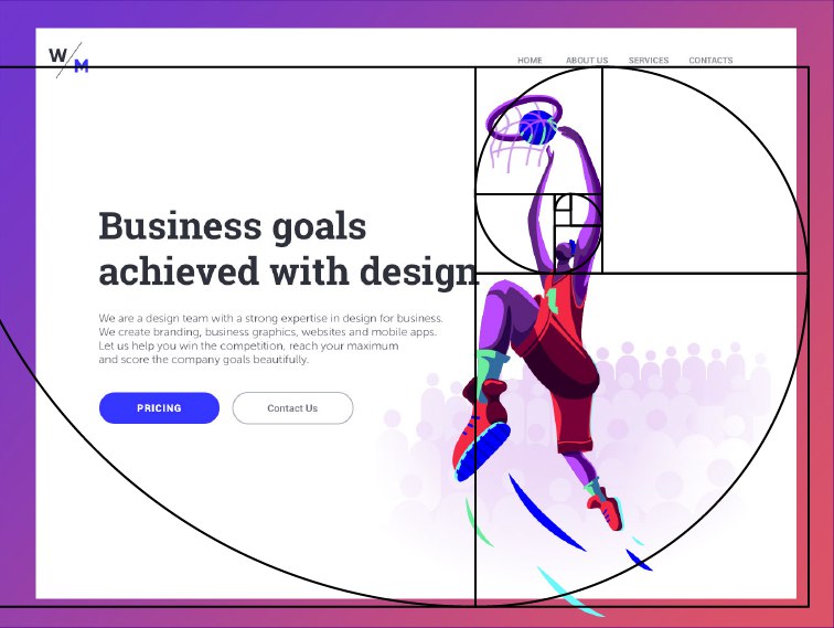
The golden ratio rule can be used when constructing blocks on your website. You can divide the page into two parts, where one part will take up 3/5 of the total width, and the other will take up 2/5. This division will create a harmonious and attractive composition.
Selection of pictures
The use of the golden ratio is also effective when selecting pictures for your online store . You can use a 3:2 or 5:3 ratio to size and position your product images. This separation will provide visual balance and help highlight the main details of the product.
.png)
Combination of text and photos
If you use text and photos in your online store , the golden ratio rule can help you create a harmonious combination of these elements. Place the text and photo so that they occupy a 3:2 or 5:3 aspect ratio. This approach makes the page more attractive and readable for users.
Benefits of using the golden ratio
Using the golden ratio in online store design has several advantages:
Harmony and attractiveness. A page using the golden ratio looks more balanced and aesthetically pleasing.
Improving user experience. Proper placement of elements on the page helps users navigate more easily and quickly find the information they need.
Increased conversion. An attractive and harmonious design attracts more attention and increases the likelihood of making a purchase.
An example of using the golden ratio
Let's look at an example of using the golden ratio in the design of an online store. Imagine that you have a page with product blocks, where each block contains an image of the product and its description.
Using the golden ratio rule, you can divide each block into two parts, where the product image will occupy 3/5, and the description - 2/5 of the width of the block. This ratio will create a harmonious composition and help the user navigate the page more easily.
Summary
The application of the golden ratio rule in the design of an online store is one of the key strategies that will help you create an effective and attractive design for your online store. Consider proportions when constructing blocks on the site, selecting images, and combining text and photos. This rule will help improve the user experience, increase conversions and create a harmonious visual impression.
"The use of the golden ratio in the design of an online store allows you to create a harmonious and attractive visual image. The proportions determined by the rule help improve the user experience and increase conversion. However, we should not forget that design is an art and sometimes the rules can be broken in the name of originality and uniqueness. It is important to find a balance and apply the golden ratio where it really fits." - Vladimir Yakimenko, design expert at Prom.
Would you like to learn more about creating a corporate identity for your online store? Read our article Corporate Identity.
"It's not as difficult as it may seem at first glance. Once you understand the principles of the golden ratio, you can apply it in your design and create effective online stores." - Myra Watson, Amazon Expert.
Home page: creating easy navigation and informative design
When it comes to online stores, the home page plays a key role in attracting the attention of visitors and keeping them on the site. To create an effective design for this page, there are a number of basic rules to consider.

Simple and clear navigation
One of the main rules of home page design The page is easy and clear to navigate. The visitor should easily and quickly find the desired category or product. It is recommended to divide the menu by product category, by brand, or in multi-filtering mode. The main thing is that the client gets to the desired product in no more than three clicks. Be sure to mention the three-click rule and explain how it will help users find the products they need.
Bright banners and promotions
On the main page you should also use bright banners that will lead to specific product pages or promotions. Please note that the discount amounts are highlighted bolder and more contrasting. Banners must be positioned so that the user immediately sees them as soon as he enters the site. If you don’t have global sales, the store’s main products can be separated into a separate “Bestsellers” section and placed on the main page.
Company story and algorithm of work
Our store always strives to create strong connections between us and our customers. To do this, we tell the story about our company on the main page, illustrating it with photographs or pictures. It is also useful to talk about our work algorithm using pictures or infographics. This will help users better understand us and our work.

Filters and search
In large online stores with a huge With a wide variety of products, it can be difficult to find the right product. Therefore, it is important to provide visitors with tools such as filters by material, color, price and other parameters. This will help users more accurately find the products they need and simplify the purchasing process.
With all these homepage design rules, our online store demonstrates professionalism, ease of use and functionality. We do everything possible to make shopping on our website as convenient and enjoyable as possible for our customers.
By the way, we have an article on our website in which we talk in more detail about the structure of an online store and the division of products into categories. I recommend you read it to get even more useful information.
⭐️ Best practices for designing the main page of an online store:
- Simple and clear navigation for quickly finding products.
- Using bright banners for promotions and sales.
- A story about the company and its work algorithm on the main page.
- Possibility of filtering products according to various criteria.
- Convenient search for visitors.
Now that you know the basic rules of homepage design for an online store, you can start creating an effective and attractive design for your online store. Be creative and useful for your visitors!
Some final tips
Of course, I want to immediately implement all these things on the site. But if you don’t have a sufficient budget yet, it’s better not to rush. There’s nothing worse than ordering a design from a self-taught beginner, but it’s cheap. Limit yourself to the basic rules and elements, and you will always have time to do a redesign.

Test and test again. Colors, fonts, text on the CTA button - whatever you want. This is the only way you will understand which option works better and increases conversion. Testing is a key aspect of successful online store design. The same proposal can vary significantly in its effectiveness depending on the design elements chosen. Through testing, you can determine which colors, fonts, and text elements generate the most engagement from your audience. Be prepared to experiment and study test results. This may require time and resources, but will ultimately help you create a more effective design for your online store.
Don't steal from your competitors - add a piece of yourself, the individuality of your business. Find a balance between a good idea and your corporate style - this will be the best option. Copying someone else's design can make your online store unrecognizable and deprive it of its uniqueness. It's best to create a design that reflects your customer proposition and your business values. Take best practices and ideas from your competitors, but add something of your own to them that sets you apart from others. This will help you attract and retain the attention of potential customers and make your online store optimal for your target audience.

The important thing is to find a balance between good ideas and your business's signature style. Your design should reflect your uniqueness and be consistent with your brand values. You must create a design that is pleasing to the eye while effectively achieving your goals. Don't be afraid to experiment and find your own ways to help you stand out in the market.
Share in the comments on social networks, send links to your sites. Interaction with the audience is one of the key elements of a successful online store. Be open to feedback and allow your clients to share their thoughts on your design. This will help you better understand your audience's needs and expectations and make changes to your design accordingly. Also keep your audience active and motivate them to share links to your website on social media to attract new customers and increase the overall visibility of your online store.
Example of use in real life
I, as the owner of an online store, was faced with the problem of low conversion on my website. The look of my store wasn't attracting customers, so I decided to test different design elements. In the process of conducting tests, I studied which color scheme, font and text on the CTA button attract more attention and help increase conversions. Ultimately, I found the optimal combinations of design elements that helped significantly increase sales in my online store.
Also, I faced the problem of similarity with competitors. Instead of copying their designs, I added unique elements to my design that reflect the personality of my business and appeal to my target audience. I created a corporate identity that distinguishes my online store from others and helps attract customers.

As a result of applying these tips, my online store has become more attractive and efficient. I received positive feedback from clients and increased my sales. Now I regularly communicate with the audience, conduct surveys and experiments to continue to improve the design of my store and remain a leader in the online trading market.
Summary
- Experiment by testing different design elements to optimize your online store's conversion rate.
- Add unique elements to your design that reflect your business's personality and attract the attention of potential customers.
- Interact with your audience and ask them to share their feedback on your design.
Online store design best practices:
| Do | Don't |
|---|---|
| Test different color schemes, fonts, and design elements | Copy a competitor's design without changes |
| Add unique elements that reflect your business | Using too much original design |
| Include elements that help increase conversion | Limit yourself to only basic design rules |
| Actively interact with the audience | Ignore customer feedback |
My experience and experiments confirm that the correct design of an online store plays a huge role in attracting customers and increasing sales. Whether you test different design elements and implement unique ideas, or copy the designs of others is up to you. However, I highly recommend applying the tips above to create an effective and attractive online store with a strong reputation.

Frequently asked questions on the topic "Design for an online store: trends, rules , useful tips"
1. What are the main trends in the design of online stores?
Some major trends in online store design include minimalist design, use of bright colors, mobile responsiveness, large, high-quality product images, and intuitive navigation.
2. What rules are important when creating an online store design?
Some important rules include using the golden ratio and the rule of thirds, paying attention to the home page, product card, Buy button and online store cart.
3. What main elements should be present on the main page of an online store?
The main page of an online store should have a bright title and an attractive image, a brief description of the company's advantages, promotional offers, popular products and easy navigation.
4. What information should be presented on the product card?
The product card must contain an image of the product, name, description, characteristics, price, information about stock availability and reviews from other customers, if any.
5. How important is the “Buy” button in online store design?
The "Buy" button is one of the most important design elements of an online store. It should be highlighted, easily visible, have an attractive design, and be accessible to users on all devices.
6. How important is the shopping cart of an online store?
The online shopping cart is a key element for users to add products and place orders. It must be always visible, easily accessible and understandable to users.
7. What tips will help you create an effective online store design?
These helpful tips include using a simple and intuitive interface, simplifying the checkout process, optimizing page load times, and using social proof such as reviews and product ratings.
8. What mistakes should be avoided in online store design?
Mistakes to avoid include overly confusing navigation, lack of quality product images, a complicated checkout process, and lack of shipping and return information.
9. Does the color scheme of an online store affect sales?
Yes, the color scheme of an online store can influence sales. Choosing the right color scheme to match your audience can create an emotional connection and increase buyer confidence.
10. How often should you update your online store design?
The design of an online store needs to be updated periodically to keep up with the latest trends and ensure better user flow. It is recommended to update the design approximately once a year.
Thanks for reading - now you're a pro!
Congratulations! You've just become a true expert in online store design. I hope you enjoyed this article and gained a lot of valuable information. Now you have knowledge about the latest design trends, as well as important rules and useful tips to create a great design for your online store.
But don't stop there! Put this knowledge into practice, and only then will you be able to fully appreciate its benefits. Good luck in creating an effective and successful online store!
Don't forget to share your thoughts and experiences in the comments below. I’d love to hear how this article helped you and what you plan to implement in your design.
Thanks for reading, and see you there! 👋🧡

Article Target
Provide the reader with up-to-date information about online store design and help him create an effective design for his store.
Target audience
Owners of online stores, designers, marketers, people interested in creating effective design for online stores.
Hashtags
Save a link to this article
Larisa Shishkova
Copywriter ElbuzIn the world of automation, I am a translator of ideas into the language of effective business. Here, every dot is a code for success, and every comma is an inspiration for Internet prosperity!
Discussion of the topic – Design for an online store: the best trends and useful tips
In this article, you will learn about the latest trends in online store design, as well as important rules and useful tips that will help you create an effective design for your online store.
Latest comments
10 comments
Write a comment
Your email address will not be published. Required fields are checked *


John Smith
Very interesting article! I love following trends in online store design. I recently updated my website and would like to see what new ideas might be useful to improve my design. I'll be waiting for useful tips!
Emma Johnson
I am also very interested in trends in online store design! As for me, one of the important aspects is the ease of use of the site for users. It would be great to hear other users' opinions on this issue. What do you think?
Max Müller
Hi all! I noticed that many modern online stores have begun to actively use animation and bright colors in their design. Do you think this is an effective approach or just a fashionable trend? I'd love to hear your opinions!
Sophie Dupont
I also noticed the increase in the amount of animation in the design of online stores. Personally, I like it when there are small animated elements on the pages. They can attract attention and make the site more attractive. But you should always remember that too much animation can be annoying for users.
Pablo González
You're right, Sophie! Balance is very important. I believe that the design of an online store should not only be beautiful, but also functional. It is difficult to attract potential customers if the site is not easy to use. Therefore, I always try to make my design intuitive and easy to use.
Katarzyna Kowalska
Hi all! I recently launched my online store and would like to know what I can do to attract more customers through design. I'd love to hear your ideas and advice!
Alexander Petrov
Hello Katarzyna! I have been working in online store design for several years now and can share my experience with you. It is important to create a unique and memorable design that will distinguish itself from competitors. Think about how you can stand out from other stores and offer something special to your customers.
Лариса Шишкова
Thanks everyone for your comments and ideas! I completely agree that creating an online store design requires taking into account many factors, including current trends and user needs. If anyone has any more questions or needs help, I am always ready to share my experience and knowledge.
Grumpy Oldman
Trends, rules... Who needs all this? I like simplicity and minimalism most of all. You don’t need anything extra, keep all these trends for yourself. I believe that effective online store design is when the user can easily and quickly find the product they need, without unnecessary tricks.
Gabriella Rossi
Hello old man! Although I understand that everyone likes different things, I believe that simplicity and minimalism are also one of the important trends in online store design. This helps create a clean and tidy impression. But, of course, I agree with you that the main thing is the ease of use of the site.