Helpful tips for creating visual content for your online store that attracts customers
-
Vladimir Kosygin
Copywriter Elbuz
Your products are new, stylish, and of high quality. They deserve to be seen by the world! But how can you allow them to reach their potential, attract the attention of customers and make a magical transformation in your online store? We are ready to reveal to you the secrets of creating visual content that will captivate and make customers stay on your site for a long time. Ready to boost your sales? Then hold on tight, because together we will go on an exciting journey into the world of visual marketing!

Choosing an online store design
One of the most difficult issues for online business owners is choosing an online store design. Many people may spend a lot of time searching for the perfect template, while others already have a clear idea of what they want their website to look like. However, no matter what category you are in, choosing a design is a critical step because the design will be what your future clients see first. Therefore, it is necessary to understand your target audience and focus on creating a positive user experience.
Capture your customer's eye from the first impression
When a user lands on your website, the first thing they see is its appearance. Color scheme, typography, composition of elements - all these are important aspects that determine the visual impression. The choice of a specific online store design can be emphasized or weakened by using different design solutions to attract the customer's attention and make them linger on your site. Don't forget, you're not the only one offering products or services in your niche, so your design needs to be attractive and memorable.
Understand and adapt to your target audience
Every online store has unique requirements, depending on the niche it operates in and its target audience. Therefore, before you start choosing a design, you need to fully understand who your target audience is and what their preferences are. If you sell high-end furniture, for example, your design should be stylish and luxurious. If your product is aimed at a youth audience, you can use bolder and brighter colors. Analyze your customer behavior data and consider the opinions of experts in your niche to make informed decisions about your online store design.

Focus on creating a positive user experience
Online store design should focus on convenience use and facilitate the purchasing process for your customers. This means that site navigation must be intuitive, product information must be accessible and attractively presented, and ordering must be quick and easy. Pay special attention to the mobile version of your site, since more and more users are making purchases using smartphones and tablets. Your design must be fully mobile responsive to provide customers with a great user experience.
Best practices and tips from the experts
Here are some best practices and tips to help you choose a design for your online store:
- Research your competitors. Check out online store designs in your niche and see what's catching your competitors' attention. This will help you understand what elements you can adopt and what improvements you can make to your design.
- Please note seasonality. Changing the design of your online store to suit time frames or seasons can create a sense of relevance and appeal to your customers. For example, using appropriate colors and images during the holidays can create an atmosphere of fun and celebration.
- Don't forget about the brand. The main thing is that your design reflects the uniqueness and values of your brand. Use your logos, colors and fonts to create a coherent and consistent look for your online store.
- Test and optimize. Once your online store is live, don't forget to test different aspects of your design and analyze user behavior data. Small changes can lead to big improvements in your website's performance.
So, choosing an online store design is a complex and responsible process. Remember that your design should be attractive to your target audience, create a positive user experience and reflect the uniqueness of your brand. Follow best practices, research your competitors, and remain flexible to adapt to the changing demands of your market.
The future of your online store depends on your design. Stand out from the crowd and create unique and compelling visual content that will set you up for long-term success.

It's important to remember that design is only one aspect of a successful online store. Take care of high-quality product photography, informative descriptions and easy navigation to make the customer’s purchase an enjoyable and easy process.
Now that you understand the importance of online store design, proceed with your selection with confidence. Consider the needs of your target audience, use best practices and analyze user behavior data to create a compelling online store that effectively attracts and retains customers.
The template overview can be your great guide for choosing an online store design. Don't miss the opportunity to explore the different options and choose the best one for your business.
Review of best practices:
| Do's | Don'ts |
|---|---|
| Consider the needs of your target audience | Ignore expert opinion and user behavior data |
| Create a unique and memorable design | Copy competitors' designs without adapting them to your niche |
| Optimize your design for mobile devices | Ignore testing and user behavior analysis |
Now that you have all the necessary information, start choosing the design of your online store with certainty. Remember that good design promotes a positive impression of your brand and makes shopping on your site a pleasant experience for customers. Good luck creating effective visual content for your online store!

Review of ELBUZ designs
We at ELBUZ know how important it is to choose a design that you will like and attract customers. We are constantly working to improve and develop new design options. In this section, we present you with an overview of ELBUZ designs that will help make your online store more attractive and effective.
Variety of Designs
We have developed various design templates to suit the needs of different niches and style trends. No matter what product or service you offer, you can find the right design for your online store.
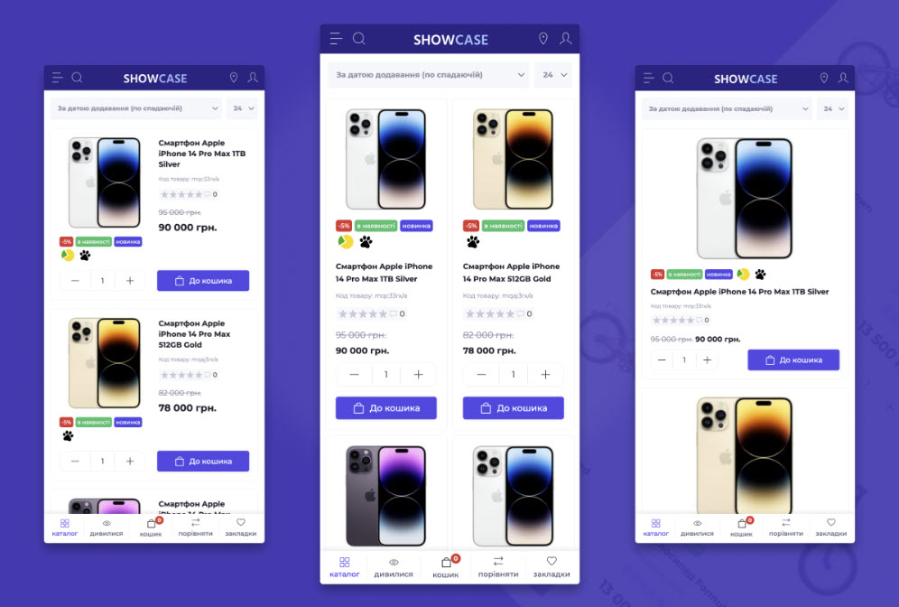
Improving usability
The design of an online store has a direct impact on its usability - ease of use and user navigation on the site. We pay special attention to this aspect of ELBUZ design development. We strive to create an intuitive and easy-to-understand interface so that your customers have a comfortable shopping experience.

Design Features
Each design in ELBUZ has its own unique features and individual elements. We use a variety of colors, typography and compositional solutions to make your online store more stylish and attractive to visitors.
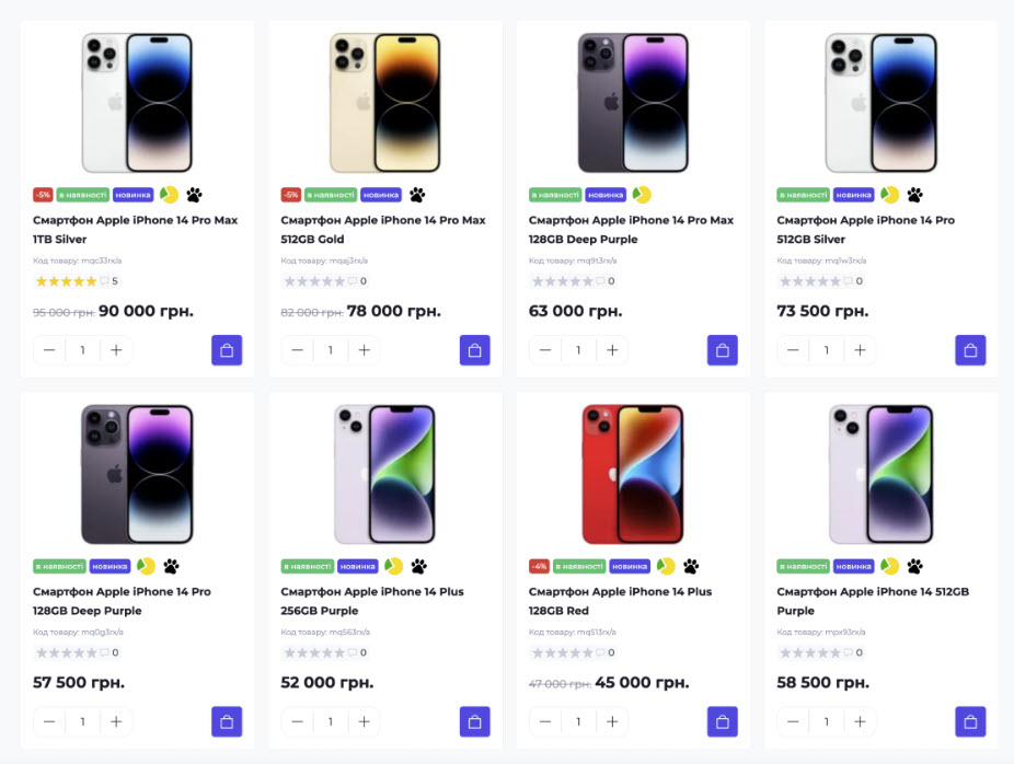
We have created various design templates that can be used for different niches. This will help you quickly evaluate your options and choose the right one for your business.
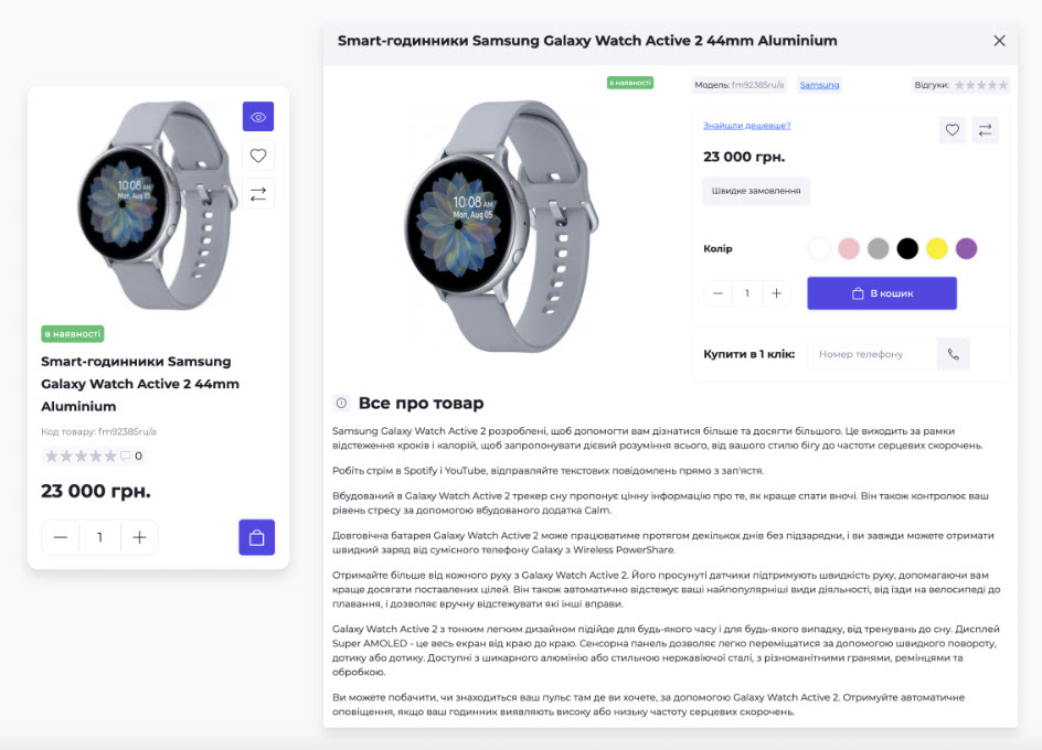
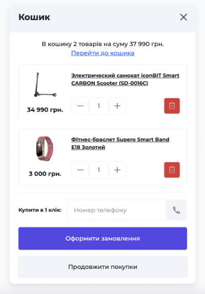
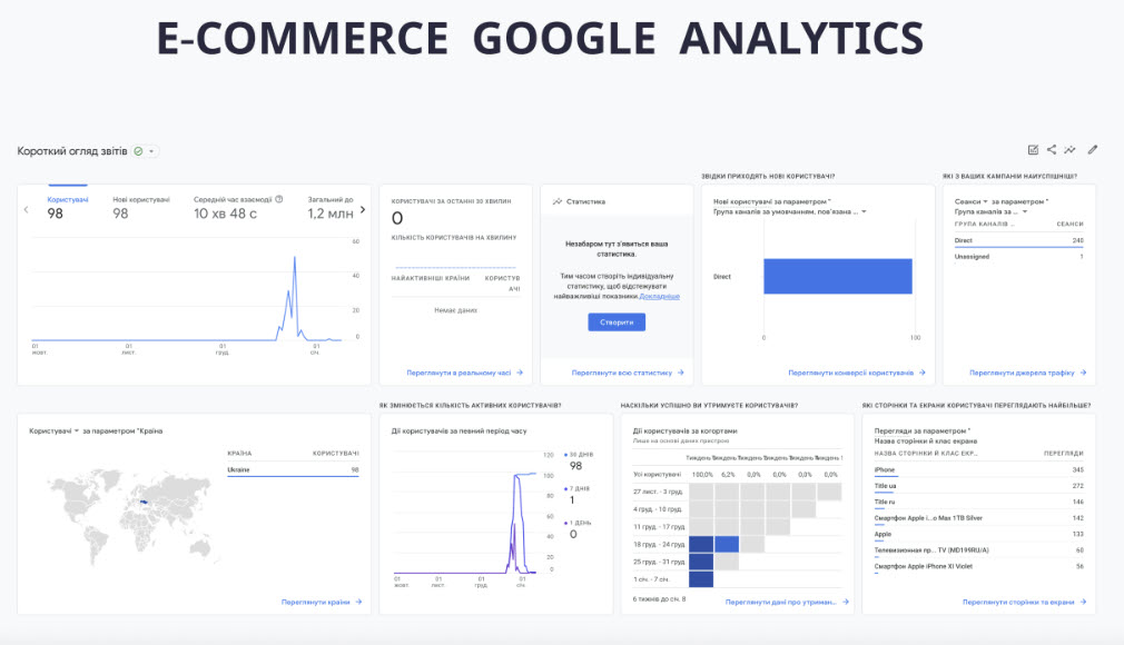
Our main advantage is an individual approach to each client and his business. We understand that a successful design must fit your needs and the specifics of your niche. Therefore, we are constantly working to improve and develop not only new design options, but also new automation features such as Google Shopping and Google Analytics.
Important to know:
- The design of an online store directly affects usability.
- We have a variety of design templates for different niches.
- Design development is based on the unique features of each option.
- An overview of design templates is presented in the form of an image gallery.
- The video shows examples of successful and unsuccessful design solutions.
- We strive for an individual approach and understanding of the specifics of your business.

We are confident that the right choice of design can increase conversion and improve the usability of your online store. Trust the experience and professionalism of the ELBUZ team, and you will be able to create an attractive and successful online store.
Conclusions
| What to do | What don't |
|---|---|
| Choose a design that suits your niche | Use non-responsive design |
| Pay attention to the ease of use of the interface | Use too bright and annoying colors |
| Get inspired by examples of successful designs | Ignore site usability |
| Watch our video review for more information | Use confusing navigation |
| Contact us for a custom design | Do not update the design along with business development |
We hope that this review of ELBUZ designs will help you make the right choice. If you have any questions or require additional information, please contact us and we will be happy to help you create effective visual content for your online store.
Usability is an important detail of an online store
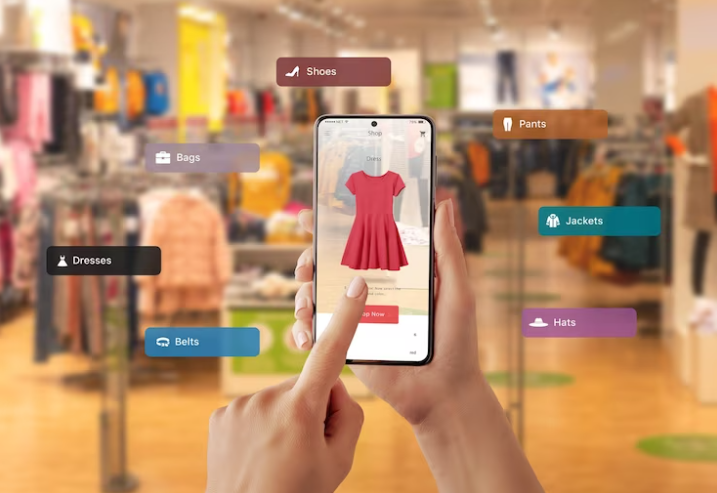
In this section we will look at the importance of usability in an online store and give useful tips for improving it. Usability is the ease of use of a website or application, and it plays a particularly important role for online stores. A simple and clear design encourages users to spend more time on the site and return in the future. Moreover, design directly influences site navigation, which has a direct bearing on such important issues as product search.
Impact of design on users
An online store that is difficult to navigate can be frustrating users, cause them to quickly leave the site and damage the brand's reputation. Users want to quickly and easily find the products they need, view information about them, and make purchases. As an online store owner, it is important for you to provide your visitors with an optimal user experience.
A well-thought-out store interface also has a positive impact on search engine rankings. The better users rate and use your online store, the more likely search engines will view your site as authoritative and relevant. This leads to improved search rankings, which in turn increases the chances of attracting more targeted visitors.
Creating a convenient interface for an online store
When creating a convenient interface for an online store, it is recommended to pay attention to the following aspects:
Navigation: Clear and intuitive navigation is the basis of a user-friendly website. Divide products into categories, establish a logical structure, and add search so users can quickly find the products they need.
Design: Clean out the clutter and make your store design minimalist and attractive. Use high-quality product pictures to draw attention to the products.
Product Information: Provide detailed information about each product, including photos, description, specifications, price and user reviews. This will help users make purchasing decisions.
Checkout: Simplify the checkout process and allow the user to review their purchase. Add clear instructions and required fields to fill out.
Responsiveness: Make sure your online store displays perfectly on a variety of devices, including computers, tablets, and Cell phones.
What can be done to improve the usability of an online store?
Simplify site navigation, make it intuitive and easy to use.
Optimize page loading speed. Nothing irritates users more than a slow loading website.
Optimize the interface for mobile devices so that your online store is easy to browse and purchase from mobile phones and tablets.
Make the ordering process as simple and straightforward as possible. Don't require users to fill out unnecessary information or register before making a purchase.
Test your site's usability regularly. Conduct testing using focus groups or use specialized services for usability testing.

Best practices for creating a user-friendly interface
When creating an online store interface, it is recommended to follow some best practices:
Simplicity: Keep everything as simple and intuitive for the user. Do not overload the interface with unnecessary elements and information.
High-quality images: High-quality product photos will help attract the user's attention and confirm the quality of the product.
Easy Navigation: Create a logical and easy-to-use navigation system using menus and product categories. The user should be able to easily find the products they need.
Quick Search: Add a search function to your site so users can quickly find the products they need.
Information Transparency: Provide complete and accurate product information, including description, specifications, price and user reviews .
Online store usability check
For a detailed usability check of your online store, we recommend using this checklist:
Navigation:
- Is it easy for the user to navigate the site?
- Are there navigation elements (menus, categories) and are they intuitive?
- Are there breadcrumbs to indicate the user's current position?
Search:
- Is the search effective? Does it return relevant results?
- Is it possible to filter results by various parameters?
Design and Visuals:
- Is the website design clean and attractive?
- Are the principles of readability and ease of perception of the content observed?
- Are product pictures and descriptions clear and informative?
Checkout process:
- How simple and clear is the process of adding an item to your cart?
- Is the ordering and payment process clearly presented?
- Is sufficient information provided regarding cost, delivery and taxes?
Registration and login:
- Is it possible to make a purchase without mandatory registration?
- Is the registration process simple and minimalistic?
Reviews and ratings:
- Are there reviews and ratings for products?
- Are the reviews credible and helpful to potential buyers?
Adaptability and loading speed:
- How well does the site adapt to different devices (mobile, tablet)?
- Does the site load quickly, especially on mobile devices?
Feedback and support:
- Is there a live chat for quick support?
- Is contact information accessible and up to date?
Security:
- Is sufficient information provided about the security of user data?
- Are you using a secure connection (HTTPS)?
User Experience Testing:
- Was testing done with real users?
- Has feedback been received and has aspects of the store been improved based on that feedback?

From this checklist you can analyze the current state of your website design and determine which aspects need improvement .
Summary
In this section, we looked at the importance of usability in an online store and gave a number of useful tips for improving it. Ease of use of an online store is an important factor that determines the efficiency and success of your business. Don't forget that simplicity and intuitiveness are the key to long-term relationships with your clients.
Don't forget to apply these tips to improve the usability of your online store and achieve the maximum level of satisfaction for your customers!
Creating a logo
No minimum design requirements If you have the skills to create a logo, it is difficult to do so, so you can use the services of freelance designers. Today, there are many platforms such as Upwork or Freelancehunt that allow you to browse artist portfolios and choose the right designer for your online store.
On these platforms, you can see the work of designers, get acquainted with their style and choose the one that best suits your needs. It is important to pay attention to reviews from previous employers and evaluate the skills and professionalism of the designer.
But what if you want to create a logo yourself? In this case, you have several options. One of the most popular logo creation tools is Canva. It is an online service that allows you to create professional-looking visual content, including logos. Canva offers a wide selection of templates, icons, and fonts that you can use to create a unique and eye-catching logo.
Another popular tool is LogoMaker. This service also offers a variety of templates and tools for creating logos. LogoMaker has a user-friendly interface and rich options for customizing your logo to suit your preferences.
Another service worth mentioning is Looka. Looka is a leading logo design service and offers a wide range of features and tools to create a unique and professional logo.
In addition to these tools, you can find other services for creating logos on the Internet. However, it is important to remember that to achieve success in creating a logo, you need to have certain knowledge and skills in the field of design. Therefore, if you are not confident in your abilities, it is recommended to turn to professionals.
Creating a logo is an important step in creating effective visual content for your online store. The logo is the face of your brand and should be memorable and recognizable. It should reflect your brand's values and style, and inspire trust among potential buyers.

Important steps when creating a logo:
Define your brand's purpose and vision. What do you want to convey through your logo? What emotions and associations do you want to evoke in your audience?
Explore the color palette. Colors can have a strong impact on how a logo is perceived. Each color has its own meaning and associations. Choose colors that reflect the personality of your brand and will harmonize with your products and services.
Pay attention to the fonts. Fonts also play an important role in creating a logo. Choose fonts that reflect your brand style and will be readable in a variety of sizes.
Create a unique icon. Your logo should be unique and memorable. An icon can be abstract or concrete, but it is important that it reflects your brand and helps create recognition.
Test your options. Create several logo options and ask experts or your target audience for their opinions. Find out which option evokes more positive emotions and associations.
Apply the logo on your website and social media. The logo should be visible on all platforms where your brand is present. Ensure uniformity and consistency in the use of the logo.
Now you know how to create logos for your online store. Don't be afraid to experiment and be creative. A good logo will help you grab attention and create a long-lasting connection with your audience.
Expert Note: Creating a Unique A logo design is not just about the visual elements, but also about conveying the value of your brand. The logo should be memorable, recognizable and emotionally appealing to your target audience. Use all the tools and resources available to you to create a logo that matches your brand and effectively attracts customers.
- Larisa Semenchuk, leading designer of the Auchan company.
Overview table:
| Service type | Benefits | Limitations | Cost |
|---|---|---|---|
| Freelance designers | - High professionalism - Ability to choose from different offers - Making changes to the design | - Risk of working with non-professionals - Time spent searching for a suitable artist - Not always available for instant order | $$$ |
| Canva | - Easy to use - Large selection of templates - Customizable to suit your needs | - Limited select fonts and icons - Duplicate logos may appear - Registration required | $$ |
| LogoMaker | - Intuitive interface - Large selection of customizable elements - Ability to export in different formats | - Limited selection of templates - Registration required - Paid access required to fully use functionality | $$$ |
| Looka | - Professional Design - Unique Templates and Icons - Free Registration and Preview | - Limited selection of customizable elements - Not all features are free - Requires upgrade to fully access functionality | $$ |

If you If you are looking for other useful articles about visual content for an online store, we recommend that you read the following publications:
Now you have all the information you need to create an attractive and effective logo for your online store. Trust your taste and creativity and you will create a logo that will perfectly represent your brand and attract the attention of potential clients.
Learning to make banners yourself
Every sale, promotion or special offer in an online store is always accompanied by banners. For a website owner, the ability to create a banner yourself is very useful. In our article we will talk about tools and services that will help you make a banner quickly and efficiently without the help of a designer.
Why do we need banners
Banners are an important element of the visual content of an online store. They attract the attention of potential buyers and help organize activities such as sales or special offers. A well-designed banner can increase your website's conversion rate and lead to more sales.

Tools and services for creating banners
You don't need any special design skills to create banners or hire a professional designer. There are many tools and services that will help you create a high-quality banner yourself.
Canva
Canva is an online tool that allows you to create professional banners without any design experience. Canva has a variety of templates available that you can customize to suit your needs. You can also upload your own images and use them in your design. Canva offers a wide selection of graphics, fonts, and colors to create a banner that is unique and eye-catching.
.png)
Fotor
Fotor is another online editor that will help you create a stylish and a high-quality banner. It also offers many templates, photo editing and text adding tools. Fotor also has social media integration, allowing you to instantly share your created banner.
Adobe Photoshop
If you want to create a more complex and professional banner, then Adobe programs Photoshop is a great choice. Photoshop offers endless possibilities for creating unique designs. Thanks to a wide selection of tools and effects, you can turn all your ideas into reality.

Integration with the ELBUZ platform
The ELBUZ platform offers its users a unique opportunity to create banners directly on website. You can easily customize the style, add images and text, and get a ready-made banner that will match your brand and current promotions. ELBUZ also provides integration with popular social networks, which makes it easy to share created banners with your audience.
How to take a product photo
A good product photo is one of the key aspects of successful online sales. High-quality images attract attention and inspire confidence among potential buyers. But how to take a photo of a product without a professional photo studio?
You don't need to have professional equipment or photography skills to take an attractive product photo. By following a few simple tips, you can take high-quality product photos yourself.

Use good lighting: Good lighting is one of the important aspects of good photography. Avoid shade and choose bright natural light or additional lighting sources.
Place the product on a simple background: Choose a simple and clean background so that all the attention is focused on the product. Avoid backgrounds with bright colors or complex patterns.
Use a stable stand: Use a stand or tripod for your camera to take clear, sharp photos. This will help avoid blurry images.
Experiment with angles: Try taking photos of the product from different angles. By playing with angles and perspective, you can create interesting and eye-catching compositions.
Edit photos: After shooting, you can use photo editors to improve the quality of the image. Correct white balance, brightness and contrast, and crop the photo as necessary.
Using these tips, you can take attractive product photos without much effort.
📝 Note: If you want to learn more about how to take product photography without a professional studio, you can check out our article.
Learning to Make Your Own Banners: Best Practices
When creating banners for your online store, there are some best practices that will help you achieve best results:
Use bright and attractive colors that match your brand and evoke an emotional response in potential buyers.
Place important information as text on a banner to attract attention and convince the customer to make a purchase.
Use high-quality product images to highlight product benefits and quality.
Consider the size and proportions of the banner so that it displays correctly on different devices and does not lose its readability.
Use challenging words or questions in your banner text to grab attention and create desire among customers.
Use your brand logo on banners to enhance recognition and create a consistent style.
Using these best practices, you will create effective and attractive banners that will successfully promote your online store.

Review: how to make banners yourself
| Actions | Usefulness | What to do |
|---|---|---|
| Use Canva | 🌟🌟🌟🌟🌟 | Use Canva's online tool to create quality banners. |
| Try Fotor | 🌟🌟🌟 | Use Fotor online editor to quickly create a banner. |
| Expand your capabilities with Adobe Photoshop | 🌟🌟🌟🌟🌟 | If you want a professional banner, use Adobe Photoshop. |
| Use ELBUZ integration | 🌟🌟🌟🌟 | ELBUZ platform provides a simple and convenient way to create banners. |
Summary
Learning to make banners yourself is a useful skill for online store owners. With online tools and services like Canva and Fotor, as well as professional software like Adobe Photoshop, you can create high-quality, attractive banners that will help you promote your business and increase sales.
Don't forget to pay attention to the quality of product photos, using simple tips, you can create attractive images of your products without a professional photo studio.
Using these tips and best practices, you can successfully create banners for your online store and attract more customers.
"The ability to create banners yourself is an important skill for online store owners. Thanks to online tools and services, you can quickly and create quality banners that attract attention and effectively sell your products. Don't be afraid to experiment and use a creative approach - this will help you stand out from your competitors and attract more customers." - Dmitry Artemyev, visual content expert at Allo.
Taking really cool photos with your own hands
Good photographs help the client make a purchasing decision. Making them is not as difficult as it might seem. This does not require a professional studio; the shooting location can be set up at home or in the office. Let's look at some useful tips that will help you take really cool product photos for your online store.

Setup of the film set
Before you start filming, you need to set up a suitable location for work. You will need a table or flat surface on which to place your items. The back panel can be a plain white piece of paper or any other background that will contrast well with your products. This will help focus on them and make them stand out from the environment. In addition, you can use additional accessories to provide an aesthetic appearance, such as decorative elements or props.

Lighting Settings
Lighting plays a key role in taking great photos. Well-lit products look more attractive and inspire more confidence among potential buyers. To begin, choose a shooting location where there is sufficient natural light. Position the table or surface so that the light falls on the products from the side or above. This will help avoid shadows and achieve even lighting.
If there is not enough natural light or you are shooting indoors with poor lighting, it is recommended to use artificial lighting. LED or fluorescent bulbs can help create bright, even lighting. Install lamps on both sides of the product to minimize shadows. If necessary, add reflectors or diffusers to soften the light and eliminate unwanted glare.

Camera Setup
Good camera setup also plays an important role in taking quality product photos. You don't need expensive professional equipment - modern smartphones and compact cameras cope with this task quite well. However, before shooting, make sure you have the macro mode turned on or the portrait setting selected. This will allow you to focus on the details of the product and create a clearer image.
Tips for optimizing your website photos
Once your photos are taken, you should optimize them for use on your website. Here are some tips on this:
- Image Size: Optimize your photo size so it loads quickly and doesn't take up too much server space. It is recommended to use the JPEG format with optimal compression settings.
- Resolution: Select the resolution that suits your site's requirements. High resolution will allow shoppers to see product details better, but may slow down page loading. A lower resolution will provide faster loading times, but may reduce image quality.
- Captions and Descriptions: Add captions and descriptions to each photo. This will help improve the SEO of your product pages and increase your visibility in search engines.
Conclusions
Creating cool photos of your products for your online store can be quite simple if you take all the necessary aspects into account. Set up your set, set up the lighting and camera, and then optimize the resulting photos for use on your site. Don't let sub-par images hurt your business - make sure your product shots are really cool!
Remember that the quality of your photos can affect sales in your online store. Invest time and effort into creating compelling, high-quality visual content and your products are sure to get noticed by more shoppers.
Now that you know how to take really cool photos yourself, you're ready to put your products in the spotlight and attract new customers. 
| Really cool photos: what to do | Photos to Avoid | |
|---|---|---|
| Use a suitable shooting location with good lighting | Avoid dark and unclear photos | |
| Set up your shooting location with a background that highlights products | Avoid clutter and inappropriate backgrounds | |
| Focus on product details and use a well-set camera | Avoid blurry and unclear images | |
| Optimize photos for use on your site | Avoid large sizes and inappropriate formats | |
| Add descriptions and captions to photos to improve SEO | Avoid missing descriptions and keywords |
Well-executed photographs not only attract the attention of buyers, but also help sell products more effectively. Follow the tips provided in this article and remember to continue improving your skills to make your online store more successful and profitable.
👉 How to create a picture for social networks 👈
One of the key aspects of a successful online store is visual content. Learn how to create effective and attractive graphics for your social media.
Creating visuals for social networks
Creating visual content for social networks is an integral part of a successful marketing strategy for the Internet store. In this section, we'll look at useful tips for creating compelling visuals that will help you effectively market your products on your website and social media.

The role of visual content
Pictures, videos, collages, photographs - all of this has a huge impact a force in the world of social media. Visual content is a key tool that helps attract users' attention and increase their engagement. It is worth noting that people find it much easier to perceive posts that contain images instead of plain text. Today, when the quantity and quality of visual content has reached a high level, it is no longer so easy to attract the user's attention with simple text.
How to Make Visuals More Effective
One way to make your visual content more appealing to your audience is to use different formats and tools. Let's look at a few tips that will help you create successful visuals for social networks:
1. Optimize the text of the image
If there is an opportunity to strengthen the text using an image, do not miss such an opportunity. Use images with text to help convey your message to your audience. Optimizing image text will make your content easier to read and attract more attention.
2. Create collages and infographics
Collages and infographics are great tools for visualizing information and attracting attention. Use them to make your messages clearer and more memorable. Collages and infographics can also help your content stand out from other social media posts.

3. Use Photos and Screenshots
Photos and screenshots are a great way to showcase your product or service in action. Purchasing a product is often based on visual impressions, so it is important to create attractive, high-quality photographs that highlight its benefits.
4. Create Memes
Memes are a popular format of visual content that can go viral and attract a lot of attention. They allow you to convey your message with humor and originality. Create memes that will relate to your audience and your brand, so you can increase engagement and sharing of your content.
How to create a picture for social networks
Creating pictures for social networks is not as difficult as it seems. We have prepared a guide for you to help you through this process. In the article "How to create a picture for social networks" you will find information on where to look for content ideas, what tools and formats to use to create effective visual content for social networks.
Author's Note: If you want to find free stock photos to use in your visuals, we recommend visiting this article.
Conclusions
Visual content plays a key role in attracting attention on social networks and in selling products in online stores. Creating compelling and effective visuals requires skill and strategy. Use our tips to create images that will grab your audience's attention and help you sell your products more successfully.

"Well-designed, high-quality visual content is a powerful tool to help you build your social presence networks more visible and successful." - Alexey Tishchenko, visual marketing expert at Moyo.
Overview of the section “Creating visuals for social networks”
| What to do | What not to do |
|---|---|
| ✔️ Optimize text in pictures. | ❌ Use low-quality images. |
| ✔️ Create collages and infographics. | ❌ Ignore visual trends. |
| ✔️ Use photos and screenshots. | ❌ Violate copyright when using images. |
| ✔️ Create memes to attract attention. | ❌ Use formats that are too complex. |
By following these guidelines and best practices, you can create compelling social media visuals that will help you effectively market your products and attract the target audience.
Photo stocks that will definitely come in handy in your work
Photo stocks are an ideal resource for online stores that provide the opportunity to use high-quality visual content to attract customers. In this section, we'll look at the best free stock photos that will help you create effective content for your online store. Find out which stock photos have advantages and disadvantages, and how to choose the right stock photos for your work.
A Few Words About Stock Photos
Before we dive into the details, let's talk about what stock photos are. Photostock is a website where photographers and designers post their work for public use. Free stock photo sites offer a wealth of photographs and graphics that can be used for a variety of purposes, including commercial projects.
Stock photos offer a variety of image categories, including nature, food, people, technology, objects, and more. You can find images suitable for any type of product you sell. With stock photos, you can combine artistic photographs, illustrations and graphics with your products and make them more attractive to potential buyers.

Best free stock photos
Now let's look at some of the best free stock photos that will definitely come in handy in operation of online stores.
Unsplash - Unsplash is one of the most popular and high-quality photo stocks in the world. They offer high-quality, high-resolution photographs that can be used for any purpose.
Pixabay - Pixabay is another great free stock photo with a huge database of images. You will find photos, illustrations, vectors and videos here.
Pexels - Pexels is another popular resource that offers high-quality free photos. You can use their images in commercial projects without any restrictions.
Burst - Burst provides free photos created by Shopify. You will find here beautiful images on various topics.
This is just a small list of free stock photos that you can use for your online store. It should be remembered that each photo stock has its own characteristics and limitations, so carefully study the rules for using images on each site.
Rules for Using Stock Photos
When you use stock photos to create visual content for your online store, keep in mind some important rules:
Check the license - Carefully read the terms of use of each stock photo to ensure you meet the license requirements.
Change the image - If possible, it is recommended to change the image to make it unique and different from other sites , which may use the same photo.
Provide attribution - If a stock photo requires attribution, do not forget to do so. This is a manifestation of respect for the work of photographers and designers.
Develop Your Style - In addition to free stock photos, consider creating your own visual content. This will allow you to develop a unique style and emphasize the individuality of your online store.

Choose the best stock photos for your online store
Ultimately Ultimately, the choice of stock photos for your online store depends on your goals, type of products and your budget. Consider all the advantages and disadvantages of each stock photo and choose the ones that are right for you.
Using high-quality visual content using free stock photos will make your online store attractive and unique. Evoke emotions in your potential customers, show the quality of your products and make your online store visually appealing.
Optimal selection of free photo stocks - comparison table
| Photostock | Advantages | Disadvantages |
|---|---|---|
| Unsplash | 🌟 High quality photos | 🚫 Limited collection |
| Pixabay | 🌟 Variety of content | 🚫 Some images are not high quality |
| Pexels | 🌟 Free to use | 🚫 No exclusive images |
| Burst | 🌟 Shopify Business Related Images | 🚫 Smaller collection compared to other stock photos |
Choosing the right stock photo is a personal process that requires careful consideration of your needs. Variety and quality of images are key factors when choosing stock photos. Use our table to determine the most suitable stock photo for your online store.
Summary
In this section, we looked at popular free stock photos that are useful in online stores. Choosing the right stock photos for your online store can make a big difference in the appeal and effectiveness of your visual content. Use free stock photos wisely by following the guidelines and creating unique content that will help you sell your products effectively.
🔥 Learn how to make a video review of product to further increase the efficiency of your online store.
"Stock photos provide a wide variety of quality images for online stores. They are an integral part of your visual strategy. Take advantage of free stock photos and create compelling content for your customers." - Ekaterina Chaika, visual content expert at Ukrzoloto.ua
Now that you have information about using stock photos for your online store, don’t waste time. Try different stock photos, experiment, and your clients will appreciate the attractiveness of your visual content!
Free stock photos are a great way to add visual interest to your online store. 📸 
Product video review
Video content is becoming increasingly popular, and companies are creating channels on a massive scale YouTube to promote your products, services and simply popularize your brand. Product walkthrough videos help sales because it is important for customers to take a closer look at the product before purchasing. According to Wyzow, nearly 50% of people believe their products won't look the same as in the photos when they arrive, which is the biggest concern when shopping online.
Video reviews can be posted either on a separate channel or directly on the product page. They allow buyers to visually evaluate a product, examine it from all sides and see how it functions in real life. This can help overcome some doubts and make your purchase more confident.
💡 Advantages of a product video review
Detailed review: Video review allows you to show the product from different angles and talk about its features in more detail than can be done in static photographs.
Use Demonstration: A video review provides an opportunity to demonstrate how to properly use a product or how it works in real life. This is especially important for products that require instructions or explanation.
"When you video review a product, remember that your goal is to show it in the best light and convince viewers of its benefits. Stick to the script, demonstrate the product and Provide detailed information. This will help build trust and convince buyers to make the right choice." - Olivia Bishop, marketing expert at Calvin Klein.
📋 Product video review
| ✔️ What to do | ❌ What not to do |
|---|---|
| Create a script | Record without a plan |
| Demonstrate a product | Skip the details |
| Invite an expert | Ignore comments |
| Ask questions | Make a long video |
| Call to action | Post videos on low quality platforms |
Try following these tips and your video product review will become even more attractive and effective in sales.
Good luck creating a fun and informative product video review! 🎥

AliExpress expertise

Description of the client, his business and goals
AliExpress is the largest international Internet platform that allows entrepreneurs and small businesses from all over the world to sell their products directly to customers. Thanks to its wide range of products and low prices, AliExpress has become an integral player in the e-commerce industry. The company has many suppliers and millions of customers.
The main goal of AliExpress is to provide a convenient and accessible platform for selling goods online. The company strives to satisfy the needs of both suppliers and customers by providing innovative solutions and quality service.
Key Problem Statement
One of the main challenges that AliExpress faced was creating attractive and effective visual content for the products featured on the platform. The variety of products and the sheer number of vendors required attention to detail and a unique approach to creating visual appeal to stand out from the competition.
Description of the characteristics and interests of the target audience
The target audience of AliExpress is extremely diverse. It includes both professional buyers and people who are using online platforms to buy goods for the first time.
The main characteristics and interests of the target audience of "AliExpress" include:
- Low prices and availability of goods
- Wide range of products
- High-quality photographs and product descriptions
- Various payment and delivery methods
- User-friendly interface and ease of use
- Shopping security and consumer protection
Highlighting key points that may be of interest to potential customers
One of the key points that may be of interest to potential AliExpress customers is the opportunity to purchase a variety of goods at significantly lower prices than from local sellers. This allows you to save money on purchases and buy something unique and exclusive.
In addition, "AliExpress" offers a user-friendly interface that provides pleasure and comfort when choosing and purchasing products. Payment security and quality assurance are another attractive aspect for potential customers.
Review of facts, figures and concrete results of the project
- "AliExpress" has more than 150 million active monthly buyers from all over the world.
- The platform offers more than 100 million unique products in various categories.
- Every year, AliExpress attracts more and more attention from international sellers.
- The company actively invests in technical development and improvement of user experience.
Thanks to its platform, AliExpress was able to significantly increase sales, attracting more and more customers and strengthening its position in the international e-commerce market.
"Through a strategy of continuous improvement and an innovative approach to online trading, AliExpress has achieved its impressive success. The key factors have been the continuous expansion of product range, improved quality of service and the introduction of advanced technologies. This allowed the company to become not only a popular brand, but also create a unique online shopping experience for millions of users around the world." - Li Dang, Marketing Specialist at AliExpress.
Overview table:
| Company | AliExpress |
|---|---|
| Goal | To provide a convenient online platform for selling goods |
| Target audience | Buyers from all over the world |
| Problem | Creating attractive visual content for products |
| Highlights | Low prices, wide range, user-friendly interface |
| Results | Hundreds of millions of active buyers, massive business growth |
Thus, " AliExpress continues to develop successfully, satisfying the needs of its large clientele and firmly maintaining its position in the global e-commerce market.
Video: ALIEXPRESS | Aliexpress | Success story
Frequently asked questions on the topic "Useful tips for creating visual content for an online store"
1. How to choose a design for an online store?
Choosing a design for your online store depends on your target audience and the type of products you offer. It's important to pay attention to aesthetics, usability, and whether the design fits your brand.
2. What are the most popular online store designs?
Some popular online store designs include minimalist, modern, sleek, and linear styles. However, the design choice should be personal and suit your brand.
3. What is the role of usability in an online store?
Usability is one of the key components of a successful online store. It includes ease of navigation, clarity of information, smooth checkout process and other aspects that make the user experience enjoyable and efficient.
4. How to create a logo for an online store?
To create an online store logo, you can turn to professional designers or use online tools. It's important to consider your brand's values and personality, as well as your target audience.
5. How to create effective banners for an online store yourself?
To create effective banners, you can use special online tools or graphics programs. It is important to take into account the rules of composition, use attractive images and selling words.

6. How to take high-quality product photographs yourself?
To take quality product photos, you'll need good lighting, proper angles, a suitable background, and the use of a quality camera or smartphone. You can also learn the basics of photography to improve your skills.
7. How to create visuals for social networks?
You can use online tools or graphics programs to create social media visuals. It is important to consider the image size requirements for each social platform and use attractive design elements.
8. What photo stocks are recommended to use for work?
Some popular photo stocks to work with include Shutterstock, Adobe Stock, Unsplash, and Pixabay. They offer a wide selection of high quality photographs on a variety of subjects.
9. What factors should you consider when creating a product video review?
When creating a product video review, it is important to pay attention to lighting, sound, image quality, video length, and content structure. You also need to remember to present the features and benefits of the product to users.
10. How to increase the attractiveness of products through visual content?
Visual content can enhance the appeal of products by using high-quality images, bright colors, selling design elements, visualizing benefits, and tapping into appropriate emotional responses.
😊 Thanks for reading and becoming a visual content pro! 😊
You've just received valuable tips on creating visual content for your online store. Now you're ready to turn your products into real sellers on your website and social media. Creating attractive and effective visual content is an important step to the success of your business.
Remember that visual content is critical to attracting the attention of potential customers. Use creativity, style, and an understanding of your audience's needs to create visual content that is memorable and makes customers want to buy your product.
Don't stop there. Explore new trends in visual marketing and experiment with different types of content. This will help you stay relevant and attract the attention of your target audience.
Now that you have the knowledge and tools needed to create compelling visual content, go ahead and transform your ideas into images and videos that will be a magnet for customers!
Good luck on your journey through the world of visual content! 🚀

Video: Make a LOGO in 5 minutes | complete instructions
- Choosing an online store design
- Review of ELBUZ designs
- Usability is an important detail of an online store
- Creating a logo
- Learning to make banners yourself
- Taking really cool photos with your own hands
- Creating visuals for social networks
- Photo stocks that will definitely come in handy in your work
- Product video review
- AliExpress expertise
- Video: ALIEXPRESS | Aliexpress | Success story
- Frequently asked questions on the topic "Useful tips for creating visual content for an online store"
- Thanks for reading and becoming a visual content pro!
- Video: Make a LOGO in 5 minutes | complete instructions
Article Target
Training and informing readers about creating effective visual content for an online store
Target audience
Online store owners, marketers, designers, entrepreneurs
Hashtags
Save a link to this article
Vladimir Kosygin
Copywriter ElbuzWords are tools, and my mission is to breathe life into online store automation. Welcome to the world of my texts, where every line fills business with meaning and efficiency.
Discussion of the topic – Helpful tips for creating visual content for your online store that attracts customers
In this article, we will provide useful tips for creating visual content for your online store. Learn how to make your products more attractive and sell effectively on your website or social media.
Latest comments
9 comments
Write a comment
Your email address will not be published. Required fields are checked *





Мария
I also run an online store and am always looking for new ways to attract customers. What do you advise?
Алексей
Hello, Maria! I'm also looking for ways to make my products more attractive. One tip I can give is to use high-quality product photos from different angles. This helps the buyer to better imagine the product.
Елена
I agree with Alexey! Beautiful and detailed photographs are a key element in the appeal of products. You can also add short video reviews so that customers can see the product in action.
Иван
Yes, using video reviews is a great tip, Elena! I also recommend creating attractive promotional banners and layouts to attract visitors' attention to promotions and sales.
Ольга
Ivan, great idea! I will also add unique and original design elements to the creation of visual content to ensure that my online store stands out from the competition and is memorable to customers.
Максим
And I believe that it is important to maintain a consistent style of visual content in an online store. From fonts and colors to the overall design of the page - everything should be seamless and harmonious.
Анна
Maxim, I completely agree with you! I also recommend using infographics to visually present information and make it more memorable for buyers.
Сергей
Ha, I'm an old skeptic, they say that all this is empty. I've never had to use all this fancy visual content and my online store works great! But I just don’t like change and new trends.
Мария
All the suggested ideas look attractive, thanks everyone for the advice! I think each of them can be useful in different situations. Some will prefer neat photos, while others will prefer dynamic video reviews. The main thing is not to be afraid to experiment and find your own style.