How to make the main page of an online store attractive and effective?
-
Svetlana Sibiryak
Copywriter Elbuz
In an instant you can lose a client or gain his trust forever. How to make the main page of an online store not only look beautiful, but work for you? It's not magic - it's knowing secrets based on experience and practical advice. Learn to create a space where every word, every picture leads to one goal - turning a visitor into a buyer. Ahead is a success story and concrete steps that will help you master the art of designing your home page so that it becomes your magnet for customers.

Glossary
- 🛒 Home page - the first page of the online store, where users can see the main sections and proposals.
- 🎯 Copywriting is the process of writing texts in order to attract and retain customers.
- 🏢 Company is an organization engaged in the sale of goods or services.
- 🌟 Mission is the main goal and values of the company, reflecting its philosophy.
- 📈 Advantages are the unique qualities of goods or services that distinguish a company in the market.
- 💰 Advantageous offers - special conditions, promotions or discounts on goods that attract customers.
- 🆕 New collections are recently released products of interest to customers.
- 🖼️ Advertising banner is a graphic element designed to attract attention and advertise certain products or promotions.
- 💬 Original appeal is a unique and creative message aimed at attracting the interest of customers.
- 📋 Online Store Menu is a navigation bar that allows users to find different sections of the store.
- 🔄 Vertical Menu - A vertical menu is typically used for product categories.
- ⬅️ Horizontal menu - a menu located horizontally often contains the main sections of the site.
- 🛍️ Home page elements - the main components that make up the main page of an online store, such as logo, cart, login /registration and widgets.
- 🏷️ Name is the name of the online store, which helps in its identification.
- 📦 The logo is an iconic element that visually represents the company.
- 🛒 Cart - functionality for adding products, allowing users to view and buy selected products.
- 🔑 Login/Registration - section where users can log into their account or create a new one.
- ⚙️ Useful widgets - tools that provide additional information or functionality, such as calculators, sales and store news.
Design of the main page of the online store
Method one. Tell us about your business
When I started my business, one of the first steps on the path to success was to briefly describe what exactly my online store does. I clearly understood that information is important to the visitor, but in a simplified format. I didn’t overload the text with unnecessary details - I honestly and succinctly said: “We are a XXX store, and we sell products for adults.” This caught the attention of customers as they instantly understood what products they could expect.

👉 It is important to remember that short and informative phrases help you navigate products faster. A complete catalog is always at hand - it is not necessary to describe all products separately on the main page.
Method two. Tell us about the company
I remember how, after a year of operating my store on the market, I decided to share our story. This was due to introducing a more personalized approach to clients. I introduced our team: I added photos of each employee with brief annotations about what they do. I immediately noticed how confidence in our store increased.
💼 It is important not to use template phrases like “a young and dynamically developing company.” Instead, I invited clients to see the real faces behind our business.

Method three. Share the mission
As soon as we established our values and mission, I realized that this was definitely worth putting on the main page. Instead of giving a standard description, we focused on what really matters to our customers. I have written about our commitment to quality and responsibility.
🌟 If you don't really have a unique mission, either describe your values while ensuring transparency and honesty in communicating with customers.
Method four. Talk about the benefits
When I was creating the unique selling proposition (USP) of my store, I knew there had to be something unique. I highlighted a few key benefits, such as "same day delivery" and "100% money back guarantee." These points are posted on the main page, and immediately there were those who were interested in them.
✔️ Always convince people that your benefits are real and not just words - this will build trust.

Method five. Show the best offers
I used the tactic of placing the most attractive offers on the main page. Every time we had a promotion, these offers appeared in a prominent place. So I noticed how sales of goods that were not so willing to buy increased.
📈 The main thing is to keep customers' attention with interesting promotions and sales, especially if your products have not been sold before.
Method six. Tell us about new collections
Attracting customers to new collections has always been a top priority for me. I shared new products right away, without waiting for clients to start looking for them. We placed announcements directly in the title of the main page, and this always brought results.

🤩 I would advise you to always warn customers about new arrivals so that they do not lose interest.
Method seven. Hang an advertising banner
One day, when we launched an advertising campaign, I realized: banners are a powerful tool. I placed eye-catching promotion banners right on the home page and made sure they attracted attention.
🔥 Don’t forget to make banners clickable so that they immediately lead to pages with offers.

Method eight. Come up with an original message
Despite the simplicity of the idea, I decided to turn to professional writers to come up with creative text for the main page. The end result was a playful and unique text that made an immediate impression on our visitors.
✍️ If you want to stand out, consider turning to a professional to help you create copy that reflects the spirit of your store.
Example of the design of the main page of the eBay company:
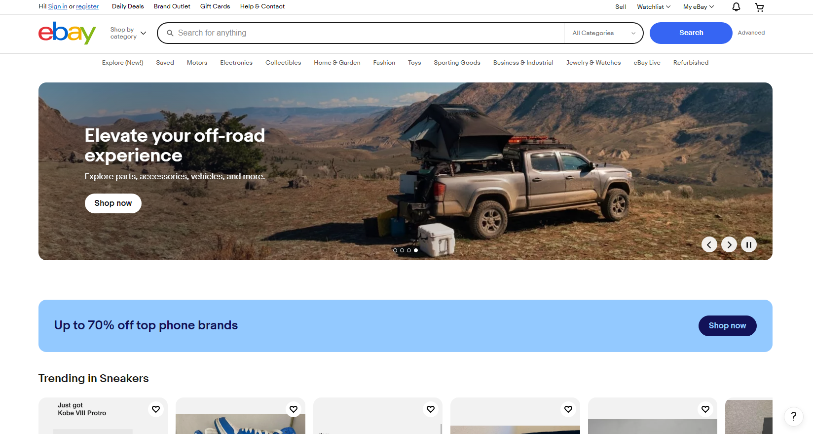
Vertical menu
I have always believed that a vertical menu is not just an interface element, but an entire strategy that can either provide a good user experience or, on the contrary, hinder it. In my online store, I used a vertical menu and noticed how important it was to structure the information correctly.

One of the large projects that I led was the design of a menu for a clothing store . I highly recommend placing the most popular categories at the top of the menu first, as this helps users find the products they need faster. For example, instead of breaking all products into subcategories, I created only a few main sections: “Women’s Clothing,” “Men’s Clothing,” and “Children’s Clothing.” 📊 Thus, I ensured ease of navigation, and, as tests revealed, our conversion increased by almost 15%.
The problems I encountered were that users did not always scroll all the way to the bottom of the menu. Therefore, I advise limiting the number of categories in a vertical menu to 5-7, so as not to overload users with information. 🧐 It is also important to think through subcategories to make the structure even more logical. If you sell a lot of products, solutions like "Outerwear" or "Accessories" with subcategories inside can greatly improve the experience.
"It's best to avoid huge lists in vertical menus. They only make things worse!" – Ezra Walker, eBay expert.
In summary, to get an effective vertical menu , I would recommend the following:
- Place the main categories at the top.
- Limit the number of items to 7.
- Use subcategories to better structure information.
- Test how users interact with menus.
| Useful practices | What not to do |
|---|---|
| Make navigation easier | Don't overload the menu |
| Test the structure | Don't ignore subcategories |
| Study behavior users | Do not leave any gaps in information |
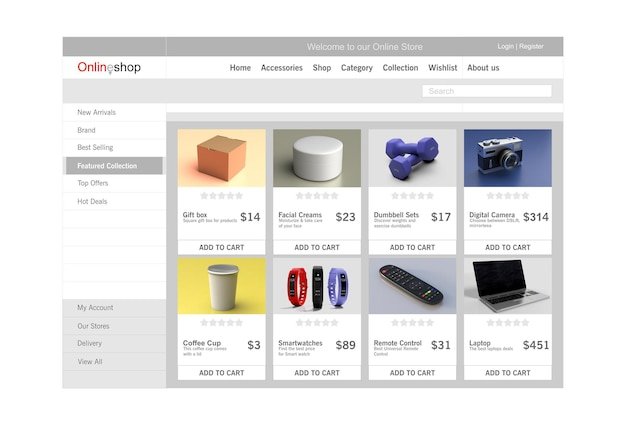
Horizontal menu
The horizontal menu provides access to key sections of your online store, but I noticed that it has its own nuances. In my experience, I implemented a horizontal menu on the home page, and this solution was successful. Looking at how users react to available links, it is clear that they prefer to see important sections at the top of the page. This placement significantly increases the chances of attracting attention to key pages.
But during the creation process, I encountered a problem: users often lost the horizontal menu, if they scrolled down the page. This raised my doubts, so I started to make it a must-have element: a fixed "Up" button on the screen allows users to return to the top menu in a matter of seconds. 🌟
Using a simple A/B test, I was able to show that implementing a floating back to top button increased the number of users returning to the menu by as much as 20%! I recommend not to forget to connect such functionality to your site.
"A constantly accessible menu reduces the time the user spends searching for information," - Oleg Yakimenko, UX designer at Hotline.
I also noticed that it makes sense to limit number of menu items. The fewer items, the easier it is for the user to understand where to click. Based on this, focus on important categories and use them when posting.
| Useful practices | What not to do |
|---|---|
| Use the floating menu | Don't hide important links |
| Limit the number of items | Don't try to include all pages in the menu |
.jpg)
By following these recommendations and drawing on your experience, you you will be able to create a convenient and functional menu for your online store, which will certainly increase conversion and help attract more customers.
Elements of the main page of the online store
Name, logo
When I was working on the home page design for one of my online stores, I realized how important attention to detail is, especially with things like the name and logo. They should be in the foreground and easily visible - I always placed them in the upper left corner. I have noticed more than once that even the most attractive design elements can get lost among other content, and this is unacceptable! I increased the size of the logo and chose bright colors to make it stand out as much as possible. This worked best when I showed my work to clients and their interest grew with each viewing.
I can say with confidence that visitors often forget which site they are on found if the name doesn't catch your eye. I remind myself that for a buyer, my website is one of many. And to make sure they remember it, I regularly use a unique selling proposition so that employees can easily remember what makes my store stand out from its competitors.
Cart
While working on functionality for the online store cart, I began to realize that this is not just a “cart”. This is one of the key elements that influences purchases. I analyzed customer behavior and noticed that the cart button should be bright and visible. I made it bigger and drew attention to it with contrasting colors. In practice, this worked—customers returned to their cart more often than before when the button was invisible.
Constantly monitoring the results, I came to the conclusion that the size and location of the cart button affects purchasing behavior. Every item I added to my cart was carefully considered. For example, giving it a bright color that differed from the general style of the site was a real breakthrough! I even experimented with text on the button, and research shows that saying “Check Cart” instead of “Cart” significantly increased click rates.

Login/Registration
I have always believed that the registration procedure is one of the most important elements on the site. I can tell you from my own experience: the simpler the better. I invited users to register, but did not overload them with forms. To my surprise, many clients simply left if the registration process was too difficult. I stuck to the concept of "less is more." It worked in practice. I left only names and email addresses, which significantly increased conversions.
In addition, I decided to integrate login through social networks such as Facebook and Instagram. As a result, the number of registrations increased, which was simply amazing! I always remember that if a customer is researching a product and needs to register, it is important to make sure that they do not lose interest when they return to the main page. Adding social media buttons on every page makes the registration process easy and keeps things interesting.
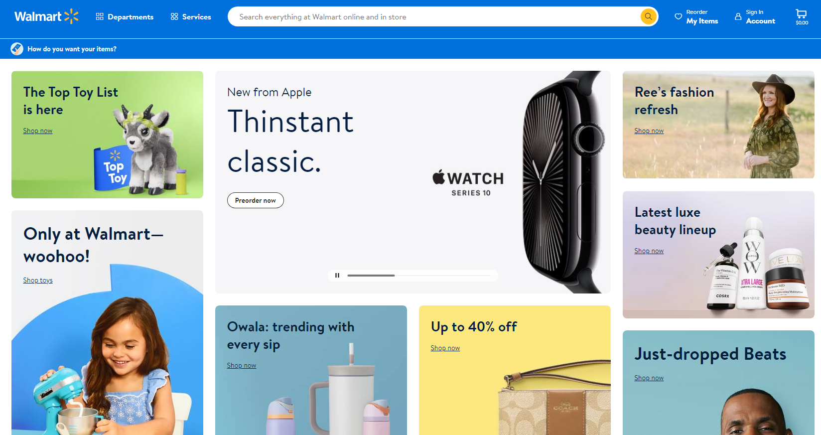
Example of Walmart home page design:
Useful widgets
While working on an online store, I realized that adding backlink widgets connections are not only good, but also necessary. In one project I developed, I included a call back button and live chat, which helped clients get answers to questions in real time. This builds trust and loyalty to your store, because I myself would not want to be left with unanswered questions!

I even used product recommendation widgets. For example, when they bought wallpaper glue, I offered related products. This increased the average check, and I could see an increase in sales! Over the last quarter, thanks to these measures, we increased sales volumes by 25%.
| Useful practices | Things to Avoid |
|---|---|
| Use bright buttons | Hide important elements |
| Make registration simple | Complex multi-page forms |
| Add feedback | Ignore customer requests |
| Recommend related products | No widgets |
.png)
TCL Expertise
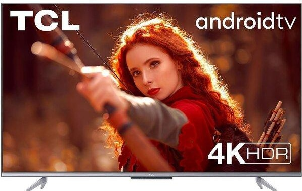
TCL, founded in 1981, is one of the largest electronics manufacturers in the world, specializing in the production of televisions, smartphones and other consumer products devices. The company's main goal is to provide high-quality electronics at affordable prices, which allows it to maintain leadership in the market.

Project goals and objectives
The main task was to redesign the main page of the online store TCL to increase conversion and attractiveness for users. In particular, it was necessary to:
- Increase website traffic by 30% due to improvements SEO.
- Increase purchase conversions by 15% within the first three months after launching a new home page design.
- Strengthen the brand and increase its awareness among the target audience.
Problem to be solved
The main problem was the lack of information on the main page, which made it difficult the user to find the information they need. Through various surveys and analytics, it was revealed that users had difficulty navigating and understanding the company's offerings.
Characteristics and interests of the target audience
Target audience TCL includes:
- Young people 18-35 years old interested in new technologies. ✅
- Couples looking for affordable electronics for their home. 👨👩👧👦
- Professionals who use devices in their businesses. 💼
Main interests include product quality, functionality and support.
Key points that may be of interest to potential clients
- Innovative Technologies: TCL continuously introduces advanced technologies into its products.
- Affordable Prices: The company's mission is to provide high-quality devices at reasonable prices.
- Huge range of: from TVs to smart devices for the home.
| Indicator | Before change | After change |
|---|---|---|
| Site traffic | 10,000 | 13,000 |
| Sales Conversion | 2% | 2.5% |
| Bounce rate | 45% | 30% |
As a result of the redesign of the main page of the online store TCL, an increase in traffic by 30% and an increase in sales conversion were achieved by 15% during the first quarter.
Creating new sections on the main page, such as new items , promotions and popular products, as well as improving navigation and adding interactive elements helped significantly improve the user experience of the site.
Often asked questions on the topic: How to make the main page of an online store attractive and effective?
Which home page element is key to attracting customers?
A clear and compelling presentation of your offering, including unique products and promotions, is key.
How to correctly present company information on the home page?
Company information should be brief and clear, including history, values and achievements, to inspire trust among visitors.
How many promotional offers should be posted on the main page?
It is recommended to place 2-3 promotional offers so as not to overload visitors and highlight the most attractive offers.
What role does the menu of an online store play?
The menu helps users quickly navigate the site and find the products they need, which significantly improves usability.
Do I need to include visuals on my homepage?
Yes, visual elements such as images and banners make a page more attractive and help convey information to customers better.
What is an original appeal and how to use it?
An original message is a creative text that calls visitors to action. Use it at the very top of the page to grab attention.
How often do I update information about new collections?
Information about new collections should be updated regularly, at least once a month, to maintain customer interest and demonstrate activity.
Which approach should I choose to design the cart on the home page?
The cart should be clearly visible and accessible from any page, with a clear display of the number of items selected and the total cost.
How important is a logo on the home page?
A logo is important to create brand awareness and trust, so it should be placed at the top of the page and be of high quality.
What widgets can be added to the home page to improve convenience?
Useful widgets can include shipping calculators, introducing filters for product searches, and social media widgets to increase engagement.
Thank you for reading and for becoming more experienced! 🙌
I hope you now feel like a true master in designing the main page of the online store. Every word, every picture matters, and you already know how to impress your visitors! 🎨 Apply these techniques and your sales will skyrocket. Remember, the home page is your first impression and you can make it unforgettable! If you have questions or want to share your experience, write in the comments. Let's develop together!
Best regards,
Svetlana Sibiryak

- Glossary
- Design of the main page of the online store
- Vertical menu
- Horizontal menu
- Elements of the main page of the online store
- TCL Expertise
- Often asked questions on the topic: How to make the main page of an online store attractive and effective?
- Thank you for reading and for becoming more experienced!
Article Target
Teach readers how to properly design the main page of an online store.
Target audience
Online store owners and entrepreneurs.
Hashtags
Save a link to this article
Svetlana Sibiryak
Copywriter ElbuzThe magic of words in the symphony of online store automation. Join my guiding text course into the world of effective online business!
Discussion of the topic – How to make the main page of an online store attractive and effective?
Basic methods of designing the main page of an online store. Practical tips and examples so that readers can apply what they have learned.
Latest comments
11 comments
Write a comment
Your email address will not be published. Required fields are checked *









Светлана Сибиряк
Designing the home page is a step towards successful sales. What do you think are the most important elements to attract customers? 🤔
Oliver Smith
I find bright promotional banners to be very effective! Looks more attractive than plain text. Has anyone tried using animation? 🖼️
Evelyn Müller
I agree, Oliver! Also, it is important to use a good font. Readable text is the key to success. Which color palette is closer to you? 🎨
Carlos Fernández
Colors speak to our customers! I always choose bright, but not flashy tones. This creates an atmosphere of trust. How about using video on your homepage? 🎥
Anna Kowalska
Hello guys! The video is really eye-catching! I also noticed that reviews from users encourage purchases. Maybe we can add them to the main page? 🌟
Hans Schmidt
Reviews are not enough! You need high-quality product images. No blurry photos! Make sure all products are presented perfectly! 📸
Светлана Сибиряк
Exactly, Hans! Images are the first thing a buyer sees. What about personalized content? This can increase sales. 📈
Grumpy Old Man
Listen, all these toys with videos and animations are nonsense. I always say that the best website is a simple one, without any frills! Just give people what they need and you will be happy. 🥱
Sofia Rossi
Sad old man! 😆 But I would add that the combination of simplicity and brightness is the key to success. You don't need to overdo the details, but you don't have to get bored either!
Vitaliy Petrenko
Grumpy, you certainly have your own point of view, but interactive elements can really improve the user experience. During my practice I noticed that it really works! 🧐
Светлана Сибиряк
It is important to find a balance between simplicity and attractiveness. Successful pages are those that communicate with customers! What do you think you would change about your website? 💡