Typical mistakes in online store usability and how to avoid them
-
Yuri Seleznev
Copywriter Elbuz
A mistake that costs a business thousands... How often have you wondered what's wrong with your online store? Perhaps it is usability that is preventing you from achieving the conversions you want. Take advantage of the recommendations that will be discussed later in this article, apply them and you will notice how usability improves and conversion increases. What are we waiting for? Let's get started!

Glossary
- 💼 UX (User Experience): The user's experience of interacting with a product or system. In the context of online shopping, this includes ease of navigation, ease of ordering, and overall user satisfaction.
- 👩💻 UI (User Interface): The user interface through which users interact with the online store.
- 🛒 Conversion: The process of converting website visitors into buyers or the user completing a targeted action.
- 📡 CTA (Call to Action): A call to action, an interface element that encourages the user to take a specific action, for example , "Buy Now" or "Register".
- 📑 Product card: A page on the online store website that provides detailed information about the product, including photographs, descriptions , price and reviews.
- 📉 Analytics: Collection and analysis of data about user behavior on the site to improve usability and increase conversion.
- 🔧 A/B testing: A method of comparative analysis of two versions of web pages or interface elements to determine which one they work better.
- 💬 Feedback: Information collected from users about their experience with an online store, used to improve usability .
- 🗂 Navigation: The structure and organization of menus and links on the site, ensuring easy movement of users across the pages of the online store.
- 🔒 SSL (Secure Sockets Layer): A security protocol that ensures a secure connection and protects user data during transmission on the website.
- 📆 Cross-selling: A method of increasing average check by offering users additional items related to their current purchases.
- 📧 Email Marketing: Using email to promote products and improve customer interactions.
- 💳 Payment: The process of conducting a transaction to purchase goods from an online store. Includes various payment methods such as credit cards, e-wallets and bank transfers.
- 🌐 SEO (Search Engine Optimization): Optimizing a website to improve its position in search results.
- 🚚 Delivery: The process of transporting purchased goods from the online store to the end consumer.
- 🔎 Search bar: An interface element for entering queries on the site, making it easier for users to search for products.
- 💡 Prototyping: Create rough layouts of pages and interface elements to test and improve the design and functionality of the site.
Common mistakes and how to avoid them
Mistake #1. Insufficient communication: problem with contacts
In my personal experience working with various online stores, I noticed that one of the most common omissions is a lack of contact information. The problem is compounded when the contact page only contains a ridiculous contact form and email address. 📨

I recommend:
- 📍 Indicate the physical address of the office and pickup points, if any, with a location map.
- 📅 Add a work schedule for the office and pick-up points.
- 📞 Ensure availability of telephone numbers and faxes, preferably with a toll-free line for calls.
- 💼 Indicate the name of the legal entity and its details.
In one of my projects, everything described above was implemented, and this significantly increased customer confidence in the store.
In my opinion, the most important thing is to create a feeling of availability and readiness to help the client at any time. When contacts contain all the necessary information, visitors feel confident and are more willing to make purchases.
Best Practices: Provide complete contact information including physical address, telephone, schedule work and legal details. Create a separate line for free calls.
| Helpful | Must be avoided |
|---|---|
| Specifying a physical address | No address and telephone number |
| Availability of travel map | Email address only |
| Detailed office hours | Office closed hours |
Mistake #2. Forced registration
It often happens that online stores require users to register before placing an order. From my own experience, I can say that this is the main barrier that causes customer churn.

I would recommend:
- Allow guest purchases. 🛒
- Simplify the registration and authorization process by making it optional.
- Add the ability to create a profile after a successful order to manage purchases later.
In one of my projects, we eliminated mandatory registration, which led to a significant increase in conversion. Users liked that they could make a purchase without additional steps.
Best practices: Allow guest purchases and simplify the registration process if it is really necessary.
| Helpful | Must be avoided |
|---|---|
| Possibility of purchases without registration | Forced registration of clients |
Mistake #3. Too many fields in the order form
One of the mistakes I regularly saw in my projects was requiring a lot of personal information when placing an order. This scares customers away and causes irritation.
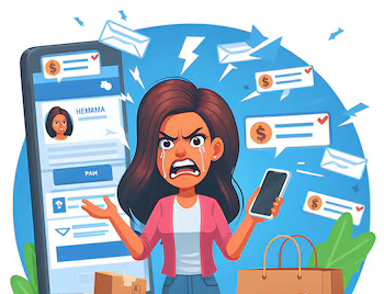
I'm sure the optimal solution would be:
- Reduce the number of required fields to a minimum: name, email and phone.
- Collect other information after order confirmation or as needed. 📋
In one of our online stores, after simplifying the order form, we noticed a significant decrease in the number of refusals and an increase in the number of completed transactions.
Best practices: Minimize the number of required fields at checkout.
| Helpful | Must be avoided |
|---|---|
| Minimum fields in the order form | Requirement of redundant information |
Mistake #4. Broken forms
Another problem I encountered was the forms on the site not working. If the form validator does not work, or the order cannot be submitted due to technical glitches, this causes great dissatisfaction among customers. 🛠️

I highly recommend:
- Regularly check and test forms at all stages of their operation.
- Make sure the form validator is working correctly. ✅
In one of our projects, we introduced regular checks and testing of all forms on the site. This has significantly improved usability and reduced the number of technical errors.
Best practices: Regularly test the functionality of forms and their correct operation.
| Helpful | Must be avoided |
|---|---|
| Regular testing of forms | Ignoring technical problems |
Mistake #5. Lack of Product Description
One of the most common mistakes I have seen is the lack of detailed product card descriptions. A photo without accompanying characteristics causes doubt and mistrust among clients.

I recommend:
- Post complete and detailed product descriptions indicating all characteristics.
- Use keywords in descriptions to improve SEO. 🔍
- Provide the ability to view various product variations (color, sizes) graphically.
I personally came across a situation where after adding detailed descriptions, the conversions of our projects skyrocketed.
Best Practices: Provide detailed product descriptions including all features and keywords.
| Helpful | Must be avoided |
|---|---|
| Detailed description of the product | Lack of product characteristics |
Mistake #6. Lack of one-click purchase
When an online store lacks a one-click purchase feature, it can negatively impact sales, especially when customers want to complete a transaction quickly.

I'm sure it's important:
- Implement a one-click purchasing feature. 🖱️
- Simplify the checkout process for large purchases.
In one of our projects, adding a one-click purchase function allowed us to increase conversion by 15% in the first month of use.
Best Practices: Implement one-click purchasing functionality and simplify the checkout process.
| Helpful | Must be avoided |
|---|---|
| One-click purchasing | Complex and multiple ordering process |
Mistake #7. Outdated website design
Outdated website design can seriously affect the usability and conversion of an online store. An outdated interface not only creates a negative customer experience, but also limits the functionality of the site on different devices. 📱

I'm sure the solution would be:
- Periodically redesign to make the site look modern and user-friendly.
- Optimize design to work on mobile devices.
- Follow modern trends in design and interface.
We noticed a significant improvement in user experience and increased sales after a complete redesign of one of our projects.
Best practices: Redesign your website to ensure it looks modern and user-friendly, Optimize for mobile devices as much as possible.
| Helpful | Must be avoided |
|---|---|
| Modern and responsive design | Outdated and inconvenient interface |
10 Ways to Increase Conversions
Method number 1. Eliminating scrolling on the home page
When I was working on a large online store project, I noticed that eliminating the need to scroll on the home page greatly improved the user experience. 🛍️ I suggest you place the most important information right on the main page. An image, a comprehensive description of the goods, information about delivery and payment - all this should be available without additional scrolling.
.gif)
One of the simple ways to improve website usability is:
- 😍 Using bright and large images to draw attention to key elements
- 💥 Interactive banners with promotions and special offers
- 📊 Information about the key benefits of your store, such as free shipping, exclusive offers for new customers, etc.
This is how I was able to increase the number of purchases on the site. Having all key elements on the home page in a clear and consistent manner allows users to find the information they need faster and experience less frustration during the search process.
🎯 Table: Do's and Don'ts of Home Page Design
| Best Practices | Bugs |
|---|---|
| Placing key information prominently | Filling the page with redundant details |
| Using high-quality images | Forgetting about the mobile version of the site |
| Simplification of navigation | Overloading of elements and banners |
Method number 2. Showcasing Competitive Advantages
Since the beginning of my UX design career, I have learned how important it is to highlight the competitive advantages of your online store. 🚀 While working on the redesign of one online store, we placed all the key advantages of the site in the most visible place.

For example:
💡 product quality ,
🎁 free shipping ,
💸 bonuses for new customers - all this should be presented in such a way that the visitor immediately sees these benefits.
I recommend:
- 📦 Place block elements with short and compelling messages about the benefits
- 📈 Use infographics or icons to visualize the advantages of
- ✨ At least briefly, but clearly describe all the main positive aspects and differences from competitors
In addition, you should remember that each point should be obvious and attractive, do not overload the user with unnecessary information.
🎯 Table: Best practices and mistakes
| Best Practices | Mistakes |
|---|---|
| Clear and concise summary of benefits | Vague and vague descriptions |
| Visualization 🖼️ | Plain text without illustrations |
| Backing every claim with facts | Ignoring real benefits |
The most important thing is that the client immediately understands why to choose your store and not a competitor.
Method number 3. Unambiguous instructions for the algorithm of actions
When your client adds an item to the cart, he doesn’t have to think long about what to do next. ⏳ On one of the projects, I was able to significantly increase conversion by simply adding clear and unambiguous steps after each action.
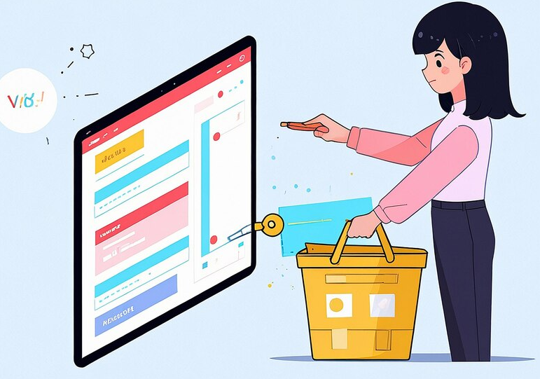
I recommend:
- ➡️ Buttons with clear headings , for example, "Proceed to payment" instead "Continue"
- 🖱 📏 Clear separation of each stage of the purchasing process: adding to cart➡️ placing an order ➡️ choosing a delivery and payment method
One of my projects shows how important this kind of step-by-step guidance is. Customers were more likely to complete purchases when they knew each next step.
🎯 Table: Best practices and mistakes
| Best Practices | Mistakes |
|---|---|
| Clear and unambiguous buttons | Vague "Continue" instructions |
| Step-by-step purchasing process 🛒 | No navigation between steps |
| Confirmation and notification of each step 📢 | Leaving the client without prompts |
Method number 4. Complete payment/delivery information
When I look at a product card, I always pay attention to the completeness of information about payment and delivery methods. ✅ In one of the successful projects, we decided to place a detailed description of delivery methods and payment options directly on the product page.

Tips:
- Indicate actual delivery times and specify the cost
- Make possible payment methods as transparent and obvious as possible
- 📦 Information should be easily accessible and in one place so that the client does not have to search for it throughout the site
🎯 Table : Best Practices and Mistakes
| Best Practices | Errors |
|---|---|
| Full and clear payment and delivery information | Unstructured information |
| Realistic deadlines 🎯 | Inflated expectations for deadlines |
| List of payment and delivery options | Few specifics, even if there are several options |
Method number 5. Duplicate product
I always recommend that friends and colleagues leave items visible in the cart at all stages of checkout. This eliminates doubt as to whether a particular item was added correctly. 🧾

I recommend:
- Display items in cart at every step of the purchasing process
- ✅ Duplicate information about the product so that the user can make sure that everything is correct
In one of my projects, this significantly reduced the number of abandoned carts and increased the number of completed orders.
🎯 Table: Best practices and mistakes
| Best Practices | Mistakes |
|---|---|
| Duplicate information about products | Lack of visibility of products in the cart |
| Mentioning key product characteristics | Ignoring small parts and accessories |
Method number 6. Simplifying the choice
When I first encountered an online store with a large range of items, I realized how easy it is to get confused in the multitude of models and brands. Therefore, the introduction of step-by-step filtration of the assortment has become a priority for us. 🛒

I recommend:
- 🤩 Use sort by price, popularity and other criteria
- Enter complex filters for narrow selection
- 🧑🏫 Help with product category navigation
This approach improved the customer experience and increased the number of completed purchases.
🎯 Table: Best practices and mistakes
| Best Practices | Mistakes |
|---|---|
| Variety of filters | Lack of parameters for filtering |
| Sort by relevant criteria | Ignore synchronization with results |
Method number 7. No restrictions
On one of our projects, we decided to eliminate the word “no” and offer clients alternatives instead of limiting their options.

I recommend:
- 🤗 You should always offer alternatives to
- 💡 If there is no product show similar options
Removing bans opens up more options and makes the purchasing process more enjoyable.
🎯 Table: Best practices and mistakes
| Best Practices | Mistakes |
|---|---|
| Offer of similar products | Limit the number of purchases |
| Alternative options | Refusal for missing items 📉 |
Method number 8. Contacts where they belong
In one of my projects I had to move contact information. This significantly improved navigation and made it easier for users to connect with the store.

I recommend:
- 📞 Place contact information in the appropriate section, and not in the product card
- Sorting contacts by importance and purpose
🎯 Table: Best practices and mistakes
| Best practices | Errors |
|---|---|
| Appropriate pin placement | Place them where they interfere with navigation 📵 |
| Important information in a visible place | User distraction |
Method number 9. Nothing superfluous in the product card
At the stage of creating product cards, I often had to deal with information overload. Conclusion - only the main details are important.
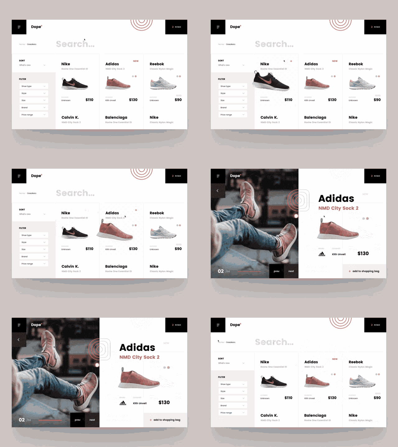
I recommend:
- Photo and comprehensive description of the product
- 💰 Information on price, delivery and other key features
- ✨ Avoid additional offers and news in product card
This approach helps to focus the client on what is most important.
🎯 Table: Best practices and mistakes
| Best Practices | Mistakes |
|---|---|
| Focus on the main information | Overload with unnecessary elements |
| Comprehensive description of the main | Introduction of distractions |
Method number 10. Interesting services among them:
When I was working on expanding the functionality of our online store, I used several interesting services that significantly improved the user experience.

I recommend:
- 🔄 "Report a problem" button
- 🧐 Online consultation
- 👀 Recently Viewed Products on each page
- 🔍 Enlarged product photo view option
- 📱 Informing via SMS about the order status
These services attracted customers and significantly increased their loyalty.
🎯 Table: Best practices and mistakes
| Best Practices | Mistakes |
|---|---|
| Introduction of many services | Lack of usability |
| Informing clients about status | Omitting important details |
This approach helps me keep my clients informed and provide them with the best possible experience.
Briefly about the main thing: Optimization of the ordering process
Throughout my career as a UX designer, I have repeatedly encountered problems with the checkout process for online stores. The saddest thing is that this stage is often the reason why customers leave the site. I can confidently say that there are several key factors that should not be overlooked.

👉 Minimizing input fields
🥇 One of my first projects required analyzing the checkout process. We noticed that many users leave the site at the stage of filling out the form. I recommend minimizing the number of input fields to the most necessary ones. While users may feel like they have to navigate through a maze of questions, reducing the fields significantly reduces the burden and increases the likelihood of order completion.
👉 Simplified registration process
In one of our projects, we introduced the option of placing an order without mandatory registration. I am convinced that this has increased our conversion rate dramatically. Users simply don't want to waste time creating an account before purchasing. I strongly advise you to consider this option.
👉 Access to information and support every step of the way
👍 Clients feel more confident when they clearly understand what to do further. I would recommend that you consider adding live chat tools or dedicating a contact center that can quickly answer all customer questions.

👉 Information content and transparency
💡 We once conducted an experiment by adding an infographic that explained the ordering process step by step. I would recommend that you consider using visual tools like these. They increase user trust in your brand and make the process more transparent.
Real life example
Even from a personal example, I can say that transparency and information play a key role. I once came across an online store where the delivery and return information was carefully hidden. This made me unhappy and I decided to refuse the purchase. When working on website usability, I always take such points into account and try to make the information as accessible as possible.
I believe that optimizing your checkout steps is the number one step to increasing conversions. It is important not to overload the client with information and at the same time provide all the necessary data.
Finally, I have prepared an overview table to help you make the right choice:
| Best practice | Not recommended |
|---|---|
| Minimize input fields | Request unnecessary information |
| Possibility of ordering without registration | Require mandatory registration |
| Ordering steps are visible and clear | Hide information about order steps |
| Availability of support in chat | Leave users without support |
| Informative infographics | Hide tons of text without visual cues |
I encourage you to pay attention to these recommendations and put them into practice . I am sure this will significantly improve the user experience and increase customer loyalty to your online store.

Stanley Black & Decker Experience
Stanley Black & Decker is a global leader in the manufacture and distribution of tools and solutions for home and professional needs. Thanks to many years of experience and high quality products, the company has won the trust of millions of users around the world.

Detailed description of the client, their business and goals
Stanley Black & Decker is engaged in the manufacture and sale of tools, repair and construction equipment. The company's main business is providing high-quality and reliable tools to both professionals and home craftsmen. The client's main goals include increasing conversion and improving usability of online store.
Identification of main goals and objectives
- Increasing the number of sales through the online store.
- Improving the usability of the website.
- Meeting the needs of the target audience.
- Reducing the number of purchase refusals.
Statement of the main problem that needs to be solved
Despite the high level of product quality, the company I encountered the problem of low conversion in an online store. Customers often abandon their purchase at the checkout stage.
Description of the characteristics and interests of the target audience
Target audience Stanley Black & Decker includes:
- 🛠 Professional builders and repairmen: interested in long-lasting and reliable tools, willing to pay for quality.
- 🏠 Do-it-yourselfers: looking for convenient and easy-to-use tools, prefer product information in accessible language.
- 👨🔧 Repair and construction companies: interested in wholesale purchases and special offers.

Highlighting key points that may be of interest to potential clients
- High quality products.
- Warranty and service.
- Wide range of tools and accessories.
- Convenient and simple services for selecting and purchasing goods.
Detailed results of the project
Here are some of the results achieved after implementing improvements:
- 📈 Increase in conversion by 25% in the first three months.
- 📉 Reduced bounce rate by 15%.
- ✒️ Simplifying the ordering process has reduced the time to purchase by 30%.
Project Overview Table
| Metric | Before project | After project |
|---|---|---|
| Conversion | 5 % | 6.25% |
| Rejection rate | 40% | 34% |
| Average time for registration | 10 minutes | 7 minutes |
" The implementation of practical recommendations for improving usability has led to a significant increase in the number of positive customer reviews among our clients." - Simon Bailey of Stanley Black & Decker.
Basic recommendations
- 📧 Contact Information: Provide easy access to contact information on all pages.
- 📑 Registration on the website: Simplify the registration process by making it optional to make a purchase.
- ✍️ Form optimization: Minimize the number of fields required to fill out when placing an order.
- 🖼 Informative Descriptions: Provide detailed and clear product descriptions.
- ⏳ Website Design: Update your website design to meet modern standards.
Studying this case may be useful for other companies seeking to improve usability and increase conversion of your online store.
Frequently asked questions on the topic: Typical errors in the usability of an online store and how to avoid them
What are the main mistakes made when designing the usability of an online store?
Why is it important to have contact information on your website?
What problems does having to register before purchasing cause?
How to reduce the number of fields in order forms?
What to do if the forms on the site do not work?
Why is it important to provide complete product descriptions?
How to implement one-click purchasing?
How often should you update your online store design?
What strategies will help increase conversion in an online store?
Why is payment and shipping information important?
What should be included in a product card so that it is informative, but not overloaded?
Thank you for reading and for becoming more experienced! 🎉
Now you know everything about improving the usability of online stores. I hope that my tips will help you increase your conversion and make your store a real magnet for customers. Don’t forget about me, Yuri Seleznev: my passion for automating online stores has helped many entrepreneurs achieve success. 💼 And remember, mistakes are steps towards perfection. Share what you think about it in the comments!

- Glossary
- Common mistakes and how to avoid them
- 10 Ways to Increase Conversions
- Briefly about the main thing: Optimization of the ordering process
- Stanley Black & Decker Experience
- Frequently asked questions on the topic: Typical errors in the usability of an online store and how to avoid them
- Thank you for reading and for becoming more experienced!
Article Target
Increasing understanding of online store usability and providing practical tips to improve conversion.
Target audience
online store owners, UX designers, marketers
Hashtags
Save a link to this article
Yuri Seleznev
Copywriter ElbuzI unravel the secrets of successful online store automation, plunging into the world of effective solutions and secrets of online business - welcome to my virtual labyrinth, where every line is the key to automated success!
Discussion of the topic – Typical mistakes in online store usability and how to avoid them
An overview of typical mistakes that are made when designing the usability of online stores. Practical methods for increasing conversion and recommendations for improving usability.
Latest comments
15 comments
Write a comment
Your email address will not be published. Required fields are checked *


Юрий Селезнёв
A common mistake that occurs is that navigation is too complex. Users get lost and leave the site. How to improve navigation? 👇
Emma
Yuri, I encountered a similar problem on my website. Simplifying categories and adding filters works wonders!
Hans
I agree with Emma. A clearer structure and logical menu layout also helps a lot.
Sophie
We had a bad experience with this. The menu seemed clear, but customers still complained... How to understand where the error is? 😕
Юрий Селезнёв
Sophie, try using heat maps and user behavior analytics. They will show where visitors are experiencing difficulties.
Pablo
We have added a real-time consultant on our website. Helped a lot in solving navigation problems.
Ania
Pablo, great! What software do you use for this?
Pablo
Ania, we use Intercom. It has many useful features!
Enzo
All these innovations are good, but few people want to learn how to use the site again. People are lazy. 🤷♂️
Hans
Enzo, well, a logical and simple solution helps to avoid this problem. 😊
Sophie
I completely agree. And it is also important that the site is adapted for mobile devices!
Marie
Sophie, really! The mobile version simply must be convenient. Half of the clients come through the phone.
Юрий Селезнёв
Marie, absolutely. A website that is not optimized for mobile devices will lose a significant part of its customers.
Alice
Yuri, do you have specific examples of successful online stores with excellent usability?
Юрий Селезнёв
Alice, ASOS and Zalando for example are great examples. They have excellent navigation and responsive design.