Increasing online store sales using color theory
-
Anton Koval
Copywriter Elbuz
What if I told you that color can change the fortunes of your online store? So, just one shade can make a client stop, look and... buy. But which colors work for you and which ones against you? Let's figure it out. The principles of color theory are simple but effective. Examples of successful use of colors fill the space around us. Look at the market giants whose pages shine with a harmony of shades. They found out long ago that the right color scheme can increase conversion by tens of percent. For best results, pay attention to color psychology. Different shades evoke different emotions. Knowing this, you can create an atmosphere that will not only attract, but also retain customers. For example, green, which symbolizes nature and health, is perfect for organic food stores. So, bet on the palette for success! Choose the right colors for your online store and watch your orders grow. Your colors are your success.

Glossary
- 🧠 Psychology of color: The scientific study of how colors affect perception, behavior and people's emotions.
- 🎨 Color scheme (palette): A set of colors used in a design that should be harmoniously combined and convey a certain mood or style.
- 🌈 Basic colors: Red, blue and yellow are basic colors that cannot be obtained by mixing other colors.
- 📈 Conversion: The process of turning website visitors into buyers or completing a targeted action.
- 🔄 Saturation: The intensity or purity of a color, which affects its brightness and impact.
- ✅ Complementary Colors: Pairs of colors that are opposite each other on the color wheel and when used together create a strong contrast .
- 📏 Color Wheel: A visual representation of colors in a circle that helps you choose harmonious color combinations.
- 💚 Cool Colors: Blue toned colors that are associated with calm, tranquility and coolness (e.g. blue, green ).
- 🔥 Warm Colors: Colors in the red range that are associated with energy, passion and warmth (e.g. red, orange ).
- 🛒 Color associations: The connections between a color and the emotions or ideas it evokes in people (for example, green with nature, red with energy).
- 🎯 Target Audience: The group of people to whom marketing efforts are directed and for whom the website design is being developed.
- 🔧 UX/UI design: Design of user experience and interface, including visual design and usability of the site.
- 🗂️ Color Scheme: A specific set of colors chosen for use in a design that must consider both aesthetics and psychological aspects.
- ✨ Contrast: The difference between light and dark or opposing colors that helps highlight important elements on a site.
- 🔦 Accent Colors: Colors used to highlight key elements or direct users' attention to key areas on a site.
The power of the right color associations in the online store
I have always believed that choosing the right color scheme is the key to success when creating an online store. In my practice, it has been repeatedly confirmed that colors have a strong influence on consumer behavior and their perception of a brand. Let's take a deeper look at the features of different colors and their impact on conversion.
Red: Call to Action
Red is a color that attracts attention and encourages immediate action. I tended to use red for call-to-action elements like the “Buy” or “Checkout” buttons. Red is associated with warmth, energy and passion, but it is worth remembering that excessive use of this color can symbolize danger and make visitors want to leave the page. For example, in one of my projects where we used a red background, users experienced discomfort and conversion rates dropped significantly, which led us to make optimal design adjustments.
Green: Natural harmony and richness
I have often chosen green for online stores related to health products, natural products or financial services. Green symbolizes nature, wealth, abundance and evokes a feeling of calm and security. In one project, I applied green accents to product categories and noticed a significant increase in the time users spent on the site, as well as improved conversion rates.
Blue: Trust and Security
Blue is a color that is associated with trust, security and calm. When I was working on creating an online store for legal services, I used different shades of blue to create a sense of security and confidence. However, you should avoid shades that are too dark, as they can evoke associations with sadness and depression. In this project, blue tones helped strengthen user trust and increase brand loyalty.

Yellow: Friendly and optimistic
I am convinced that yellow is the perfect color choice for online stores that want to create an atmosphere of friendliness and optimism. For example, when developing a website for children's products, we used yellow accents and bright emotions. Yellow evokes feelings of happiness and energy, which encourages users to actively engage with content.
Orange: Warmth and Activity
Orange is an equally important color that symbolizes warmth, fun and activity. I recommended it for summer collections and sporting goods. Orange tones call for action and arouse interest. In practice, I noticed that orange "Add to Cart" buttons increased clicks and improved conversion rates.

Purple: Luxury and quality
Purple is often associated with chic, luxury and quality. I recommend using this color for premium product categories. In one project that offered luxury accessories, purple elements helped convey a sense of exclusivity to users and maintain the high level of the brand.
Black: Power and Elegance
The color black depends on the context of its use. It can symbolize power, elegance and high quality. I've used black accents for websites related to fashion and premium electronics. This helped create a sense of modernity and minimalism, which had a positive impact on brand perception.

Color wheel - principles of the correct combination of colors in website design
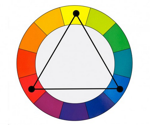
In their work, designers usually use a color wheel where the corners of the triangle indicate the three most compatible shades (base colors):
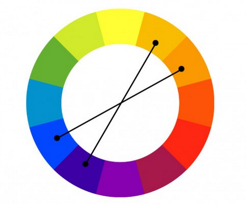
Basically 4 colors are used, two of which are contrasting (complementary) and two complementary:
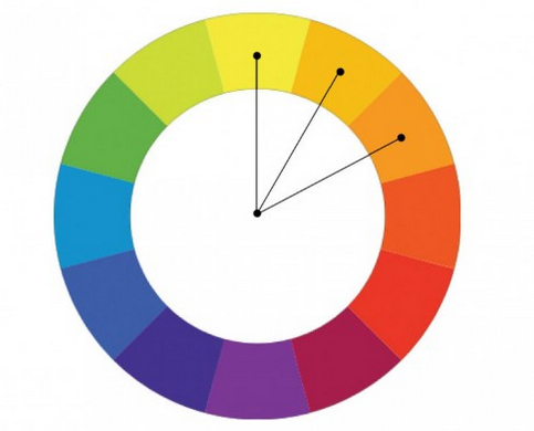
Or you can also use color sequences (similar color schemes) such as:
Recommendation table
| Color | Value | Usage examples |
|---|---|---|
| Red | Activity, energy | Buttons "Buy", "Place an order" |
| Green | Nature, wealth, tranquility | Health products, financial services |
| Blue | Trust, safety, peace of mind | Legal services, blogs |
| Yellow | Friendliness , optimism, energy | Children's products, entertainment |
| Orange | Warmth, fun, activity | Summer collections, sporting goods |
| Purple | Luxury, generosity, quality | Premium Accessories |
| Black | Power, elegance, high quality | Fashion, premium electronics |
I believe that the correct use of color scheme in online store design can significantly influence brand perception and customer behavior. I recommend that you carefully consider the choice of colors and their combinations, based on the characteristics and target audience of your store.

Experience ASUS
Detailed description of the client, his business and tasks
ASUS is one of the world's leading companies producing computer equipment and electronics. Founded in 1989, ASUS has built a reputation for advanced technology, innovation and high quality products. Their range includes laptops, motherboards, video cards, monitors and much more. ASUS's main goal is to provide users around the world with high-performance and reliable solutions for various purposes, from gaming to professional work.

Main goals and objectives
- 📈 Increase in sales conversion in the online store
- 🎨 Optimize color scheme to improve user experience
- 👥 Increase user engagement and a decrease in the bounce rate
- 🛒 An increase in the average check and the number of repeat purchases
Main problem
The main problem was the incorrect use of colors on the site, which led to a decrease in conversion and likelihood of purchase. The main goal was to create a color scheme that would match the perception of the target audience and encourage them to make purchases.
Characteristics and interests of the target audience
The main target audience of ASUS includes:
- 💻 Young professionals aged 25–40, often working in IT and creative industries
- 🎮 Gamers of all ages looking for high-performance computers and gaming accessories
- 🧑🎓 Students who need reliable and productive technology for study and entertainment

These groups of people value technological innovation, quick access to information, and the ease of use of online services.
Key points that could be of interest to potential clients
- 🟢 Brand Colors: Using the main brand colors (blue and black) to increase recognition
- 🔵 Accent colors: Adding elements of contrast (orange, green) to draw attention to key CTAs
- 🔴 Color schemes for different product categories: For example, bright and saturated colors for gaming products, more neutral and calm for business solutions
Examples of using colors and specific results project
To improve user experience and increase conversions, ASUS has changed the site's color scheme based on color psychology:
- Home: The main blue color was used to create a sense of reliability and professionalism, and the accent buttons were bright green to encourage clicking.
- Gaming Section: Aggressive red and black tones were used here to enhance the perception of power and speed, attracting gamers.
Specific results:
| Indicator | Before changes | After changes |
|---|---|---|
| Sales Conversion | 1.8% | 3.2% |
| Time on site | 2 min 34 sec | 4 min 12 sec |
| Bounce rate | 55% | 38% |
| Average bill | $300 | $350 |
" Since introducing the new color palette, we have seen a significant increase in customer engagement and completed purchases. Color really makes a difference!” - Chen Lin, ASUS Marketing Manager.
Using the right color scheme allowed ASUS not only improve user experience, but also significantly increase your commercial performance.
Frequently asked questions on the topic: Increasing online store sales using color theory
Thanks for reading and enriching your experience 📚
Now you know the secrets of color theory, and your successful online trading will now sparkle with new colors. You have become a real guru of color psychology, ready to turn any online store into a sales masterpiece thanks to the correct selection of shades. Don't forget to share your successes and thoughts in the comments - I look forward to them! 🚀
Anton Koval, independent expert, "Elbuz". In the business world, words are my pencils and automation is my artistic painting. Welcome to the gallery of online store efficiency, where every text is a masterpiece of success!
- Glossary
- The power of the right color associations in the online store
- Color wheel - principles of the correct combination of colors in website design
- Experience ASUS
- Frequently asked questions on the topic: Increasing online store sales using color theory
- Thanks for reading and enriching your experience
Article Target
The purpose of this article is to show the value of choosing the right color scheme for online stores and provide practical tips for increasing sales.
Target audience
Online store owners, designers and marketers
Hashtags
Save a link to this article
Anton Koval
Copywriter ElbuzIn the world of business, words are my pencils and automation is my art. Welcome to the gallery of online store effectiveness, where every text is a masterpiece of success!
Discussion of the topic – Increasing online store sales using color theory
Description of the basic principles of color theory and their influence on consumer perception. Examples of using different colors to increase conversion in an online store. Psychology of color: recommendations for choosing color schemes for different types of products.
Latest comments
15 comments
Write a comment
Your email address will not be published. Required fields are checked *







Антон Коваль
Colors can really have a big impact on customer perception. For example, the color red is often used to create a sense of urgency. Does anyone have examples of the color red being used successfully in their store? 🔴🛒
Emily
Anton, absolutely right! We used red for the “Buy” buttons in our clothing store, and the conversion rate increased significantly.
Johannes
Emily, on the contrary, blue works better for us - it evokes a feeling of trust. Maybe your case is an exception?
Isabelle
Johannes, blue is really good for financial and technology services. We use it too. Who else has favorite colors?
Luis
Anton, are there universal colors that work for everyone? We used orange for promotions and the results improved noticeably! 🍊
Антон Коваль
Luis, orange is often associated with energy and positivity, so it is a good choice for stocks. There are probably no universal colors; it is important to consider the context and target audience.
Marco
It always seemed to me that these were more fashion trends. Blue and red colors, green... All this is nonsense.
Monika
Marco, there’s no need to be so skeptical. We just recently changed the color scheme of the site to a warmer one, and traffic has increased!
Sophie
Monika, interesting! What colors did you use? I'm thinking about changing the design too.
Антон Коваль
Sophie, Warm colors like yellow or orange can make a website feel more inviting and friendly. 👍
Olga
Hi all! We recently added color gradation for jewelry: pink and gold. Sales increased by almost 20%. Who else has experimented with colors?
Hans
Olga, cool! For premium products, black and gold work great for us.
Carlos
Hans, has anyone used a silver one? I was thinking of trying it for the electronics section.
Emma
Carlos, silver is ideal for electronics! We did this and clients responded positively. ✨
Антон Коваль
Carlos, I support Emma. Silver color can emphasize the technological and modernity of a product.