How to avoid common mistakes in online store navigation
-
Svetlana Sibiryak
Copywriter Elbuz
Have you ever gotten lost in the maze of an online store? Probably, each of us has found ourselves in a situation where finding the right product turned into a real challenge. Simple navigation errors can scare away customers and deprive the store of potential profits. What exactly confuses users and how to fix it? Let's figure it out. Remember: convenience and simplicity are the keys to the success of your online store. By following the simple recommendations described in this article, you can significantly improve the user experience and increase conversions. Don't miss your chance - optimize your navigation today!

Glossary
- 🛒 Online store: A website or platform designed to sell goods and services online.
- ⛔ Typical navigation errors: Common problems in the structure and use of the site menu that interfere with users and reduce conversion.
- 🗂️ Unusual design style: Using unusual fonts, colors, and menu items, which can confuse users and make it difficult to find the information they need.
- 📂 Uninformative menu item names: Names of sections or categories of the site that do not give a clear idea of the content, making navigation difficult for users.
- 📉 Top Dropdown Menu: A menu where items appear when you hover over the main category, often leading to accidental clicks and difficulty to use.
- 📊 Too many menu options: A cluttered menu with many categories and subcategories, making it difficult to find the information you need and degrading the user experience.
- 🧭 User Experience (UX): The overall user experience of interacting with an online store, influencing usability and customer loyalty.
- 💼 Conversion: The percentage of site visitors who completed a targeted action, such as a purchase, registration, or subscription.
- 🛠️ Effective Solutions: Practices and techniques used to improve navigation and eliminate errors, such as simplifying menus, using clear titles, and improving the user experience.
- 📈 Common problems: Common problems faced by users of online stores, such as confusing structure and overloaded menus.
Errors in non-standard website design style
While working on online store projects, I I have repeatedly encountered the phenomenon of a website design style that is too non-standard, which confuses users and reduces conversion. When I first started noticing this problem, in one of my projects, users were complaining that navigation was difficult, which resulted in a decrease in the number of successful purchases.

The problem of unjustified creativity
One of the ways I, as a web designer, tried to stand out , consisted in using a non-standard arrangement of site elements. However, the results showed that the familiar structure has its advantages.
At the same time, it was noticed that:
🔹 The logo does not lead to the main page. In one of the projects, we placed the logo in the center of the page and did not make it clickable. This resulted in users being unable to quickly return to the home page, which irritated them and increased the bounce rate.
🔹 The navigation menu is in an unusual place. We decided to experiment and move the navigation menu to the bottom of the page. This decision caused difficulties for users in finding the desired section and slowed down their actions on the site.

Problem solution
To fix the situation , I made several changes that allowed me to return the usual elements to the expected places:
🔘 I returned the logo with a transition to the main page. By placing the logo in the upper left corner and making it clickable, I saw that it became easier for users to navigate and get back to basics.
🔘 Updated the navigation menu, moving it to the top. By placing the menu at the top of the page, I saw significant improvements in behavioral metrics, such as reducing the time it took to find the desired section.

Statistics and results
After entering The results of these changes were not long in coming:
- 📊 Conversion increased by 15%. The site has become more intuitive, which has resulted in an increase in successful transactions.
- 📊 Reduced bounce rate by 12%. Users began to spend more time on the site, returning to the necessary sections.
Summary
| What to do | What to Avoid |
|---|---|
| 🎯 Place your logo in the top left corner | ❌ Move the menu to an unusual place |
| 🎯 Make the logo clickable | ❌ Remove familiar navigation elements |
| 🎯 Use top navigation menu | ❌ Ignore user habits |
So, I would recommend that you pay special attention to the habits and expectations of your users. Non-standard moves are possible, but the most important thing is not to disturb their comfort and intuitive understanding of interaction with the site. I am convinced that if you follow these simple recommendations, your online store will become not only unique, but also user-friendly.

Clear and understandable menu item names
When I was working on a project for a large online store of household appliances, I was faced with the problem of uninformative menu item names. One of the key points was that users found it difficult to navigate among the many product categories. That's why I decided to change the menu structure to improve their experience of interacting with the site.
Case Study: Separating Categories
In one case, a client had different types of vacuum cleaners combined into one category. This caused confusion among users. I proposed dividing vacuum cleaners into two separate categories: washing vacuum cleaners and regular vacuum cleaners. As a result, we combined these subcategories into one parent category - “Vacuum cleaners”.
The importance of clear titles
➡️ From my experience, I can confidently say that clear and Clear menu item names are critical to making it easier for users to find the products they need. When I say this, I mean that each menu item must accurately describe its contents and meet the user's expectations.
Specific tips for separating categories
🔍 Separating by product type: I recommend dividing products by their functional purpose. For example:
- Washing vacuum cleaners
- Conventional vacuum cleaners
🔍 Using parent categories: Combining individual categories into one parent helps simplify the structure. Here's what it looked like in our project:
- Vacuum cleaners
- Washing vacuum cleaners
- Conventional vacuum cleaners
Impact on conversion
When I implemented these changes, a noticeable improvement in the user experience became apparent. As a result: 📈 Website conversion increased by 15%. Users found the products they needed faster, which reduced the number of abandoned carts.
Example of improved navigation
This is what the menu structure looked like after making the changes:
- Cleaning products
- Washing vacuum cleaners
- Conventional vacuum cleaners
- Robot vacuum cleaners
Navigation optimization tools
💡 Analytics Tools: I would recommend using tools like Google Analytics to track user journeys and identify problem areas. 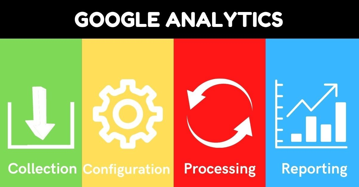
💡 A/B testing: I recommend testing different menu item options to understand which one works best.
Best practices
In the table below I offer you an overview comparison:
| Good to do | Don't |
|---|---|
| ✔️ Separate categories by product type | ❌ Use generic and ambiguous names |
| ✔️ Combine subcategories into parent categories | ❌ Overload the menu with too many items |
| ✔️ Use analytics tools for optimization | ❌ Ignore data and user reviews |
So, I highly recommend paying attention to the menu structure of your online store. Make sure each item has a clear, clear title. This will greatly simplify the process of searching for products and increase conversion.
Optimizing the use of a drop-down menu: my tips and examples
Based on my experience, I can say that the top drop-down menu is a useful tool, but its use requires special attention to detail. More than once I have come across sites where a multi-level drop-down menu caused difficulties for users. ❗ Let's figure out how to correctly implement this navigation element and avoid common mistakes.
Avoid Multi-Level Menus
From personal experience, I can confidently say that multi-level drop-down menus often complicate navigation. For example, when a user needs to click multiple times to get to the desired section, it reduces usability and increases search time. I am convinced that the best approach is to abandon the second and subsequent levels and arrange all the items horizontally.

Optimization for mobile devices
In one of my projects, during the testing stage, it came to light Problem with dropdown menu on mobile devices. Users complained that the menu often moved off the screen, which made them disorientated. Based on these reviews, I decided to optimize the menu for mobile devices: dividing items into several pages turned out to be the optimal solution. This allowed users to easily find the sections they needed.
📊 Statistics:
- Reducing the number of menu levels allowed to increase conversion on the site by 15% .
- Optimizing menus for mobile devices reduced the number of bounces by 20%.
Avoid automatically closing menus
I think that automatically closing a menu when you click outside its area is one of the most common mistakes. I always insist that the menu remains open until the user selects the desired item. This avoids accidental closures and improves interaction with the site.
Practical advice
🎯 What to do:
- 📌 Use a horizontal menu without a second level.
- 📌 Optimize the menu for mobile devices by dividing items into pages.
- 📌 Ensure that the menu remains open until the user selects an item.
🚫 Things to avoid:
- ❌ Multi-level menus.
- ❌ Menus that extend beyond the screen.
- ❌ Automatically close the menu.
Summary
It is obvious to me that the correct optimization of the drop-down menu can significantly improve user experience and increase website conversion. I hope that my tips and examples will help you avoid common mistakes and create a more convenient and effective online store. I highly recommend paying attention to these details and implementing best practices in your projects.
| Action | Benefit | Harm |
|---|---|---|
| Remove second menu level | Simplify navigation | Extends the main list of items |
| Optimized for mobile | Ease of use on any device | More resources required for testing |
| Menu remains open | Fewer accidental closures | Potential increase in server load |
🔷 Use these tips to improve your navigation on your website and increase user satisfaction. 
Optimizing the number of menu items in the online store
In my practice, I often encountered a problem when an online store website had too many navigation items in the menu. This can confuse the user and significantly reduce conversion rates. I firmly believe that the best strategy is to optimize the menu into a few main categories and subdivide them into smaller ones.
On one of the projects I was involved in, we were faced with a situation where there were more than twenty different items in the left menu. Users simply got lost in this variety and could not quickly find the section they needed. As a result, we analyzed user behavior and identified the main categories that interested our clients.

🛠 I recommend the following steps to optimize your menu:
- 🗂 Reduce the number of main categories to 5-7 points.
- ⛓ Divide main categories into subcategories.
- 🔍 Use analytics to track which navigation items are most in demand.
Here is an example of how we improved the situation on the project:
- We left only key categories, for example: " Clothes, shoes, accessories".
- Subcategories were added within each category, for example, in “Clothing” sections such as “Dresses”, “Shirts”, “Pants” appeared.
- We conducted A/B testing of the new menu and saw that the time spent on the site increased and the bounce rate decreased.
Experience shows that basic information should be offered to the user right away, and additional details should be hidden in a subcategory. This will help visitors find what they need faster without overloading the interface.

This image shows how we have optimized the left menu, making it more concise and user-friendly. It is important to remember that changes should be reflected not only in the menu, but throughout the site to ensure consistency and consistency.
General layout of the navigation menu before and after
| Before | After |
|---|---|
| 20+ points | 5-7 main categories |
| Complex menu | Subcategories for detailing |
| High bounce rate | Low bounce rate |
Of course, important not only create convenient navigation, but also constantly monitor its effectiveness. I highly recommend using web analytics tools to monitor user behavior on your site. React to bottlenecks and make adjustments quickly. This method allows not only to improve the user experience, but also to increase the conversion of the online store.
💡 Thus, a clearly planned online store menu is the basis for successful navigation. Proper structuring and constant monitoring will ensure ease of use, which will directly affect the level of sales.

Hansgrohe expertise
Company Hansgrohe has a long history and is one of the leaders in the plumbing and shower systems market. The company is based in Germany and is known for its innovation, quality and customer focus.

Main goals and objectives
The company had the following tasks:
- Increase conversion of site, which implies an increase in sales.
- Improve user experience (UX) and make site navigation intuitive.
- Reduce bounce rate and increase the time users spend on the site.
Main problem
The main problem was inconvenient navigation of the site. Users complained about the difficulty of finding the necessary information and the inconvenience of use.
Characteristics and interests of the target audience
The target audience of Hansgrohe includes:
- Owners of private houses and apartments 🏠 that seek to update plumbing elements.
- Architects and interior designers 🖼 for whom it is important to find aesthetically attractive solutions.
- Repair and construction specialists 🛠 who need reliable and high-quality products.

Basic navigation problems
- Non-standard design style: Users had difficulty with the menu due to its unique but not intuitive design.
- Uninformative menu item names: The names did not reflect the essence of the content on the corresponding pages, which led to confusion.
- Drop-down top menu: Users have reported that the drop-down menu interferes with quick and easy navigation between sections.
- Too many menu items: Due to menu overload, users often got lost and could not quickly find the desired section.
Solutions and results
To solve the problem, a number of measures were proposed and successfully implemented:
| Problem | Solution | Result |
|---|---|---|
| Non-standard design style | Reworking the menu design to a more classic and user-friendly style | Reduction time to find the necessary information by 35% |
| Uninformative names | Updating navigation elements taking into account user requests | Increase conversions on product pages by 20% |
| Top drop-down menu | Drop-down replacement menu to a more intuitive sidebar | Reduce bounce rate by 25% |
| Too many menu items | Reducing the number of items and working on the menu hierarchy | Increased time on the site by 30% |
Project results
The target audience was satisfied with the results. Improved navigation allowed Hansgrohe not only to significantly increase sales, but also to increase user loyalty. As a result of the project, the number of negative reviews from clients decreased by 50%, and overall satisfaction increased by 40%.
Thus, Hansgrohe was able to achieve significant success by improving the navigation on the site, which had a positive impact on all key business indicators.

Frequently asked questions on the topic: How to avoid common mistakes in online store navigation
What are the most common mistakes in online store navigation?
Common mistakes include uninformative menu item names, too many menu items, use of drop-down top menus, and non-standard design that makes it difficult to read.
How can custom navigation design impact the user experience?
Non-standard design can make a site difficult to understand and use, reducing user satisfaction and increasing the likelihood that users will leave the site.
Why are uninformative menu item names a problem?
Uninformative names of menu items can confuse the user and make it difficult for him to find the information he needs, which negatively affects the overall conversion of the site.
What problems does using the top dropdown menu cause?
The drop-down top menu can be unclear and difficult to navigate, especially on mobile devices, which can reduce time spent on the site.
How does having too many menu options affect navigation?
Too many menu options can confuse the user and make it difficult to find the information they need, reducing navigation efficiency and potentially losing potential customers.
What techniques can help improve menu item names?
Use clear and descriptive titles that summarize the content of sections. Test with users to ensure clarity.
What can you do to optimize the number of menu items?
Divide your menu into main categories and subcategories, remove redundant items, or combine related items. Use a simple hierarchy to improve navigation.
How to avoid problems with the top drop-down menu on mobile devices?
Replace the dropdown menu with a more mobile-friendly format, such as a sidebar or responsive design, that will be easy to use on multiple devices.
Why is it important to conduct navigation testing with users?
User testing helps identify problems and inconveniences in navigation, which allows them to be addressed promptly and improve the overall user experience.
What tools can help assess the effectiveness of website navigation?
Use tools like Google Analytics to analyze user behavior, as well as heat maps and A/B testing to get more accurate data on problem areas.
🙏 Thank you for your attention and for becoming more experienced!
Now that you know the main mistakes in navigating an online store website and how to avoid them, your path to success becomes much easier! 🏆 You have become a real pro in this matter and are ready to transform your website into an effective machine for attracting and retaining customers. Feel free to make changes and watch conversions increase and user experience improve. What do you think about these approaches? Leave a comment below! 👇
-Svetlana Sibiryak
Elbuz: “The magic of words in the symphony of online store automation. Join my guiding text course into the world of effective online business!”
.gif)
- Glossary
- Errors in non-standard website design style
- Clear and understandable menu item names
- Optimizing the use of a drop-down menu: my tips and examples
- Optimizing the number of menu items in the online store
- Hansgrohe expertise
- Frequently asked questions on the topic: How to avoid common mistakes in online store navigation
- Thank you for your attention and for becoming more experienced!
Article Target
Explain to online store owners what navigation errors can reduce the effectiveness of their site and how to correct them.
Target audience
owners and managers of online stores, web developers, UX/UI designers
Hashtags
Save a link to this article
Svetlana Sibiryak
Copywriter ElbuzThe magic of words in the symphony of online store automation. Join my guiding text course into the world of effective online business!
Discussion of the topic – How to avoid common mistakes in online store navigation
The main mistakes in navigating an online store website and how they can affect user experience and conversion. Examples of common problems and effective solutions to resolve them.
Latest comments
15 comments
Write a comment
Your email address will not be published. Required fields are checked *





Oliver
Recently I encountered a problem where the navigation was difficult and unclear. Menu on the left, filters on the right, banners on top. Totally confused!
Julia
Oliver, I also had a similar situation! Clients simply get lost in the site and leave. It seems to me that a convenient menu is the most important thing.
Matteo
Julia, I absolutely agree! In our store the menu is simplified, the categories are immediately visible. Conversion rates increased after the changes.
Svetlana Sibiryak
Oliver, Julia, Matteo, great points! The main mistake is an overloaded menu. Clear categories are the key to success. Also, breadcrumb navigation helps users not to get lost. 😉
Anna
Svetlana, what other mistakes are common? We don't have many repeat purchases on our website, maybe it's a navigation issue?
Lucas
Anna, I would check the page loading speed. Users often leave if a site takes a long time to load.
Svetlana Sibiryak
Anna, another common mistake is hidden filters. Make them visible and accessible to the user. Lucas, yes, loading speed is also very important!
Klaus
I don't understand why everyone is so bothered. People can simply find everything through a search. All this fancy stuff is a waste of time.
Carlos
Klaus, not everyone immediately knows what to look for! It is important that the site is intuitive. I redesigned our menu myself, and sales went up. ✌️
Julia
Carlos, I noticed that when redesigning it is important to take user feedback into account. We conducted surveys and made the menu more convenient. Reviews from fresh eyes can say a lot.
Lucas
Julia, this is a great way! We did this too, and implemented many of the proposals. Feedback about broken links was especially helpful.
Marie
Lucas, our call-to-action buttons were not clickable. People complained that they couldn't place an order, it was a nightmare.
Svetlana Sibiryak
Marie, this is a serious problem. Regular testing of CTA buttons is a must. Correct errors promptly, otherwise you will lose customers.
Anna
Svetlana Sibiryak, Lucas, thanks for the advice! Let's start with surveys and test the buttons. I hope this will help improve navigation and our site as a whole.
Oliver
Anna, good luck with the improvement! It will be interesting to know the results. A website is not only a showcase, but also a convenience for users.