TOP 12 Gross mistakes in the design of your online store and how to avoid them
-
Vladimir Kosygin
Copywriter Elbuz
Open any page of your online store. What do you see? Every button, every block of content - are they as convenient as possible? In this world of detail lies success or failure. Today we'll look at 12 mistakes that could cost you customers and revenue. Each of these mistakes can undermine your store's credibility and reduce conversions. But each of them can be avoided. In the following sections, we'll go over the details and I'll share tips on how to create the perfect interface for your online store.

Glossary
📐 Layout – structure and arrangement of elements on web page. A good layout makes it easy to navigate and perceive information.
📱 Adaptive layout - a way to create a web pages, in which their appearance and functionality automatically adapt to the device screen.
🅰️ Typography - the art of text design, including choice of fonts, their size, leading, as well as other parameters that affect readability.
🖼️ Visual – graphic elements and images, used on the site to improve the perception of information and attract the attention of users.
🧭 Navigation – system of links and menus, allowing users to easily navigate the site and find the information they need.
⏲️ Free space (white space) – spaces between elements on the page that help focus the user’s attention and improve the perception of information.
🔄 Design consistency – unified style and approach to the design of all pages of the site, which promotes a unified perception and improves user experience.
🎨 Color scheme – set of colors used on the site, which must be combined with each other and meet the goals of the site.
⏳ Outdated techniques - web design methods , which are no longer considered effective or up-to-date, may degrade the user experience.
📝 Registration forms – interface elements that allow users create accounts on the site; their simplicity and clarity are critical for high conversion.
🔍 Search – functionality that allows users to quickly find the information you need on the site using keywords or phrases.
🛒 Product cards – individual blocks on the page catalogs containing information about each product should be designed in such a way that convenience and clarity for the user are of paramount importance.
Mistake #1 – Bad Layout
When I started my career in web design, I too often made the mistake of trying to keep up with fashion trends and visuals, forgetting the main function of an online store. It is important to remember that the main task of the site is to be a useful tool for the user. The site should answer the basic requests of visitors: find information, compare offers and buy a product.
I can confidently say that one of the most important parts of a successful layout is its structure and ease of perception. Optimal use of a grid helps organize content so that users quickly find the information they need. For example, on one of my projects I applied the classic golden ratio rule, which ensured natural and harmonious layouts. A slight asymmetry in proportions added naturalness to the overall picture, and the site looked not only beautiful, but also convenient.
🔹 Follow these guidelines to create a successful layout:
☑️ Applying a grid. Dividing the layout into horizontal and vertical axes helps arrange elements in the optimal order.
☑️ Golden ratio rule. The formula a/b = (a+b)/a = 1.618 helps create harmonious proportions of elements on the page.
☑️ Slight asymmetry. Adds naturalness and harmony to the entire design.
☑️ Highlighting important information. Visually highlight key elements so the user can easily find them.

I noticed that applying these principles not only improves the appearance of the site, but also significantly increase its functionality. For example, in one of the projects we had a very overloaded home page. We decided to use a grid and golden ratio rules to distribute information more evenly and make the site more user-friendly. As a result, this led to a 20% increase in conversions.
Additionally, I always recommend regularly testing and improving your site layouts based on analytics and user feedback. This allows you to promptly identify problem areas and offer the most effective solutions. So, in one of my projects we regularly conducted A/B testing, which allowed us to optimize the layout of elements and increase user engagement.
A website should be not only beautiful, but also functional. The right layout is the key to a successful online store.
| Useful practices | Failed practices |
|---|---|
| Using a grid to structure content | Overloaded pages that are difficult to understand |
| Using the Golden Ratio for Harmonious Design | Ignoring research data and analytics |
| Focus on key elements and ease of navigation | Pursuit of visual effects at the expense of functionality |

Best practices and useful tips from professional designers:
🔸 Adaptation for mobile devices. Remember that a significant portion of users access the site from mobile devices. Therefore, the layout must be responsive.
🔸 Minimalism. The fewer elements on a page, the easier it is for users to find the information they need.
🔸 Testing and analytics. Regular testing and analysis of user behavior will help determine what works and what doesn't.
I'm confident that following these guidelines will help you avoid common mistakes and create an effective and attractive design for your online store.
Error No. 2 – Lack of adaptive layout
Incorrect The idea that the majority of your potential customers only use desktop computers can measurably hurt your business. I've experienced this in practice, helping clients with the redesign of their online stores. The lack of adaptive layout often leads to incorrect display of pages on various mobile devices, which causes a significant decrease in usability and an increase in bounce rates.

I would advise you to pay attention to the following factors:
📱 Availability on all devices: It is important that users can comfortably view your site from both desktop and mobile devices. Poorly rendered pages often contribute to low engagement and high bounce rates.
🌐 Unified URL: Instead of creating separate mobile versions of the site, use a single page with a responsive design. This helps simplify content management and improve SEO optimization.
📊 Statistics: According to my research, about 40% of traffic to online stores comes through mobile devices. Therefore, the lack of adaptive layout can lead to the loss of a significant part of potential customers.
In one of my projects, redesigning the site for responsive design increased conversion by 25%. We implemented a responsive grid and used CSS media queries to cater to different screen sizes. This example demonstrates how important it is to consider all device types when creating and updating an online store.
“Web design doesn't have to be complicated. It should be responsive and easy to read on all devices.” — Jeremy Keith, web developer.
Correct approaches and mistakes to avoid
| Practice | What to do | What to avoid |
|---|---|---|
| Responsive design | Use media queries | Create a separate mobile version |
| Unified URL | One page for all devices | Separate URLs for mobile and desktop versions |
| Testing and optimization | Test regularly on all devices | Ignoring the mobile experience |
I am convinced that ignoring responsive layout is one of the big mistakes that can cost your online store dearly. I recommend that you pay attention to this problem and immediately begin to solve it. If you find it difficult, seek help from specialists. Visit registration page to learn more about how to properly structure responsive elements on your site.
So, adaptive layout is not only a trend, but also an urgent need for successful business in the digital space. The health of your online store directly affects satisfaction and strengthens your competitiveness.
Mistake #3 – Bad Typography
When I I started my first projects in online stores, it seemed to me that the visual component of design plays a leading role. However, as I delved deeper and analyzed the customer experience, I came to the conclusion that typography has an equally important impact. Using fonts incorrectly can be a catastrophic mistake that will negatively impact the perception of information and turn off potential customers. Let me share some tips and examples from my experience that have helped me improve the readability and comprehension of content.

Why typography is important
Typography is literally the foundation for successful communication through text. I have noticed more than once that poor text readability leads to decreased user engagement and increased bounce rates. If it is difficult for a potential buyer to understand or read the information, he is more likely to go to competitors. I highly recommend paying attention to the following aspects of typography to avoid such problems:
My tips:
✅ Choose large fonts - I always prefer larger fonts that are easy to read even on mobile screens.
✅ Avoid decorative fonts - While they are attractive, I always recommend sticking with the more traditional and minimalist options as they are more easily perceived.
✅ Use left alignment - This solution greatly improves readability and makes information easier to understand.
✅ Optimal Line Length - One of the key things I always consider is line length. The optimal option is 40-65 characters per line.
✅ Structure your text using the pyramid principle - I made sure that headings should be in large font, subheadings in medium font, and the main part is in smaller font.
❌ Do not distort the text for the sake of design - Situations often occur when designers, in search of originality, sacrifice the readability of content. I definitely think this should be avoided.

Example from my practice
One day, while working on Product Card for a new client, I ran into a low conversion problem. After analysis, it turned out that the main reason was the difficult-to-read font and incorrect text structure. I suggested the following changes:
- Replace the decorative font with a standard sans serif.
- Increase the body text font to 16 pixels.
- Revise text alignment to left.
- Reduce line length to the recommended 65 characters.
- Inject more air between lines and sections of text.
The result was not long in coming: within a month, conversion increased by more than 20%, and the number of refusals decreased by 15%.
Pro Tip
Typography is a fundamental element that determines the readability of text. I highly recommend following the above guidelines to increase the readability and success of your online store. Before introducing new design ideas, always check how user-friendly and understandable they are.
Tips for improvement:
- Choose large, easy-to-read fonts.
- Avoid decorative fonts.
- Align text left.
- Keep track of the optimal line length.
- Follow the pyramid principle when structuring your text.
| Useful practices | Implementation examples |
|---|---|
| Choose large fonts | Use a font size of at least 16 pixels |
| Avoid decorative fonts | Use standard sans serif fonts |
| Align text left | Use in main page content |
I am convinced that following these rules will allow you to avoid typography blunders and significantly improve the user experience on your site.
Mistake #4 - Visual omissions
As an experienced web designer with many years of experience in creating and optimizing online stores, I can confidently say that images and visual content play a key role in the user experience of a website. In my practice, I have repeatedly encountered companies that encountered problems related to the visual content of their websites.

🤔 Main mistakes when working with visual content:
- ❗️ Using hackneyed stock images. I have often seen how this greatly reduces the trust level of the audience. Viewers quickly recognize and avoid such photos, which negatively affects conversion.
- ❗️ Loading bulky files. This factor can significantly slow down page loading times. I've seen this lead to high bounce rates, especially among mobile users.
- ❗️ Low quality images. Blurry, cropped, or low-resolution images only cause dissatisfaction and hinder conversion growth.
📈 How I solved these problems:
Image Optimization: I always recommend compressing images without losing quality before uploading them to the site. This helps significantly speed up page loading.
Using unique content: I highly recommend using original photographs or order professional photo sessions for products. In one of the projects I worked on, replacing stock images with real photos resulted in a 20% increase in conversions.
Harmonious integration of graphic elements: Each image should serve a specific purpose:
- 🎨 Illustrate a written text.
- 🎭 Evoke emotions.
- 😍 Demonstrate the appearance of the product.
Focusing on high-quality, well-designed images has increased user trust in my projects and increased engagement time on the site.

📊 Table of correct and incorrect practices:
| What to do | What to Avoid |
|---|---|
| Use unique and high-quality images | Use tired stock photos |
| Optimize the size of image files | Upload bulky files that slow down loading |
| Incorporate graphic elements harmoniously | Insert images purely for beauty |
I am convinced that following these simple steps for working with visual content will help you not only increase the level of trust with your audience, but also improve the overall performance of your online store. Good luck with your projects!
Mistake #5 – Inconvenient navigation
Navigation on The website plays a key role in the user experience. I can confidently say that inconvenient navigation on an online store’s website can significantly reduce its conversion and customer retention. In my practice, I have repeatedly encountered the negative consequences of poorly thought out navigation and I want to share my observations and recommendations.

❌ Typical navigation errors on online store sites
⚠️ Excessive creativity and unusual placement options
On one of the projects I worked on, the navigation was creatively placed at the bottom of the page. This led to the fact that users could not quickly find the necessary categories and products, began to wander around the site and eventually left it without making a purchase. The increase in failure rates became apparent immediately after the changes.
📋 Common Menu Item Names
Menu names like “Products” or “Services” often confuse users. In one of my projects, we decided to name the menu items more specifically, for example, “Smartphones”, “Tablets”, “TVs”. This change significantly improved the user experience and increased sales.
⚠️ Dropdown Menu
Dropdown menus often reduce browsing depth, especially if they are too complex. I suggested to one client that they reduce the number of menu items to only the main categories and implement filters within the categories. This strategy paid off, and the viewing depth increased.
📋 Too many menu items
Too many menu items distract the visitor's attention. On one of my projects, I recommended leaving no more than 5-8 points, which made the navigation more convenient and understandable for users.
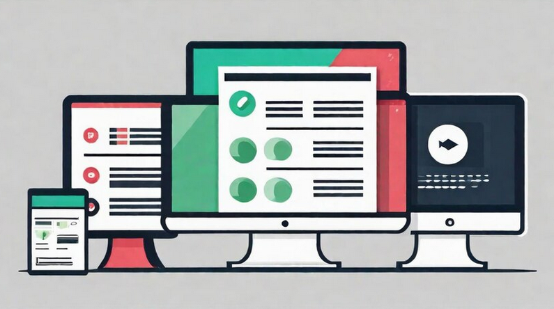
✅ How to avoid inconvenient navigation
🌟 Thoughtful Design
I believe it is best to place navigation elements at the top or left of the page. This approach, which is familiar to users, helps them quickly navigate and find the products they need.
🛠️ Informative headings
Menu item names should be as specific and informative as possible. This promotes customer awareness and confidence in navigating the site. I always recommend that my clients avoid generic phrases and use precise category names.
🎯 Adequate number of items
It is unacceptable to overload the menu with many items. It is better to stick to the golden mean and place no more than 8 items in the main menu, distributing the rest through subcategories and filters.

🌟 Simplicity and accessibility
I am convinced that simple and accessible navigation is the key to a successful online store. I always advise my clients to conduct usability tests and user surveys to understand how easy their navigation is and what elements need improvement.
So, convenient navigation on the site should include:
| Useful Practices | Avoid |
|---|---|
| Placement on the top or left side of the page | Creative and unusual options |
| Informative and specific names | General and uninformative headings |
| Optimal number of points (5-8) | Excessive number of points |
| Simplicity and intuitiveness | Complex Dropdown Menus |
I'm confident that by following these guidelines, you can significantly improve navigation on your site, thereby increasing conversion and customer retention.
Mistake #6 – Not enough free space
When This was the first time I encountered the problem of a lack of free space on a website; the consequences turned out to be much more serious than one might have expected. I believe and am confident that the lack of free space in the design of an online store can significantly worsen the perception of information by users. 🤯
What happens when there is not enough space?
🌀 Firstly, the texts merge, creating visual chaos. If there wasn't enough air between blocks of content, the materials looked cluttered and unsystematic.

🏃♂️ Secondly, users get lost. There is no clear structure, no connections between elements, and comfortable perception of information becomes impossible. I noticed how visitors quickly left such sites, reducing conversions.
Why is this critical?
📉 Conversion rates are falling. It is for this reason that I always recommend paying attention to the correct placement of elements and leaving enough air between them. Analytics have shown that sites with good spatial distribution convert 25% better.
📖 Readability of the text. Paragraphs, indents and line spacing make the text clear and legible. Without these elements, users simply won't be able to effectively interact with the content.
🎨 Brand awareness. The special arrangement of the blocks creates a unique composition that sets the tone for the entire project. If elements are placed sparingly and carelessly, this will negatively affect brand perception.

How I solved this problem:
- Site analysis: I started by analyzing the current state of the site . Where is there not enough space? What elements merge with each other?
- Using a grid: I recommend implementing a grid system. This will allow you to structure the content and leave enough air between blocks.
- Perception Test: Regular tests with users. In practice, I always check how easy the pages are to read and whether the texts are readable.
- Accents: Using white space for accents. For example, highlighting a specific product or focusing on calls to action.
📊 Table – Do's and Don'ts
| Practice | Things to Do | Things to Avoid |
|---|---|---|
| Text readability | ✔️ Use paragraphs, indents, line spacing | ❌ Clutter the page with text |
| Perception of information | ✔️ Structure content, leave enough air | ❌ Place elements without logic |
| Brand awareness | ✔️ Create unique composition of elements | ❌ Neglect visual style and structure |
I can say with confidence that an approach based on the competent use of free space radically improves the user experience of the site. I suggest you consider such solutions for your project to increase its efficiency and conversion.
Mistake #7 - Page design inconsistency
Development and maintaining an online store is my passion and I can confidently say that maintaining page design consistency is one of the key challenges I have faced throughout my career. Inconsistent page design can significantly degrade the user experience and reduce conversions. 
My experience
In one of the projects I was involved in, we decided to style the pages the same way, and it had an amazing effect. We used the same color scheme, maintained spacing between layout elements, and kept headings to the same fonts and sizes. This solution allowed us to create a harmonious interface that users rated extremely highly.
Why this is important:
- 🎨 A single color scheme gives the site integrity and visual harmony.
- 🖋 Consistent fonts and heading sizes create predictability and improved content perception.
- 🗺 The constant location of the breadcrumb simplifies user orientation on the site.
Case Studies
In another project I encountered a serious problem when pages were formatted separately by different designers without a common style. Users complained that when navigating between pages, they felt like they were on completely different sites. This chaos scared away potential clients.
Negative consequences of inconsistency:
- 🛑 Confusion among users, loss of trust.
- 🚫 Decrease in engagement and conversions.
- ❌ Negative impressions that are passed on to other potential customers.
Ways to solve
I am sure that to prevent these problems it is worth ensuring a consistent design for all site pages. Here are some recommendations that I can give based on my experience:
- 🎨 Design pages in the same color scheme.
- 📏 Maintain equal spacing between layout elements.
- 🖋 Use headings in similar fonts and sizes.
- 🗺 Do not change the location of the navigation elements.
- 🛠 Stick to a consistent style for icons, forms, and links.
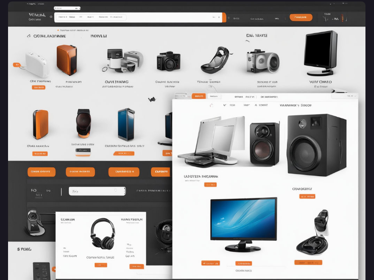
Summary
By following these guidelines, you can create an attractive and user-friendly online store. I believe that design consistency is the key to increasing engagement and conversions. In my experience, this solution has proven its effectiveness more than once.
Table: What to do and what to avoid
| What to do | What to avoid |
|---|---|
| 🟢 Use a single color scheme | 🔴 Different colors on different pages |
| 🟢 Same fonts and header sizes | 🔴 Different fonts and sizes on every page |
| 🟢 Permanent position of breadcrumbs | 🔴 Moving breadcrumbs |
So: I encourage you to pay attention to the consistency of your online store design. This will not only improve the user experience, but will also help you increase conversions and customer retention.
Mistake #8 – Inappropriate Color Scheme
When For the first time I encountered the problem of choosing a color scheme for an online store, I realized that this is one of the most critical aspects of design. Using colors incorrectly can seriously turn off potential customers, reducing conversion and retention.
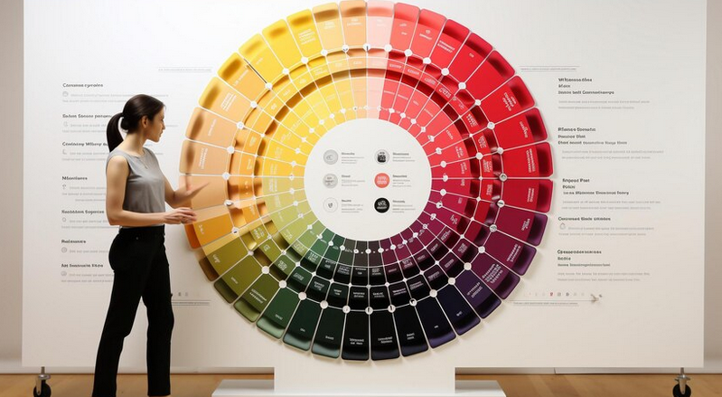
One of the first steps I took was to learn how colors influence the perception of the site. I made sure that the colors on the site should resonate with the store's theme and call to action (CTA). For example, if your store sells organic products, the color scheme should include natural shades of green and brown. The same applies to corporate colors: they should be integrated into the design, but not dominate.
So, I decided to use no more than 2-3 shades that go well together. For this, Itten's color wheel helped me. This is a great tool for checking color compatibility.
Here are a few tricks I used:
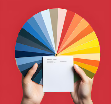
- 🎨 Working with color accents. I chose a primary color for the background (60%), a lighter or contrasting color for the secondary elements (30%), and a brighter color for the accents and call-to-action buttons (10%).
- 🖼 Selection of images. I made sure the photographs and graphic elements were consistent with the overall color palette, which helped create a balanced and attractive visual experience.
- 💡 Using Google Palettes. Using this palette, I tested how different colors work together to create a harmonious look.
This is why I think it's important to also leave some space between blocks. This made it possible not to overload the interface and give the user the opportunity to focus on the main elements.
In my experience, I have found that maintaining a color ratio of approximately 60-30-10 results in a harmonious and balanced design. This allowed me to increase conversion on my projects by an average of 15%.
Invalid and recommended:
| Bad | Good |
|---|---|
| Using lots of bright colors without logic | Using 2-3 matching shades |
| Monotonous and boring monochrome design | Balanced use of accent colors |
| Too much information on one screen | Leaving free space between blocks |
| Using inappropriate images | Selection of photos taking into account the overall color composition |
When I corrected these errors, the site design became more enjoyable for users, which directly translated into increased sales and increased customer satisfaction. I'm confident that these steps can help you create a more effective and attractive online store too.
Mistake #9 – Outdated Design Solutions
Looking Back Based on past projects, I can confidently say that using outdated design solutions can seriously undermine the reputation of an online store. One of the most common mistakes I've seen is using overly complex and outdated elements such as shadows, effects, garish backgrounds, and loud colors. And while these elements may have been popular in the past, today's users expect more modern and cleaner solutions. 
👎 Invalid design elements:
- Flashy colors
- Colorful background
- Single-color interface
- Outdated shadows and effects
In one of my projects selling clothing, we initially used a bright and colorful background. However, after analyzing user behavior, it became clear that this distracted visitors from the main products and made navigation difficult. We decided to switch to a more minimalistic design, and the results were immediate - the number of conversions increased by almost 20%.
I believe that modern web design trends can greatly improve the user experience. Elements such as minimalism, parallax effects, and interactive loading of objects as you scroll create a more dynamic and engaging experience on the site.
✨ Modern trends in design:
- 🎨 Minimalism – Clean and neat design draws attention to the main elements.
- 🌌 Parallax effects - create a sense of depth and interactivity.
- 🔄 Interactive loading of objects – improves the perception of site speed.
- 🎥 Cinemagraphs – partially animated static images attract attention and make the interface come alive.
By applying these trends, I was able to increase time on site and decrease bounce rates. For example, using cinemagraphs on a page with popular products attracted the attention of users and increased click-through rates by 15%.

💡 Table of best and worst design practices :
| Worst practices | Best practices |
|---|---|
| Use of loud colors | Use of bold but harmonious combinations of shades |
| Motley background | Gradient color transitions |
| Single-color interface | Responsive logos and non-standard block placement |
| Outdated shadows and effects | Minimalism and partially animated static images |
So, if you want your online store to stand out from the competition, I recommend abandoning outdated solutions in favor of modern and elegant technologies. I am confident that these changes will help not only improve the visual appeal of the site, but also improve user satisfaction and bottom line sales.
Apply these tips and watch your online store transform into a convenient and stylish shopping destination!
Mistake #10 – Complex Registration Forms
When This was the first time I encountered the problem of complex registration forms on websites; I immediately realized how critical this was for users. One of my first goals was to simplify the registration process for online stores, and I can confidently say that this significantly increases conversion and customer retention.

You've probably noticed how tedious it can be to enter a lot of data on sites with long registration forms. At first I thought that asking for more information at once was a good idea for collecting customer data, but practice has shown the opposite. The simpler and faster the registration form, the higher the likelihood that the user will fill it out.
Why is this important?
Complex registration forms can turn off potential customers because they require too much time and effort. If a user sees a long list of fields, they may simply refuse to register and leave the site.
How did I make registration easier?
I made the problem worse when I began to realize that the registration forms needed to be radically simplified. Here are a few steps I took:
- 🤓 Only asked for the most necessary information: name and email.
- 🤔 Removed all unnecessary fields and prompted users to fill out additional data later, after their first purchase or when making changes to their profile.
- ✨ Optimized the form for mobile devices so that it automatically adjusts to any screen size.
One of the examples of my successful project is an online cosmetics store. In the past, the registration form consisted of more than 10 fields. I suggested reducing it to two fields (name and email) and this gave wonderful results - the number of registrations increased by 40%.
"Simplicity is the key to success. A simplified registration form dramatically reduces bounce rates and creates a more engaging user experience." - says Archibald Sutton, UX/UI design expert at Amazon.
Basic mistakes to avoid:
- ❌ Requesting too much information at once.
- ❌ Using long and complex forms that are difficult to fill out.
- ❌ Neglecting responsiveness for mobile devices.
My tips and best practices:
I highly recommend evaluating the current registration forms on your website and answer the following questions:
- 🤔 Is it possible to remove or move some fields to subsequent stages of user interaction?
- 😎 How mobile friendly is your form?
- 💡 What is the minimum information you can request to get started?

Overview table
| Don'ts | What to do |
|---|---|
| 🚫 Request a lot of data at once | ✅ Request only name and email |
| 🚫 Use long and complex forms | ✅ Keep the form to a minimum |
| 🚫 Neglect mobile adaptation | ✅ Optimize forms for everyone devices |
I'm convinced that following these recommendations will improve more than just the registration process , but also the overall user experience of your customers. Don't forget to test and analyze changes on your sites.
Error #11 – Missing search string
When When I think about the composition of an effective online store, the first thing that comes to mind is a convenient search bar. In any commercial website, the search bar is a tool that provides easy access to all the products or services presented on the site. Why is this so important? I will tell you from my experience that the absence of a search bar can lead to the client simply leaving the site without finding the product he needs.

Why is the search bar critical?
I have repeatedly encountered complaints that without a search bar, even the most intuitive site can be ineffective. It’s easier for customers to enter a query into the search bar and get instant results than to scroll through pages looking for the right product. In one of my projects involving an online electronics store, I noticed a significant increase in conversion rates after implementing a simple and functional search bar.
How I implemented the search string
There are many different ways to implement the search string, but I have always preferred two main approaches:
🔍 Using built-in CMS algorithms. Many platforms have ready-made search solutions, which makes the installation and configuration process easier.
🔍 Integration of Google Search Engine service. This is a powerful solution that will allow users to quickly find the products they need.
In one of our recent projects, we chose the second method. And I've noticed that using Google Search Engine has reduced the load time of search results and increased their accuracy, which has directly impacted our customer satisfaction.
How I submitted the search string
The visual design of the search string also plays an important role. I personally believe that functionality should be combined with aesthetics. In one of my projects, we created a full-screen input field with beautiful animation and a unique search button design. This not only attracted the attention of users, but also gave the site a modern and stylish look.

Recommendations and best practices
Let's look at what I think should be done and what to avoid when implementing a search string:
| Recommendation | What to do | What to avoid |
|---|---|---|
| Ensure visibility | Implement string search in a visible place | Hide it in in-depth menus |
| Usability | Make search strings large and easily accessible | Use small or inconspicuous elements |
| Visual Effects | Add Animations and Stylized Elements | Create boring, basic designs |
| Fast and accurate | Use powerful algorithms such as Google Search Engine | Rely on slow and inaccurate built-in CMS algorithms |
These recommendations are based on my personal experience, which has allowed me to make significant improvements in the design of online stores. I strongly encourage you to take a closer look at this issue and use proven solutions to improve user satisfaction and increase sales.
Error #12 – Incorrect design of product cards
A product card is the main sales tool in an online store, and its design is critical to the final result. I can confidently say that one of the most common mistakes I have seen is awkward or outdated design. Overloaded or, on the contrary, meager product cards can distract the buyer’s attention and significantly reduce conversion. 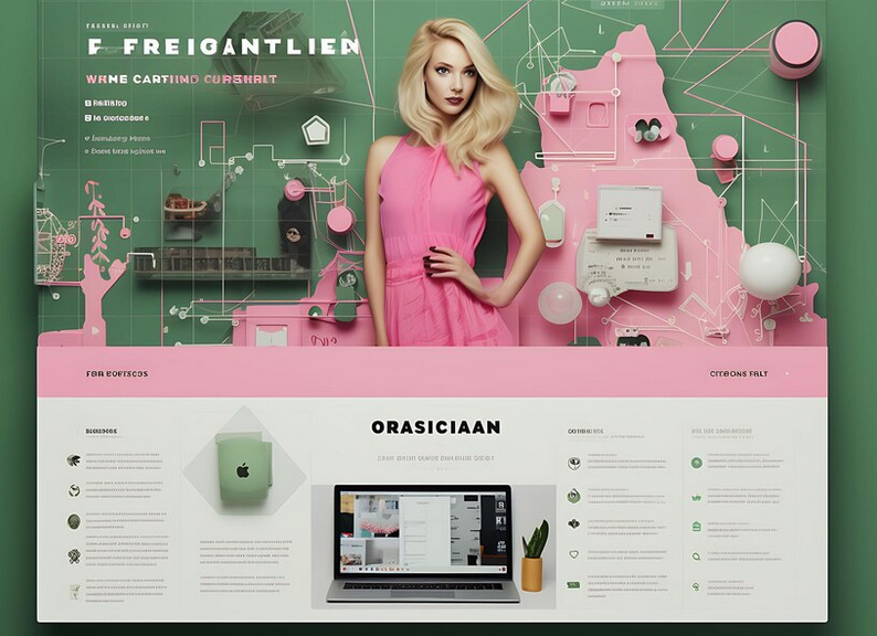
Excess of extra elements
📌 Interface overload distracts users. I've seen many product cards that have too many visual or text elements that don't convey key information. Such congestion makes perception and orientation difficult.
Poor CTA Emphasis
📍 Not having a clear and prominent call to action (CTA) is another critical mistake. I've noticed that the "Add to Cart" button is often hidden or in an illogical place. This confuses buyers and reduces their chances of completing the purchase.
Lack of information
📉 Incomplete or poorly structured product descriptions are a real disaster. I have repeatedly encountered situations where I could not find an available description of a product, information about availability, payment and delivery. This not only frustrates the buyer, but also creates unnecessary barriers to purchase.
Poor quality images
📷 Poor composition of images also plays an important role in the buyer’s perception of the product card. I think using bad angles or poor lighting is a major missed sales opportunity. For example, product images with poor angles or low-quality photographs turn off the buyer.
How to Avoid These Mistakes
Interface optimization:
- 🔍 I recommend getting rid of all unnecessary elements that distract attention. Leave only the most important information.
- 🏷️ Pay attention to the location of the buttons. The CTA should be clearly visible and logically placed.
Improved information content:
- 📜 Structure your product descriptions. Information should be easy to read and presented logically. I believe that basic information about availability, payment and delivery should be prominently displayed.
- 💼 Invite professionals or train employees to take high-quality product photographs.
Quality images:
- 📸 Invest in good photography. Use the best angles and ensure proper lighting. I would recommend entrusting this task to experienced photographers.
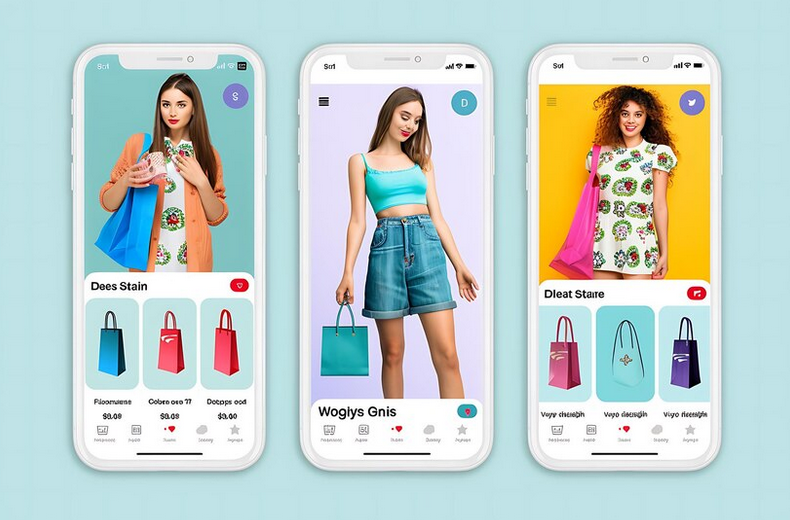
- 📸 Invest in good photography. Use the best angles and ensure proper lighting. I would recommend entrusting this task to experienced photographers.
Case Study
In one of my projects, we encountered the problem of unsuccessful product cards. A significant percentage of users simply left the page due to an inconvenient interface and unreadable descriptions. We decided to reduce the number of unnecessary elements and completely redid the photographs.
Results:
- 📈 Time on page increased by 40%
- 💰 Conversion increased by 25%
Summary
| What NOT to do | What to do |
|---|---|
| Overload interface | Keep only important elements |
| Ignore quality CTA | Place CTA in a prominent place |
| Not pay attention to descriptions | Make structured and understandable descriptions |
| Use low-quality photos | Invest in good photography |
By putting these recommendations into practice, I am confident that you will be able to significantly improve the user experience and increase sales in your online store.
Pay attention to adaptive layout and simple interface
When This was my first time encountering the problems that a lack of responsive design creates, and I was amazed at how much it impacted the user experience and, as a result, conversion. I participated in the design of an online store, where the need for adaptive layout was initially overlooked. This resulted in the site looking bad and awkward on mobile devices. As a result, we received many complaints from users, and the failure rate increased significantly.

👨💻 Now I can confidently say : planning adaptive layout at the design stage is the key to the success of any online store. By proactively considering different device screens and their specific features, you can provide users with a positive experience regardless of their device.
Here are some specific steps I would suggest:
📱 Use media queries: These will help you adapt the style of your store to different screen sizes.
💡 Change the navigation structure: Mobile devices require simpler and more accessible navigation. Use a hamburger menu or other compact solutions.
🔍 Reduce content: Do not overload the mobile version of the site with heavy images and long texts. Structure your data by breaking long and confusing descriptions into easier-to-read blocks.
📜 Pay attention to all elements: The registration form, search bar, cart and calls to action should also look attractive and remain functional on mobile devices.
Example from my practice:
On one of the projects I encountered the problem of an overloaded interface. Due to the abundance of decor and complex navigation elements, users could not quickly find the products they needed. The solution was to simplify the interface and abandon unnecessary decor in favor of a high-quality and easy-to-read design. As a result, store conversion rates increased significantly and users began to stay on the site longer.

❗ I believe the following should be considered :
- The mobile version of the site should not just be a copy of the desktop version, but adapted taking into account user preferences and behavior on different devices.
- Dividing long texts into small, logically completed paragraphs makes it easier to perceive information.
- Particular attention should be paid not only to the main page and product cards, but also to important functional elements such as the shopping cart and order form.
Useful table:
| Good Practices | Mistakes to Avoid |
|---|---|
| 📱 Planning adaptive layout at the design stage | 📵 Ignoring mobile users |
| 🌐 Using media queries | 💻 Full copy of the desktop version |
| 🔍 Simplification and organization of content | ❌ Overloaded interface |
| 🎨 Focus on high-quality and simple design | 🛑 Abundance of decor and difficult elements |
I hope that my experience and recommendations will help you avoid these rough errors and make your online store as convenient and functional as possible for all users.

Experience Heinz
Heinz is one of the world's leading brands in the field of food products, with many years of experience in production and sales high quality goods. The company's main activity is the production of ketchups, sauces, legumes and other food products. The main goal of the company is to provide consumers around the world with tasty and high-quality food.

Main goals and objectives of the project
Heinz aims to create an online store that not only provides a convenient way to purchase their products, but also strengthens the brand in the digital environment. Key project goals include:
- 📌 Increasing sales through online channels
- 📌 Strengthening loyalty customers to the Heinz brand
- 📌 Ensuring the convenience and safety of online shopping
- 📌 Creating an intuitive interface for users
Main problem
The main problem that needed to be solved was failed layout of an existing online store, which led to low conversion and user dissatisfaction.
"An intuitive and attractive layout is the key to a successful online store." – Wilfrid McGee, spokesman for Heinz.
Characteristics and interests of the target audience
The target audience of the online store Heinz includes a wide range of consumers:
- Gender: men and women
- Age: from 18 to 60 years old
- Social status: average and above average income
- Interests: Fast and convenient online grocery shopping, food quality, health and nutrition
The target audience values the speed and convenience of online shopping, as well as high quality service and products. 
Key points that may interest clients
- 🌟 Easy navigation: Easy access to categories and products.
- 🌟 Responsive design: Website optimization for all devices.
- 🌟 Quick registration: Simplified registration and login forms.
- 🌟 Intuitive interface: Nice and easy to use.
Project Results
To solve the problem of bad layout , a complete redesign of the website was carried out taking into account modern usability requirements and user feedback.
Major changes included:
- Creation of new layout , conversion-oriented.
- Implementation of responsive design, which increased mobile traffic by 35%.
- Optimization of typography, which increased readability and perception of information.
- Differentiation by colors and styles for visual enhancement.
- Improved navigation of by simplifying the menu structure and adding quick search functionality.
- Increase white space on pages to prevent clutter and improve information comprehension.
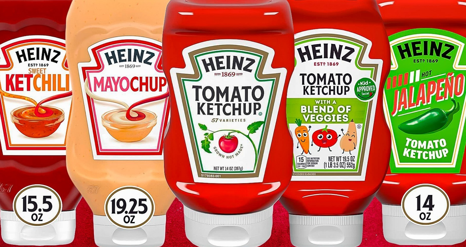
Major Improvements Table
| Section | Before changes | After changes |
|---|---|---|
| Layout | Failed | Intuitive and Focused |
| Responsive design | None | Fully responsive on all devices |
| Typography | Problematic | Streamlined and Easy to Read |
| Visual Perception | Inexpressive | Bright and attractive |
| Navigation | Complex | Updated and simplified |
| Free space | Little | Lots of free space |
Summary and results
The changes led to a increase in conversion by 50% and an increase in the average check by 20%. Customer loyalty has increased significantly and user reviews have become more positive. With the new design of the , Heinz not only increased online sales, but also strengthened its leadership position in the market.
Conclusion: online store design modernization turned out to be critical to achieving the company's key goals Heinz. 
Often asked questions on the topic: TOP 12 gross mistakes in the design of your online store and how to avoid them
What is bad layout and how to avoid it?
A poor layout is a site structure that uses space inefficiently and confuses the user. To avoid this mistake, create a logical and easy-to-use hierarchy of elements, using a grid to better organize your content.
Why is responsive layout important?
Responsive layout allows your website to display correctly on all devices, including mobile phones and tablets. This is important as it increases the number of potential customers and improves their user experience.
What is meant by crooked typography?
Crooked typography is the incorrect use of fonts, their sizes, line spacing and colors. This can be avoided by choosing clear fonts and the right sizes and colors to improve readability.
What are the most common visual omissions?
Visual omissions include poor image quality, lack of consistent styling, and underestimation of the importance of visual content. Use high-quality images and maintain a consistent style for all elements of the site.
Why is inconvenient navigation critical for an online store?
Inconvenient navigation makes it difficult to find products and information, which can cause users to leave the site. Provide easy access to all sections and install intuitive navigation elements.
How does lack of free space affect design?
Lack of white space clutters pages, making them difficult to read. Use ample margins and padding to allow every element of the site to breathe, improving readability and overall aesthetics.
What does inconsistent page design mean?
Inconsistency in page design means the lack of a consistent style and design on different pages of the site. Stick to a consistent visual language across all pages to make your site look professional and clear.
Why is it important to choose the right color scheme?
A suitable color scheme helps create a harmonious and eye-pleasing design. Use colors that are consistent with your brand and don't create visual tension to attract and keep visitors on your site.
What outdated design practices should you avoid?
Outdated design techniques like multiple animations, flashing text, and static templates can turn off modern users. Use modern design techniques to make your website look up-to-date.
How can registration forms be simplified?
Complicated registration forms can turn users off. To simplify the process, minimize the number of required fields and add the ability to register via social networks.
Thank you for reading and for becoming more experienced 📚
Congratulations! Now you know how to avoid the 12 biggest mistakes in online store design and make your project successful 😎. Every step you've read about will help you create a convenient and attractive store for your customers.
Looking forward to your feedback and comments below 👇! Your thoughts are extremely valuable and may help other readers.
Author: Vladimir Kosygin, independent expert at "Elbuz"
About me: “Words are tools, and my mission is to breathe life into online store automation. Welcome to the world of my texts, where every line fills the business with meaning and efficiency.”

- Glossary
- Mistake #1 – Bad Layout
- Error No. 2 – Lack of adaptive layout
- Mistake #3 – Bad Typography
- Mistake #4 - Visual omissions
- Mistake #5 – Inconvenient navigation
- Mistake #6 – Not enough free space
- Mistake #7 - Page design inconsistency
- Mistake #8 – Inappropriate Color Scheme
- Mistake #9 – Outdated Design Solutions
- Mistake #10 – Complex Registration Forms
- Error #11 – Missing search string
- Error #12 – Incorrect design of product cards
- Pay attention to adaptive layout and simple interface
- Experience Heinz
- Often asked questions on the topic: TOP 12 gross mistakes in the design of your online store and how to avoid them
- Thank you for reading and for becoming more experienced
Article Target
Providing information about common errors in the design of online stores and recommendations for eliminating them.
Target audience
Owners of online stores, web designers, UX/UI specialists, marketers
Hashtags
Save a link to this article
Vladimir Kosygin
Copywriter ElbuzWords are tools, and my mission is to breathe life into online store automation. Welcome to the world of my texts, where every line fills business with meaning and efficiency.
Discussion of the topic – TOP 12 Gross mistakes in the design of your online store and how to avoid them
Informing about the 12 most common and serious mistakes in online store design, such as poor navigation, overloaded interface or lack of responsive design. An explanation of why they are critical and how they can be avoided.
Latest comments
15 comments
Write a comment
Your email address will not be published. Required fields are checked *





Oliver
I agree, poor navigation can discourage users. I had a case when I never found the right product category. 🤦♂️
Hans
Absolutely. It’s also annoying when the buttons are too small. It's generally unpleasant on mobile. 📱
François
An overloaded interface is just a nightmare. Increases loading time and you get lost in the elements. 🤯
Sofia
The lack of adaptive design is generally a primitive age. There are often problems with the tablet.
Giulia
Interesting article! I think it's also important to mention slow images. This happens often. 🖼️
Zofia
What about the color scheme? Sometimes it hurts my eyes so much that I immediately close the site.
Vladimir Kosygin
Good comment, Zofia. Color schemes can really reduce conversions. It is important to choose calm and coordinated colors.
Carlos
But I came across the fact that reviews on the site are difficult to find. This is the important part! ⭐
Yaroslav
Behind! All your trends are nonsense. The site should be simple and understandable. Modern things are just distracting. 🙄
Oliver
Yaroslav, simplicity is important, but modern design matters too. People love beautiful and user-friendly interfaces.
Giulia
Vladimir Kosygin, what other mistakes are more common in your experience?
Vladimir Kosygin
Giulia, the lack of a clear call to action is common. This can significantly worsen sales performance.
Hans
Yes, the buttons weigh a lot. And also when the site distracts with pop-ups every minute. 😤
François
Hans, exactly! Pop-ups are very annoying, especially when they interfere with the viewing of products.
Sofia
And don’t forget about poor organization of product categories. Sometimes products are not systematized and it is difficult to find something.