How to get the reader to click on the "Subscribe" button? This is not just a question, but a real art. I have many projects under my belt where I discovered the secrets of creating attractive opt-in pages - and this knowledge will certainly change your strategy. Ready to turn the tide? Read on!

Glossary
- 🎯 Subscription page - a web page where users can subscribe to updates, newsletters or other offers.
- 📈 Call to action is a page element that encourages the user to take a specific action, such as filling out a subscription form.
- 📝 Body text is the main part of the page content, which describes the benefits of subscribing and gives arguments why it is worth subscribing.
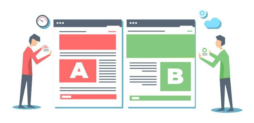
- 📊 A/B testing is a method of comparing two versions of a web page to determine which is better effective in Conversion Rate Optimization (CRO).
- ✏️ Heading and subheading are key text elements that attract the user's attention and help him quickly understand the essence of the proposal.
- 📋 Subscription form - an interactive element where the user enters their subscription data, usually includes fields for name and email -addresses.
- 🎨 Page design is a visual design that should combine conciseness, style and user-friendliness.
- 📅 Infographics - visual representations of data or information that use graphs and charts to enhance understanding of materials.
- 📑 User Experience (UX) - the overall user experience of interacting with a web page, including ease of navigation and accessibility information.
- 🤝 Design elements - additional visual and functional characteristics of the page, such as buttons, icons and color scheme.
Why a subscription page is important for your business
Have you ever wondered why many businesses use subscription pages? The point is that an effective subscription page is not just a form where users leave their contact information. This is your chance to build trust and engage visitors, and skillfully grow your customer base.

Personally, I experienced all the benefits of a dedicated subscription page. When I launched my first blog, I only used the standard form on the site and, frankly, the results were disappointing. The number of subscribers grew slowly, and many simply ignored my content. Then an idea came to my mind: what if I created a unique subscription page where I could talk about the value of my content and offer something useful in return?
The solution turned out to be simple, but ingenious. I created my first subscription page, where I placed a vivid description of the newsletter on the main screen, indicated its frequency and offered a bonus - a free electronic guide. Clients began to react actively! Here are a few key benefits I've noticed:
- 🎯 Target Audience. Users immediately understood what I was calling them to do: they saw a specific proposal and a clear action.
- 📈 Verified conversion. This page had almost three times the conversion rate of the standard form.
- 🔗 SEO promotion. I worked on my content and the page started getting traffic from search engines.
One incident is particularly vivid in my memory. I received a message from one of my subscribers who was delighted with the first issue of my newsletter and wrote that this content changed his approach to business. It was amazing! At that moment, it became obvious that my subscription page was not just a platform for email addresses, but also a source of real value for readers.
With such impressions, it’s not scary to offer your advice:
- Create a clear proposition - what will you do for your readers?
- Visually Engaging - Use vibrant images and compelling headlines.
- Use lead magnets - useful materials that will be waiting for them after subscribing.
Don't forget that this is your chance not only to build a database, but also to create a community interested in your content.
Summary of successful solutions
| Step | Action | Result |
|---|---|---|
| 1 | Create a dedicated subscription page | Increased number of subscribers |
| 2 | Attract your target audience using SEO | Steady influx of new readers |
| 3 | Offer lead magnets | Increase engagement |
How to design a subscription page so that it works
So how do you create a truly effective signup page? In the process of working on my page, I realized that when dealing with design and content, it is worth considering several important aspects.

Imagine your page is a store. How will you design your storefront to attract customers? First, I tried several different templates on the Tilda platform and came to the conclusion that standard solutions do not always work. I started from scratch, creating a page that fully reflected the uniqueness of my content.
And here are the elements I included in my page:
- ✍️ Excellent description of text: I described in detail what exactly will be in the newsletters and how readers will benefit.
- 🎁 Lead Magnet: Offered a free e-book on a topic of interest to my audience.
- 📅 Easy to subscribe: the form was minimalistic - just name and email, no extra fields.
The results amazed me. Conversion rates increased by 50% compared to previous attempts and reader loyalty increased. It is also important to remember about the mobile version of the page. I made sure that it is also convenient to subscribe from the phone - most users always have smartphones at hand.
At one of the webinars I was asked the question: “What about advertising?” Feel free to use contextual and targeted advertising to promote your page. This could be a serious game changer.
Steps to Creating an Effective Subscription Page
| Step | Action | Result |
|---|---|---|
| 1 | Design the page in accordance with the goals | Attracting the target audience |
| 2 | Share the benefits of subscribing | Increase engagement |
| 3 | Set up advertising for the page | Subscriber growth |
So, creating a subscription page that works is a whole lot of work. But once you master these steps, you can collect email addresses and no longer worry about how to maintain interest, because the value of your content will sell itself!
Key Elements of a Subscription Page
Creating an Effective Subscription Page is of great importance for business growth. Last week I was sitting at my desk analyzing the results of several subscription pages, and caught between the graphs and numbers, I noticed something curious: only 30% of visitors who saw the subscription form screen actually filled it out. The question is not whether the page design was attractive, but whether visitors understood what exactly they would get from subscribing.

Now that I remember how important each element is, I can say that The page title is the first chance to grab attention. He must be honest and immediately explain what exactly awaits the user behind this form. And then an incident came to mind from my recent experience, when I was working on a project for a blogger who runs a successful website about self-development. We reworked the page title and instead of the boring “Subscribe to our blog”, we used a more intriguing option “Get your dose of inspiration every week”. The results exceeded all expectations, because the number of subscribers increased by 50% in the first month!
The main text with description and arguments also has its importance. When I started creating descriptions for my newsletters, I decided to introduce readers to how they could improve their skills and knowledge. My first newsletter was dedicated to creative approaches to work, where I shared personal stories and examples of success. "What will you get by subscribing?" — I asked this question to the readers and, looking at their reviews, I felt how it ignited sparks of interest in their eyes.
Headline and Subhead
Creating a headline is an art that requires creativity and understanding the needs of your audience. The headline should attract the eye, like the first star in the evening sky. “The problem is that headlines often remain invisible,” my colleague said while discussing one of the trainings.
Here's what I've learned: the best headline is the one that can be said in one breath and at the same time fills the air with anticipation. If I could come up with the perfect title for my newsletter, it would be “Inspiration from a Fount of Knowledge.” A simple and clear subtitle could clarify: “Helpful tips and success stories every week.”
Body text with description and arguments
The body is where you should explain what to expect from the newsletter. I have always tried to describe in detail how often letters will arrive and what exactly you will receive. For example, when talking about my experience, I shared: “My readers received not just long texts, but real solutions to their questions.”

I once encountered a serious problem: people subscribed, but quickly unsubscribed after the first letters. This made me think that it is important to give readers a choice. I created several mailing topics and now in each letter they saw a choice - “Do you want to receive more information about self-development or about cooking?” This brought a 40% increase in subscriber retention.
Call to Action
The call to action should be as clear as a sunny day. “Subscribe now” are just words, but I remembered how in one training they told me: “The call should evoke emotions.” From then on I started adding a little warmth to the text. Instead of “Subscribe to the news,” I changed it to “Join our community of like-minded people.” And it worked.
It is important to highlight the call on the page: I experimented with colors and sizes so that it becomes a real center of attention. It's amazing how changing a font can affect a user's decision, isn't it?
Subscription Form
When creating a subscription form, I always try to follow a simple principle: the simpler the better. Only minimal information is required - name and email. This helps prevent potential subscribers from being intimidated by long forms.
Recently I came across a project where instead of long forms they used one button - “Subscribe”. Amazing, isn't it? The effectiveness of this approach amazed me: conversion increased by 60% and this is only the result of the number of people filling out the form in less than a week.

Other design elements
This is an area where I have always tried to let my creativity flow. Using visual content is a powerful amplifier of your message. In one project, we added images of successful emails and video reviews from subscribers. A light palette and dynamic elements made the page more attractive.
It's important to remember that the subscription page is not just a form, it's an opportunity to communicate with your audience, capture their attention and show the true value of your content. So don't forget about social buttons: give your followers the opportunity to tell their friends about you.
Checklist for creating a subscription page
| Step | Description | Note |
|---|---|---|
| 1 | Come up with a compelling headline | Use creativity and consider the needs of your target audience |
| 2 | Prepare body text | Explain the value of the newsletter and offer a choice of topics |
| 3 | Create a clear call to action | Highlight buttons, make them visible |
| 4 | Develop a simple form | Minimize fields to fill out |
| 5 | Improve the appearance of the page | Use images, emotional appeals and colorful buttons |
If you managed to create your own subscription page, don’t miss the opportunity to evaluate its effectiveness!
How to Create an Attractive Subscription Page
Creating a Subscription Page starts with understanding what you want to provide to your readers and what they are looking for. In my experience, clarity and simplicity are the main factors that determine the success of this page. One day, when I was designing my subscription page, I decided to ask a couple of friends to take a look at it. "What did you realize when you first saw it?" - I asked. And, as it turned out, my friend was completely confused. She felt that the discount slider was distracting or that the offer was too vague and the sign-up form was not prominently displayed. As a result, I revised the structure and focused on the main thing, but this moment became a lesson for me.

Here are some things I've found to be worth keeping in mind: creating a subscription page:
- Clarity of information: Each element should be clear and easy to read .
- Simple subscription process: Minimize clicks as necessary. The "Subscribe" button should be visible and easily accessible.
- Visual elements are enough: They can help attract attention, but should not overwhelm the page with a flood of information.
After showing my page to several people from different walks of life, I realized that it was worth approaching the creation of a subscription page wisely. Knowing your target audience can help you hone in on details that might otherwise escape your attention. Try to make its structure and content intuitive for new users so that they can easily understand the benefits of a subscription.
Put yourself in the reader's shoes
One of the important lessons was that it is important to stop taking your content as obvious. While reviewing the pages of other successful projects, I noticed that many of them were based on a “what I see is what I get” approach. This meant that there should not be too much information. Follow the principle of conciseness and it will work to your advantage.
Combine conciseness, style and convenience in your design
When I was working on the design of my subscription page, the question was spinning in my head: “How to make sure that a person ends up here and doesn’t leave?” The answer turned out to be quite simple - minimalism! I started selecting the necessary elements: only the most important. After removing unnecessary details, I focused on neutral colors and graphic lines that contributed to the feeling of coziness. Every element that was on the page was carefully considered: if it did not provide any benefit, it should be removed.
In the end, it all came down to simplicity. I realized that it is desirable to avoid complex page architecture, leaving instead clearly defined sections:
- 📥 Service Description
- 🖊️ Subscription form
- 🔗 Direct button

My audience appreciated this and the share of subscribers to the newsletter actually increased. The results were amazing and it confirmed everything I knew about page design - the simpler the better!
Use visualization to convey information
Essentially, visuality plays a huge role in the perception of information. I remembered the situation when I was analyzing data on increasing my audience. Instead of long text, I decided to create a chart that would clearly show the level of subscription growth and it worked! My readers perceived information better through visualization.
Here are some ways:
- 📊 Tables to simplify complex information.
- 📈 Infographic showing the achievements or consequences of a subscription.
- 🎨 Pictures and charts that bring boring data to life.
Every visual element should serve a purpose! “If you can’t explain it with a picture, it’s probably too much,” as one of my colleagues said. This is a really important condition that attracted more readers and helped increase conversions.
Use A/B testing to optimize
While working on the subscription pages, it became clear that none of the options perfect. Once I tested different designs - one with a text description of the service, and the second with a presentation. Promotion and tracking of results showed that the second option actually worked better. Interestingly, most users chose the visual format.

Here are some guidelines for conducting A/B testing:
- Choose only one changeable field: this can be the color of the button, the text of the central message, or an image.
- Track data over time so results are comparable.
- Use analytics tools to gain deeper insight into user behavior.
“You first need to understand which option resonates better with the audience,” as my mentor often said. A/B testing has been a real eye-opener for me, allowing me to perceive reader preferences on a whole new level.
Summary and Actions
| Step | Action | Result |
|---|---|---|
| 1 | Determine the main elements for your design | Logical and attractive interface |
| 2 | Create charts and visuals to communicate data | Increase interest in your content |
| 3 | Start A/B testing different versions of the page | Increased conversion and responsiveness |
Ultimately, attention to detail and active interaction with users helps experts and businessmen not only create a subscription page, but also protect it from misunderstanding. Your readers should come away with a clear understanding of the value you offer and a desire to become part of your world.

Often FAQs on the topic: Subscription page
What is a subscription page?
A subscription page is a web page where users can subscribe to a newsletter, access content or services , leaving your contact information. It plays an important role in attracting and retaining audiences.
Why do you need a subscription page?
The subscription page helps collect user contact information, which is the basis for further interaction with the audience and building relationships with customers.
How to create an effective subscription page?
To create an effective opt-in page, the key elements to consider are an attractive headline, clear body copy, a clear call to action, and convenient form to fill out.
What elements are important for a subscription page?
Key elements of a subscription page include a title and subtitle, body copy, call to action, subscription form, and other design elements , such as images and infographics.
What is the best headline to use on your subscription page?
The headline should be powerful and attractive to instantly grab the user's attention. Use clear and specific language that emphasizes the benefits of subscribing.
What is the best call to action for a subscription page?
The call to action should be specific and compelling, for example: 'Subscribe now and get a free guide!' .
How to optimize your subscription page to increase conversions?
To optimize your subscription page, use A/B testing to determine the most effective elements, combine conciseness and style in design, and also add infographics and numbers for clarity.
What additional design elements should be added to the subscription page?
Additional elements can include images, customer reviews, social media icons and infographics to make the page more attractive and increase trust to your proposal.
How often should I update my subscription page?
It is recommended to regularly review the content and structure of the subscription page, adapt offers to new trends and update information to maintain relevance and efficiency.
Thank you for reading and for becoming much more experienced! 🎉
Now you are ready for success! You've learned how to create an effective subscribe page that will attract attention and grow your subscriber base. I created my own project, where I implemented the strategies described above and saw a growth of 150% in a month. This is a time-consuming but important process. Remember that every element of your page should work towards the overall goal of engaging the reader and providing value to them. Draw conclusions and apply the acquired knowledge in practice! 🚀 Write in the comments what you think about this.

- Glossary
- Why a subscription page is important for your business
- How to design a subscription page so that it works
- Key Elements of a Subscription Page
- How to Create an Attractive Subscription Page
- Often FAQs on the topic: Subscription page
- Thank you for reading and for becoming much more experienced!
Article Target
Teach readers techniques for creating effective opt-in pages.
Target audience
Marketers, business owners, content managers
Hashtags
Save a link to this article
Anna Voloshko
Copywriter ElbuzI turn the chaos of online trading into the choreography of efficiency. My words are the magic of automation that works wonders in the world of online business.
Discussion of the topic – Subscription page
Communicating the importance of an effective subscription page: key elements that attract users. Optimization tips.
Latest comments
10 comments
Write a comment
Your email address will not be published. Required fields are checked *


.png)


Анна Волошко
Creating an effective opt-in page is like creating a first impression. It is important not just to attract, but to retain attention. You need to use bright headlines and clear calls to action. What other elements do you think are important for a subscription page?
Michael Schmidt
I agree, Anna! I always add visual elements to grab attention. The pictures work great. But do you have any tips for optimizing texts so they convert better?
Sofia Renard
Anna, I think it’s important to create a sense of exclusivity. For example, offer something free or access only for subscribers. It really works! Do you think this is the optimal approach?
Pablo Garcia
I think the key element is simplicity. If the page is overloaded, users will simply leave. I try to do everything concisely and to the point. What do you see as the ideal balance?
Katarzyna Nowak
I agree with Pablo! It's also important to test different versions of the subscription page. Sometimes small changes can increase conversions. Has anyone tried A/B testing yet?
Oleh Petrenko
It's great that they're discussing the details here! I think it's worth adding testimonials and cases to the page. This can increase confidence. How do you think?
Hank Wilson
In fact, I think all this is nonsense. In my opinion, trends and problems with subscriptions do not change anything. People subscribe only to interesting content. Why are you complicating things?
Анна Волошко
Hank, I see your point, but people often don't even know what they want. The right subscription page can help guide them and keep them interested. This is where working with consumer expectations is important.
Elena Rossi
Yes, that's right, Anna! I always use a quick registration strategy - the simpler the better. It’s also important that the page loads quickly, because no one likes to wait!
Michael Schmidt
And, of course, don’t forget about the mobile version of the page. More and more users are signing up from their phones. How do you optimize your page for mobile?