Creating an effective product card: key points
-
Galina Ostrachinyna
Copywriter Elbuz
Before you is a magic product card... It hides behind it an inexhaustible stream of opportunities and prospects in developing your business. How to create a product card that is attractive, captivating, necessary and useful? So that you want to know everything in detail about this product? In this article we will tell you about this in detail, our dear and respected reader!✨
Glossary
- Product card - a page on the online store website containing information about the product: its description, characteristics, price and other information designed to attract attention and establish trust among potential buyers.
- Title - title or product name placed at the top of the product card to attract the attention of potential customers.
- Gallery - a section of a product card containing a set of product images that can be clicked or scrolled to allow visitors to view the product in more detail.
- Price - information about the cost of the product indicated on the product card allows customers to immediately assess its availability and make a purchasing decision.
- "Buy" button is an interface element located on the product card that allows customers to add products to the cart or buy them directly from this page.
- Description and characteristics - a section of the product card containing a detailed description of the product, its characteristics and other useful information that helps customers make a purchasing decision.
- Modifications - product variations offered to customers, such as different sizes, colors or other parameters that may influence their choice.
- Terms of Purchase - information or terms associated with the purchase of a product, such as delivery, warranty, payment and return options, that help buyers make more informed decisions purchase decision.
- Reviews - a section of the product card containing reviews or ratings of the product that can help potential customers form their opinion about the product and make a purchasing decision.
- Favorites and Compare - interface functionality that allows online store visitors to save products to favorites or compare different products with each other.
- Breadcrumbs - a navigation element displayed on a product card, showing the sequence of user transitions on the site and allowing you to easily return to previous pages or categories.
- Product sets - the ability to purchase several products together in the form of a set or set, which can be more convenient and profitable for customers.
- Viewed and similar products - a section of the product card containing information about previously viewed products and similar products, it helps the user find other products that may be suitable for them interesting.
Product card: a key component of an online store!
In our article, we have already mentioned that the product card is one of the most important parts of an online store website. And today we will look at this element in more detail. What is a product card and why does it play a major decisive role in the purchasing process? Let's figure it out.
Role of the product card
A product card is a page with a description of the product, its characteristics, images, price, terms of purchase and customer reviews. She provides complete information about the product and answers all questions that potential customers may have. When a user becomes interested in a product, they can immediately go to the product page from search results or advertising. The product card is a decisive stage before a purchase, so each of its elements is important and must be thought out and attractive.
The product card performs several functions. Firstly, it informs the potential buyer about the product: its properties, characteristics, advantages. Secondly, it pushes the client to purchase. It should create a need, make the client want to purchase the product. Thirdly, the product card should simplify the ordering process, make it intuitive and fast.
How to create an attractive product card?
Creating an attractive and effective product card is an important task for every online store. This element can significantly increase conversion and increase sales. But what should you pay attention to when creating a product card? Let's look at 12 key aspects.
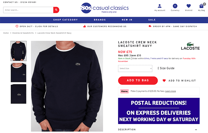
1. Product name
The product name is the first thing that attracts the user's attention. It should be large and noticeable. Don't forget to include the brand of the product if it has special meaning. You can also include in the name one of the key characteristics of the product, which distinguishes it from other variations. For example, the amount of memory on a smartphone. The length of the name does not play an important role, the main thing is that it is informative and attractive.
2. Image gallery
After the product name, the user usually pays attention to the product images. The gallery is usually placed on the left side of the page. It is important that the gallery contains several high-quality photographs that will allow the user to view the product from all sides. If you have a video review of a product, add it to the gallery. The video gives a more complete picture of the product. An extensive gallery will help the buyer to consider all the details of the product.
Example of a high-quality video product review:
3. Price
Price is one of the main factors influencing the purchase. Make the price visible by using a large font. If there is a discount, highlight the price in a bright color, and make the old price less noticeable and smaller in size. The price font size should be as large as the product name. The more attractive the price, the more likely it is to make a purchase.
4. "Buy" button
The "Buy" button is the main element that calls to action. It should contrast with the rest of the page elements and be more visual for the user. Place the button so that the customer can easily see or find it. If there are additional buttons on the page, such as “Buy with one click” or “Buy on credit,” place them next to the main button, but do not make them as contrasting. A skillfully designed “Buy” button will help make the purchasing process as convenient as possible for the client.
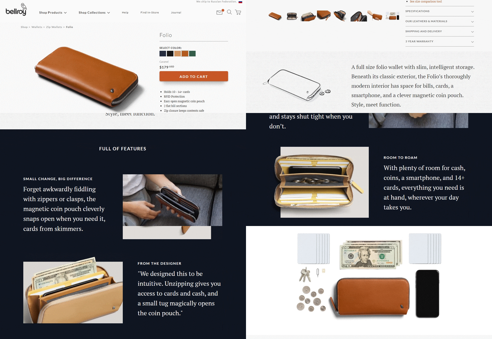
5. Description and characteristics
Product description and characteristics are important information that should be presented on the product card. Characteristics are a clear list of parameters and distinctive properties of a product. Description is a freer form of story about a product, its advantages and capabilities. The description may contain some characteristics, but the blocks must be separated from each other. Creating a competent description with keywords for SEO will help promote the product card in organic search. Place the description after the gallery, and the characteristics next to them on the right side of the page, near the “Buy” button. The choice of order for placing blocks depends on the specific product and characteristics of purchasing behavior.
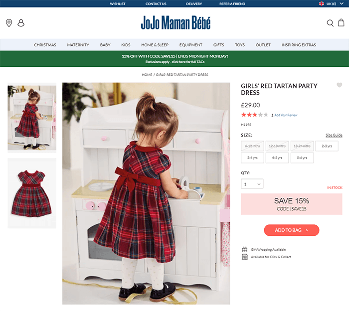
6. Product modifications
Many products have several variants or modifications. For example, a T-shirt can be presented in different colors or shampoo in different volumes. Placing modifications below the price will help users see how the cost and appearance of the product changes when switching between options. Modifications will help buyers make choices and choose the option that will ideally suit their needs.
7. Terms of purchase
Don't forget to inform your customers about the terms of purchase. Place a block with information about payment, delivery, warranty, returns. Indicate your benefits, for example, free shipping or favorable installment plans. Information should be clear and unambiguous so that the client does not encounter surprises during the ordering process.
8. Reviews
Reviews about the product and the store are an important element of the product card. Good reviews can influence a customer's purchasing decision. Reviews can be placed immediately after the "Buy" button or under the product gallery. If there is no way to highlight reviews in a prominent place, they will still be noticeable. The main thing is the presence of customer ratings and a link to the number of reviews. When clicking on the link, the user will be taken to a page with reviews. Reviews create trust in the store and product.
9. Additional functions
In addition to the main elements, you can add some additional ones on the product card functions. For example, the "Favorites" and "Compare" buttons. They are placed next to the price and made intuitive. The comparison feature isn't always up to date, but Favorites works for any store and allows customers to save items they're interested in.
10. Breadcrumbs
Breadcrumbs are a navigation tool that displays the user's path to a product page. They allow you to quickly go to the desired section of the site. Placing breadcrumbs on the product page makes the site convenient and helps retain the customer. For example, by clicking on a specific item in breadcrumbs, the user can return to the product category. Breadcrumbs make it easier for clients to navigate the site.
11. Product bundles
If you have products that can be purchased as bundles with favorable conditions, be sure to tell your customers about it. You can create a separate block in the product card, which will indicate that when purchasing several products together, they cost less. You can also inform about the gifts that the client will receive when ordering. Such offers will become an additional incentive to purchase and will increase the average check.
12. Viewed and similar products
A user, browsing the assortment of an online store, may accidentally miss products that interested him. A block with viewed products will help avoid this situation. It will display cards of products that the user has previously viewed. At the same time, you can place a block with “Similar Products” next to it to show him other options and keep him on the site. In this way, you introduce the client to the horizon and offer additional choice.
🔥 Review: Best Practices for Creating an Attractive Product Card
| What to do ✅ | What to avoid ⛔ |
|---|---|
| - Create an informative and attractive product title | - Use vague or confusing titles |
| - Post a gallery of high-resolution images | - Use low-quality or uninformative images |
| - Highlight the price with special formatting if available discounts | - Hiding or unclear display of prices |
| - Make the "Buy" button clear and contrasting | - Placing the button in an inconvenient place or small size |
| - Provide complete information about the product in the description and characteristics | - Mixing descriptions and characteristics, their lack of information |
| - Add product modifications to expand customer choice | - Lack of variety in product options |
| - Place information about the terms of purchase under the "Buy" button | - Lack of information about warranty, returns and other conditions |
| - Include a block with product reviews | - Hide reviews or inability to leave a review |
| - Add additional features such as "Favorites" and "Compare" | - Usage not enough intuitive and unclear icons |
| - Enable breadcrumbs for easy site navigation | - Lack of navigation elements or their incomprehensible display |
| - Offer sets of goods with favorable conditions and discounts | - Lack of information about the possibility of purchasing goods as a set |
| - Place blocks with viewed and similar products for additional selection of products by the buyer | - Inability to view viewed or similar products products |
Conclusions: an attractive and effective product card is the key to success!
Creating an attractive and effective product card is a key task for every online store owner! Correct and detailed information about the product, attractive design and easy site navigation will help users make the right purchasing decision. Don’t forget that the product card should be informative, inspire confidence and push the potential buyer to action.
We hope that our tips will help you create an attractive and effective product card that will help increase conversions and increase sales. Be attentive to detail and keep in mind the needs of your target audience. Good luck and success in business!
Estée Lauder experience
The Estée Lauder Company Expertise
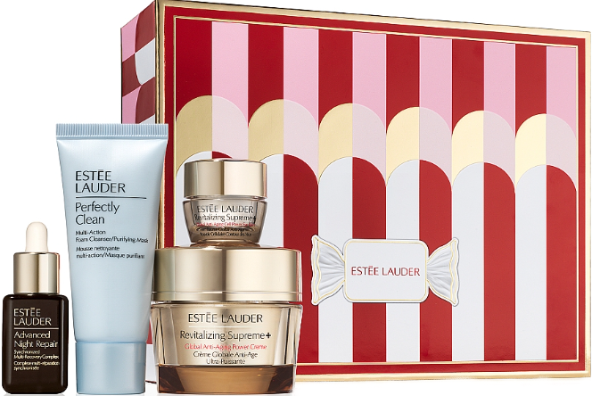
The Estée Lauder Company has been a leading player in the beauty industry for over a century, offering a wide range of cosmetic products, including skin care products, perfumes and decorative cosmetics. The Estée Lauder brand is known for its high quality products and innovative approaches to the production of cosmetics and skin care.
Detailed description of the client, his business and goals
Estée Lauder is an international corporation which is proud of its rich heritage and brand history. The company strives to create products that can meet the highest demands of customers in the field of beauty and skin care. Estée Lauder's goal is to provide customers with innovative and effective solutions that help them express their individuality through beauty.
One of the main goals that the company wanted to achieve was to increase the attractiveness and effectiveness of the product cards presented in their online store. Estée Lauder sought to improve conversions and reach even more potential customers by offering them information that not only effectively promoted products, but also aroused interest among the target audience.
Statement of the main problem that needed to be solved
The main problem the company faced Estée Lauder's problem was the poor conversion of their online store. Product cards were not attractive enough and did not reflect all the benefits and features of the products. This negatively impacted potential customers' purchasing decisions.
Description of Target Audience Characteristics and Interests
Estée Lauder's target audience included a diverse group of consumers who were focused on their appearance and skin health. The main audience included women and men, mainly between the ages of 25 and 45, who always wanted to look stylish and young.
The target audience's interests included current beauty trends and the search for effective cosmetic products that would meet their skin care needs. Customers were interested in products that were made from natural ingredients, did not contain harmful chemicals, and provided visible results.
Highlighting key points of interest to potential clients
The collaboration project with Estée Lauder was is focused on creating attractive product cards that present the company's cosmetic products in an informative and colorful way. Several key points were purposefully highlighted that could arouse interest and attract even more potential buyers:
- Product innovation. The uniqueness and exclusivity of the cosmetics offered by Estée Lauder in its product cards was emphasized.
- Skin care. The impact of products on the health and beauty of the skin was emphasized, providing a solution to a pressing customer problem.
- Naturalness and safety. Attention was paid to the use of natural ingredients and the absence of harsh chemicals, which is important for clients seeking natural, natural self-care.
- Effectiveness. The ability to achieve visible results using Estée Lauder products was emphasized.
Facts, figures and concrete results of the project
Thanks to the implementation of the project to create attractive product cards for the Estée Lauder company, the following concrete results were achieved :
- Increased conversion on their online store by 25% in the first 3 months after updating product cards.
- Increase in the average order bill by 15% due to greater interest and trust of potential buyers in Estée Lauder products.
- Significant increase in the number of positive reviews of products, helping to increase the attractiveness of the brand in the eyes of customers.
🔥 Review: Results of Creating Attractive Product Cards for Estée Lauder
| Variations ⚙️ | Estée Lauder 🛍️ |
|---|---|
| Industry | Beauty and skin care |
| Goals | Increasing conversion and attractiveness of product cards |
| Results |
Increase in conversion by 25%; Increase in average check by 15% |
Conclusions
We are proud to present the results of a project to improve product cards for the Estée Lauder company. The unique characteristics of the products, their effectiveness and naturalness attracted the attention of potential customers, which led to a significant increase in the conversion of the online store and an increase in the average order bill. Our joint project with Estée Lauder has become a successful example of effective promotion and increasing the attractiveness of a brand in the online environment.
🔥 Video review: Estée Lauder - Blockbuster 2023, test of each product!
🔥 Frequently asked questions on the topic: "How to create an attractive product card?"
1. What elements should be included in the product card?
The product card must include the name, image gallery, price, "Buy" button, description and characteristics of the product, information about modifications, purchase conditions, customer reviews, "Favorites" functions " and "Compare", breadcrumbs, product bundles, as well as sections with viewed and similar products.
2. What is the best name to use for a product card?
The best name for a product card should be informative, attractive and accurately reflect the main characteristics of the product. It should also contain keywords to improve search engine optimization.
3. What elements influence the attractiveness of a product card?
The attractiveness of a product card depends on bright and high-quality images, a detailed and unique description of the product, customer reviews, visibility of the "Buy" button, easy navigation on the page and a simple order form.
4. What product description should be used in the product card?
Product descriptions should be informative, interesting and unique. It should contain the main characteristics of the product, its advantages and ways of using it. You should also use keywords to improve your search engine optimization.
5. Which image gallery is the most attractive for a product card?
The most attractive image gallery is one that includes several high-quality product photos from multiple angles. You can also add the ability to enlarge images on hover or view in full screen mode.
6. What product characteristics should be indicated in the product card?
The product card should indicate the main characteristics of the product that may be important for buyers. For example, dimensions, material, color, weight, performance and other features of the product.
7. What are product modifications and how to indicate them in the product card?
Product modifications are different versions of a product with different characteristics or configurations. The product card should indicate the available modifications and their main characteristics so that buyers can choose the appropriate product option.
8. What information should be included in the "Terms of Purchase" section?
In the "Conditions of purchase" section, you should indicate the methods of payment, delivery and return of goods, as well as the terms and conditions of the warranty. You can also add information about the availability of promotions, discounts or bonuses for customers.
9. How important are customer reviews for a product card?
Customer reviews are very important for a product card, as they create trust among potential buyers and help them make a purchasing decision. It is recommended to include reviews with ratings and comments on the product card page.
10. What elements help improve navigation and ease of purchase on the product card?
To improve navigation and ease of purchase on the product card, it is recommended to enable the “Favorites” and “Compare” functions, as well as add sections with breadcrumbs for navigating by category, product sets for sales of several products together and sections with viewed and similar products.

Thank you for reading! You've become an expert at creating attractive product cards!🔥
Congratulations! You now have all the necessary knowledge and skills to create attractive and effective product cards. Are you ready to skyrocket your conversion rate and attract a huge number of customers to your online store?
We hope that our advice and recommendations will be useful for your business and help you achieve good results. Don't forget to delight your customers with bright pictures, unique descriptions and excellent offers! The more attractive your product card is, the greater the chances of sales success.
Don't waste time and start creating amazing product cards right now - your success is already waiting!
Thank you for trusting our advice! We hope to see you again to share even more useful information!🎁
Good luck to you and prosperity to your online store! 🔥🥇

🔥 Video review: How to create product cards on Prom and make more than 1000 orders per month, Dmitry Mashtalir
- Glossary
- Product card: a key component of an online store!
- Estée Lauder experience
- Video review: Estée Lauder - Blockbuster 2023, test of each product!
- Frequently asked questions on the topic: "How to create an attractive product card?"
- Thank you for reading! You've become an expert at creating attractive product cards!
- Video review: How to create product cards on Prom and make more than 1000 orders per month, Dmitry Mashtalir
Article Target
provide useful information and specific tips for creating effective product cards
Target audience
online store owners, marketers
Hashtags
Save a link to this article
Galina Ostrachinyna
Copywriter ElbuzThe secrets of online store automation are revealed here, like the pages of a magic book of a successful business. Welcome to my world, where every idea is the key to online effectiveness!
Discussion of the topic – Creating an effective product card: key points
In this article, we'll look at ways to create an attractive and effective product card that will help you increase conversions on your online store.
Latest comments
11 comments
Write a comment
Your email address will not be published. Required fields are checked *



.png)
Ethan
Cool! Thanks for these helpful tips. I'm sure they will help increase my sales in the online store. I especially noticed the tip about product photography. High-quality and attractive photos can make a decisive contribution to the purchasing decision. Does anyone have experience with this?
Sophie
Hi Ethan! I agree with you about the photos. I launched an online store a few months ago and noticed that the quality of the photos really affects the conversion rate. Personally, I found that using light backgrounds and macro mode helped make my photos more attractive. Good luck in your new endeavors!
Jens
Hi Ethan! I was working on developing our online store and noticed that not only photos, but also product descriptions were of great importance. A sales description with clear benefits and features of the product can attract more buyers. What do you think about this?
Laura
Hello Jens! I completely agree with you. Good product descriptions spark the imagination and help potential buyers see how the product can meet their needs. I'm constantly working to improve the descriptions by adding real stories and examples of using the product. Can't wait to hear more tips!
Diego
Hello Laura! You're right, descriptions can make a huge difference. I have added customer reviews to my product cards. People like to see positive reviews and read other customers' opinions. Have any of you tried this method?
Magdalena
Hello Diego! I did the same in my online store and noticed positive results. Customers feel more confident about a purchase when they see other people's reviews. I think this is a very useful way to increase conversions. What else have you tried?
Pavel
Hello Magdalena! I also used video product reviews in my online store. They help customers gain a better understanding of the product and build trust in the store. Has anyone else used video in their product cards?
Olga
Hello Pavel! I also added video reviews to my online store and noticed that customers spent more time on product pages and were also more likely to make a purchase. I've also added an option to ask questions in the comments below each video so customers can get more information. What other methods have you used?
Victor
None! I think all these trends with photos, descriptions, reviews and videos are just noise. I have always had a simple online store and have never had problems with sales. After all, the main thing is the quality of the product itself, right?
Ethan
Hello Victor! I understand that it is important to have quality products, but in a world of strong competition it is necessary to use all possible methods to attract the attention of potential buyers. Personally, I found these tips helpful and intend to implement them in my online store. Everyone has to find what works for them. What else do you think about creating an attractive product card?
Laura
I agree with you, Ethan! I think it's important to find a balance between product quality and presentation. An attractive product card is the first impression that can influence a buyer's decision. If you have cool products, it's important to present them at a level that gets people to pay attention. I am sure that improving the product card is a good investment. Who else agrees?