E-commerce success: Main web design trends 2024
-
Sergey Berezin
Copywriter Elbuz
In the world of online trading, there is one small but incredibly important detail that can determine the fate of your business - web design. Yes, you heard right! Web design plays a key role in the success of e-commerce. And if you want to conquer the heights of the online market in 2024, then you need to know and take into account the main trends in web design. After all, only a carefully thought-out and attractive design of your website can turn a casual visitor into a regular customer. Discover the hottest trends of 2024 and gain a competitive advantage in the world of e-commerce!
.jpg)
Glossary
- E-commerce (electronic commerce) is a type of commercial activity carried out via the Internet, including the sale of goods and services, payment transactions and order management.
- Web design is the process of designing and creating the visual design of websites.
- TOP trends – the most relevant and sought-after areas of development or design in a certain area.
- Design of a selling website – visual design of a website aimed at maximizing the attraction of visitors and successful purchases.
- Dark Theme - A design based on the use of dark colors, creating a nighttime or elegant visual style.
- Engaging scrolling is a technique that encourages the user to scroll a page to obtain new, interesting and relevant information.
- Movable 3D elements are graphic objects or design elements that create a sense of volume and movement on the page.
- Geometry - the use of geometric shapes and figures in design, giving it structure and organization.
- Split screen – division of a web page into separate blocks, each of which can contain its own design elements and information.
- Focus on typography - using features and a variety of fonts to highlight and shape the main elements on the page.
- Product as a design element - visual integration of products sold on the site into the overall composition and design structure.
- Retro - a style based on elements and trends of past times, allowing you to create a feeling of nostalgia and unique visual design.
- Building blocks are individual pieces of information on a page that help organize content and navigation for the convenience of visitors.
- Anti-design - a deliberate design style that opposes standard or traditional techniques, aimed at evoking emotion and difference from others.
This glossary provides definitions for key terms and expressions used in this article about the importance of web design for e-commerce and key trends relevant in 2024. By using these definitions, readers will be able to better understand and understand the content of the article and the basic concepts associated with web design and e-commerce.
The importance of web design in e-commerce
The importance of interaction with visitors
When it comes to about e-commerce, web design plays an important role in improving the visitor experience. Thanks to its efficient design, users can easily navigate the site, find the products they need, and make purchases. The user-friendly interface and pleasant appearance of the page attract attention and make the user experience more pleasant and convenient.

In addition, web design allows you to convey brand values. By using appropriate graphics, color schemes and typography, a business can emphasize its uniqueness and recognition. Visual elements can convey the atmosphere and style of a company, creating a sense of consistency and longevity of the brand.
Creating a common ground between businesses and customers
Web design also provides the opportunity to become a common ground between businesses and customers. With the help of a website design, a business can accurately present the necessary information about its products and services, as well as provide additional materials that will help users make an informed purchasing decision. This builds trust and confidence with customers, adding value to the site and products.
Set yourself apart from competitors
Web design is a way to set yourself apart from your competitors and stand out from the crowd of other online stores. By following the latest trends and developing unique design solutions, a brand can arouse the interest of visitors and attract their attention. Creative and original design helps create a unique atmosphere and make the user experience memorable.
Quality of customer service is one of the most important criteria when choosing an online store. And although website design is not the only factor in success, it greatly influences the first impression and interaction with visitors. Users evaluate a site not only by its appearance, but also by its ease of use. The design and convenience of the interface, the availability of information, as well as the clarity and clarity of the presentation of goods and services - all this is important for the formation of a loyal audience.
Clearly communicating brand values and interacting with audiences
Web design focuses on clearly communicating brand values and interacting with audiences. By using appropriate design, you can create a sense of value and importance among potential customers. The opportunity to make a successful purchase, find the right offer or receive quality service - all this contributes to the formation of customer trust and loyalty.

A web designer must consider the key challenges of e-commerce web design to create an effective and attractive website. Only then will it be able to improve interaction with visitors, convey brand values, become a point of contact between business and customers, and differentiate itself from competitors.
On the way to the ideal website design for an effective e-commerce business
For online store owners, web design plays a role important role in building a successful business. To attract and retain customers, you need to present your website in the best possible light and provide easy navigation and a pleasant user experience. At the same time, web design must be in line with current trends and provide potential buyers with a unique and unique shopping experience.
My deep dive into the world of web design allows me to confidently say that website design is one of the key success factors in e-commerce. I believe the most effective approach is to find a happy medium between style and functionality.
My first piece of advice is that when creating a website design, you need to take into account the target audience and the specifics of your business. I highly recommend that you use basic website design templates that are relevant to your industry. This will allow you to create a framework for future designs that suits your audience.
However, do not forget that users have their own individual needs and preferences. Therefore, it is important to pay attention to the elements that are identified based on identifying the pain points and needs of your target audience. Intuitive navigation and convenient placement of information will help users quickly and easily find the products or services they need.
To ensure your website design aligns with your values and brand objectives, include elements that highlight your expectations for the site. For example, if your brand is focused on environmental values, add elements to your site that reflect these principles.
.gif)
During the website design process, I recommend developing several design schemes so that you can choose the most attractive and selling option. And B-testing a website will be an effective way to identify the most attractive design that will bring the maximum number of sales.
Applying the above steps in my own practice has shown positive results. For example, when I was working on a website design for an outdoor client, I used design elements that helped highlight the brand's sporty feel and showcase the products in the best possible light. As a result, the client received a website that immediately attracted the attention of the target audience and became the basis for a successful e-commerce business.
To make this information more compelling, I'll give you a few facts and statistics to give you a better understanding of how important website design is to running an effective online business:
- According to a study conducted by Forrester Research, every second user leaves a website that does not meet his expectations in terms of design and usability.
- Many companies see their conversion rates increase after website design changes. For example, Amazon increased its sales by 35% after updating its product page design.
- Users spend less time on poorly designed sites, which negatively impacts their likelihood of purchasing and repeat visits.
- The visual appeal of a website is one of the key factors influencing users' first impression. The more positive emotions the site evokes, the more likely it is that the user will become your client.
Based on my experience and expertise, I am convinced that web design is one of the most important aspects of an e-commerce business. It affects the attractiveness and functionality of the site, its conversion rates and customer satisfaction. Therefore, do not underestimate the role of design in your online store.

What to do:
- Use basic website design templates, relevant to the specifics of the business.
- Incorporate into the design elements identified through identifying the pain points and needs of the target audience.
- Add elements to the site that correspond to the values and objectives of the brand.
- Develop several design schemes and conduct A B testing of the site.
What not to do:
- Underestimate the importance of website design for business.
- Follow fashion trends without taking into account the target audience.
- Indulge in overly complex or confusing designs that make it difficult for users to find information.
- Ignore the results of A B-testing and do not make changes to the site design.
At the end of this section, I would like to offer you an overview table that will help you make the right decision when creating a website design for your e-commerce business:
| Do's | Don'ts |
|---|---|
| Use Design Patterns | Ignore the Benefits of A B Testing |
| Consider target audience | Ignore brand needs |
| Reflect brand values | Underestimate the importance of design for conversion |
| Conduct A B-testing | Follow trends trends without a critical eye |
I hope that you will find the information and recommendations provided useful regarding the importance of web design for effective e-commerce business. Successfully implementing these strategies will help you create an attractive and functional website that will be the foundation for a successful online business.
Summary: On the path to success in e-commerce, the role of website design cannot be underestimated. Based on my experience and expertise, I am confident that a properly designed design that is in line with modern trends will be the golden mean between style and functionality, attracting and retaining the target audience, and will positively affect the success of your business.

How to choose a reliable webmaster for website development
Online store owners know how important web design is for a successful e-commerce business. The website is the business card of the company and greatly influences customer perception of products and services. Therefore, it is important to choose a reliable webmaster to develop a website that will achieve success and meet the needs and expectations of customers.
Security value
First of all, you need to take care of security. Customers' personal data and confidential information are business assets and must be securely protected. The webmaster you choose must have a high level of professionalism and ethics to ensure the security of your site.
Be especially scrupulous when choosing a webmaster. View his portfolio and real reviews from clients. To be more sure, do additional searches on the Internet and ask your friends if they have had experience with this company or webmaster.

Be sure to conclude a cooperation agreement that will establish the mutual obligations of the parties and, in case of disputes, will help resolve them. The price of a webmaster's services may be an important factor when choosing, but do not be fooled by the cheap services of inexperienced designers. You may have to pay a little more, but it will give you maximum safety and quality work.
Responsiveness and cross-device compatibility
Having your site responsive across devices is critical to your business. In today's world, where more and more people use mobile devices to access the Internet, your website must load correctly and work on all types of devices, including desktops, tablets and smartphones.
The most common design elements that are not responsive are buttons, templates, and images. Therefore, it is important to control the responsiveness of a website at each stage of development to avoid the need to redesign the same elements several times.
It is also important to check your site's compatibility with various browsers and search engines before launching the resource. Webmasters use special services such as Browsershots or Xenocode Browser Sandbox to evaluate cross-browser compatibility.

Summary
Web design plays a significant role in the success of an e-commerce business. When choosing a webmaster for website development, do not forget about security, adaptability and compatibility with various devices and browsers. Enter into a cooperation agreement with a reliable specialist who has real experience and positive reviews. Keep in mind that sometimes it is better to pay a little more and be sure of the safety and quality of the work.
Use these recommendations to choose a reliable webmaster and create a website that will attract customers and help you achieve success in your e-commerce business.
Expert Quote: "Security, responsiveness, and cross-device compatibility are critical aspects of e-commerce web design. Without "You could lose customers and lose potential for increased profits." - Sally Hage, Amazon Web Design Expert.
Author's note: In my practice, I have repeatedly encountered issues of security, adaptability and compatibility of websites for e-commerce business. I believe that choosing the right webmaster and paying attention to detail can have a significant impact on the success of your website and your business as a whole. I recommend paying attention to these aspects when developing your web design.
✅ Best practices
- Check the portfolio and reviews of the webmaster
- Enter into a cooperation agreement to guarantee security
- Ensure the site is responsive on all devices
- Check the site's compatibility with various browsers
- Use special services to check cross-browser compatibility
🚫 Not recommended
- Rely only on cheap services of inexperienced designers
- Launch a website without checking adaptability and compatibility
- Put the security of the website at risk due to poor web professionalism masters
TOP web design trends in 2024
How web design influences on the success of an e-commerce business? What technology trends will be relevant in 2024? I am sure that these questions concern many online store owners, marketers and web designers. In this chapter, I would like to tell you about ten key web design trends that will shape the development of online commerce in the coming years.

1. Minimalism and clean design
One of the most significant web design trends in 2024 will see the use of minimalistic and clean designs. Many successful e-commerce sites today rely on simplicity and elegance of visual design. Customers increasingly value simplicity and intuitive navigation, so I'm confident that clean design will remain in demand even into next year.
2. Personalization and user experience
Consumers are becoming more demanding every year. They want sites customized specifically for them and their preferences. Therefore, another important web design trend in 2024 is personalization and creating a unique user experience. This could include providing recommendations based on previous purchases, making the site responsive to different devices, and even changing the visual design depending on the user's location.
3. Animation and Interactivity
Animation and interactivity are effective ways to attract the attention of visitors and make their interaction with a site more interesting. In 2024, we will see even more use of animated effects: moving elements, variable backgrounds, smooth transitions, etc. Web designers will also make heavy use of interactive features, such as the ability to view products in 360 degrees or create visual effects when hovering over page elements.
4. Virtual and augmented reality technologies
Virtual and augmented reality technologies will continue to develop and influence web design in 2024. They enable the creation of unique and immersive user experiences, such as allowing customers to virtually “try” a product before purchasing. In the future, virtual and augmented reality will become an integral part of many e-commerce sites.
5. Graphic Illustrations and Drawings
The visual aspect plays a huge role in web design. In 2024, we will see more and more use of graphic illustrations and drawings on websites. This helps you stand out from your competitors and create a unique style. In addition, graphic illustrations and drawings add a certain “humanity” and warmth to the site.
6. Dark theme and neon graphics
Dark theme and neon graphics have gained popularity in recent years. They create a mysterious effect and attract the eyes of users. Web designers actively use these elements to create a stylish and modern look for websites. I'm sure the dark theme and neon graphics will still be relevant in 2024.
7. Gradients and Bright Colors
Gradients and bright colors help attract attention and create atmosphere on a website. In 2024, their use will only increase. Combining bright colors and gradients makes the site more attractive and memorable, which is important in the world of online trading.
8. Mobile responsiveness
The number of users visiting websites from mobile devices is constantly growing. Therefore, great importance will be attached to the mobile responsiveness of websites. In 2024, more and more companies will strive to create a convenient and optimized experience for mobile users.
9. Security and confidentiality
Every year, users' demands for data security and confidentiality increase. In 2024, web designers will have to pay special attention to protecting users' personal information. They will use additional security measures, such as implementing two-factor authentication or SSL encryption.
10. Video content
Video content is becoming increasingly popular among Internet users. In 2024, we will see more and more websites actively using video to promote their products and services. Web designers will focus on creating engaging videos that will attract and hold the attention of visitors.
In conclusion, web design plays a huge role in the success of an e-commerce business. Using current trends and unique design solutions will give you an advantage over your competitors. Look for your uniqueness, experiment with new technologies, and you will see the results!

📌 Practical tip: Introducing new web design trends is always a risky task . I recommend that you first test and study how users react to changes on your site. Feel free to ask for feedback and analyze the results to better understand what changes should be implemented.
Web Design Best Practices in 2024
| Things to do | Things to avoid |
|---|---|
| ✔️ Use a minimalist and clean design. | ❌ Do not overload the site with information and elements. |
| ✔️ Personalize the user experience. | ❌ Don't ignore user feedback. |
| ✔️ Use animation and interactivity to grab attention. | ❌ Don't overdo the animation so as not to slow down the page loading. |
| ✔️ Use virtual and augmented reality technologies to create unique experiences. | ❌ Don’t forget to ensure your site is mobile responsive. |
| ✔️ Use graphic illustrations and designs to create a unique style. | ❌ Don't forget about data security and confidentiality. |
| ✔️ Use bright colors, gradients and neon graphics to create an attractive site. | ❌ Do not clutter the site with unnecessary functions and elements. |
| ✔️ Use video content to promote products and services. | ❌ Do not use too annoying advertising so as not to alienate users. |
So, in 2024, web design will continue to evolve, and you need to be prepared for change. Use these trends and best practices to create a unique and effective web design for your e-commerce business. Don't be afraid to experiment, look for your uniqueness and be one step ahead of your competitors!

⚡️ Share this article with your friends and colleagues so that they too are aware of the latest web design trends !
Trend No. 1. Topic: Importance of web design for e-commerce
In this section, I want to tell you how web design affects success in e-commerce business. We live in an era of technological development, where new opportunities and trends appear every day. Web design plays an important role in creating a unique and attractive online store. I, as a specialist in this field, want to share my experience and knowledge with you. After all, my experience can be useful for online store owners, marketers and web designers.
The importance of web design for e-commerce
Many people believe that the success of an e-commerce business depends only on the quality of the product or service. However, in the modern world, users are concerned not only with the product itself, but also with its visual presentation. This is where web design comes in.
First impression
As you know, first impressions matter a lot. The owner of an online store needs to interest potential buyers at first sight. A beautiful and thoughtful website design will help attract attention and keep the user on the page. I am confident that your website will stand out from the competition if you pay attention to its aesthetics and usability.

Usability
Accessibility and usability of a site are key indicators of effective web design. Users want to get the most convenient and intuitive interface that will allow them to easily and quickly find the product or service they need. In addition, page loading speed is also important for the user. Remember, the more convenient and simple your site is, the greater the chance that users will become your customers.
TOP trends for 2024
With the advent of new technologies and changes in consumer behavior, new trends in web design for e-commerce are emerging. Here are some trends that will be relevant in 2024:
Dark mode
Due to the constant glow of the screen, users often experience eye fatigue. Web designers took this problem into account and came up with a solution - dark mode. Now users can comfortably spend time on the Internet even at night, without worrying about eye health. Today, about 30% of online purchases are made at night.

Interactive Elements
Interactivity is a key feature of the web design of the future. Customers want to interact with the site and have new experiences. Interactive elements such as animations, video backgrounds and parallax scrolling make the site more lively and attractive to visitors. This is a great way to not only make your website memorable, but also increase user engagement.
Personalization
Personalization is becoming increasingly important in the world of e-commerce. Customers want websites to offer them products or services that match their preferences and interests. Thanks to advanced algorithms and big data, today it is possible to make a website more personalized, adapt to a specific user and offer him something that is really interesting to him.
Summary
As you can see, web design plays an important role in the success of an e-commerce business. The quality of the design determines the user's first impression, its convenience and efficiency. Stay on top of new trends in web design to make your website stand out from your competitors and attract more customers. I hope my tips and tricks will help you create a unique and successful online store in 2024.
"With a successful web design, you can create a virtual environment where every visitor can realize their dreams." - Octavia Gregory, Walmart Expert.
Practical advice
If you want to improve your website design, introduce dark mode and interactive elements. Remember the importance of personalization and strive to create a unique and aesthetically pleasing space for your clients. I am confident that with the help of proper web design, your e-commerce business will become even more successful and attractive to visitors.
"Lucky is not the one who reaches the top, but the one who is happy along the way." - Reinhold Andreas Messner, world famous mountaineer.
Overview of methods and actions
| What to do | What not to do |
|---|---|
| Grab attention at first glance | Don't ignore the importance of web design |
| Focus on usability | Don't create a complicated and confusing interface |
| Implement a dark mode | Don't forget about optimizing page loading speed |
| Use interactive elements | Don't overload your site with unnecessary animations |
| Personalize your site for specific users | Don't settle for a one-size-fits-all approach |
I hope that my information was useful to you. If you have any questions or comments, feel free to ask them in the comments below. All the best to you and your successful e-commerce business!
Trend No. 2. Immersive Scrolling: How Web Design Turns Users into Lifetime Customers
When I first heard about the concept of immersive scrolling, I was a little skeptical. What impression can a finite amount of scrollable content make? However, as I began developing one of my latest web design projects, I realized the enormous potential of this technology.
Scrolling through an endlessly long page with a huge amount of information presented in text is boring. But now there is an opportunity to make this process fun and interesting. While scrolling the site, some action occurs in the center of the screen: animation or video with sound. The designer literally creates a story that unfolds on the resource page. It is unlikely that anyone will be able to resist and close the site even before the story has come to its logical conclusion.

When I came across this idea, I immediately started implementing it. Instead of traditional methods of delivering information, where each page of the site displays a separate piece of content, I decided to combine everything into one compelling web page. I used animation to create a stunning visual environment and added sound effects to enhance the intensity of the experience. The result was amazing.
It's obvious that immersive scrolling can greatly improve the performance of your e-commerce site. Users will feel deeply immersed in your brand and products. Research shows that engaging design and animation can significantly improve user experience and increase conversions.
It is important to note that immersive scrolling must be implemented competently and tastefully. Before diving into the development process, I did research to evaluate which stories and animations would be most appealing to the target audience. Also, I took into account that it is necessary for scrolling to move smoothly from one section to another so as not to cause discomfort to users.
Additionally, you should be careful about overloading content. Clogging a page with too many animations and videos can be annoying and distracting. The best approach is to balance animation and messaging to ensure your brand is solid and memorable.
Now that I've implemented immersive scrolling on my site, I can confidently say that it was the right decision. My e-commerce clients have seen increased conversions and deeper engagement with content. And I'm convinced that web design using immersive scrolling will be a thing next year and beyond.

Summary:
- Immersive scrolling is innovative and fun to web design.
- It allows you to attract users' attention and create deep immersion in the content.
- Well-implemented immersive scrolling can significantly improve conversions and user experience.
- It is important to strike a balance and avoid overloading with content so as not to alienate users.
Immersive Scrolling Best Practices Chart:
| Helpful Things to Do | What to avoid |
|---|---|
| Plan and research your audience wisely | Overload the page with content |
| Balance animation and information load | Use incompatible animations |
| Improve user experience through interaction with content | Tire the user with lengthy animations |
| Create unique stories and experiences | Ignore convenience and simplicity |
After reading the example of using immersive scrolling on my site and the results I achieved, I recommend that all online store owners implement this technology to improve the efficiency of their business and provide deeper interaction with customers.
"Immersive scrolling is a progressive step in web design that allows you to create unique visual stories on the page of your site. It is a powerful tool for attracting and retaining users." - Sergey Golubev, web design expert at Prom.
Now that you know about immersive scrolling and its benefits for e-commerce, why not implement this innovation on your own website? Your customers will love the unique and engaging experience you create for them.
Trend No. 3. Transition to realistic visualization using 3D animation
Web design plays a huge role in the success of an e-commerce business. The design and usability of the user interface determine how attractive and understandable the site will be for potential customers. Therefore, it is important to follow new web design trends and apply them to your online store. One of these promising areas is the use of 3D animation to create realistic visualizations.
Until recently, 3D graphics were a common practice on e-commerce sites. It made it possible to create voluminous and colorful images of products, attracting the attention of visitors. However, over time, users have become more demanding, and simple 3D graphics no longer provide the same "wow" effect as before.
In this regard, designers began to experiment with combining 3D technology and animation. Now when the site loads, visitors can see interactive 3D objects that rotate and move. This creates attractive visual effects and adds realism to the pictures.
One of the most successful examples of using 3D animation in e-commerce can be seen on some popular portals. When site pages load, users see rotating 3D elements, creating the effect of depth and movement. This visually attracts attention and reduces the time it takes to load a page.
Many online store owners understand the importance of using 3D animation on their websites. Thanks to this technology, it is possible to create realistic visual effects that will attract attention and increase the interest of visitors in the products offered. Using 3D animation allows you to make your website more attractive and modern.
Advantages of using 3D animation in e-commerce:
Attracts the attention of visitors. Realistic 3D elements visually stand out on the site, attracting attention and sparking interest among visitors. This helps to retain the attention of potential buyers and make the site memorable.
Improves the visual presentation of the product. 3D animation allows you to show a product from all sides and from different angles. Visitors can examine the product in more detail and see it in all its glory, which helps them make the right purchasing decision.
Increases engagement levels. Interactive 3D elements activate the imagination of visitors and create a feeling of real interaction with the product. This level of interactivity allows you to create a deeper connection with the product, which stimulates the desire to purchase it.
Reduces page loading time. By using 3D animation while the site loads, visitors can browse and rotate interactive elements instead of waiting for the page to fully load. This reduces wait times and improves the overall website experience.
Raises the visitor's mood. Realistic and interesting visuals can create a positive emotional impression among visitors. Elevating a customer's mood can influence their purchasing behavior and increase the likelihood of making a purchase.
Example of my experience
I have personally used 3D animation on one of their e-commerce projects. We included interactive 3D elements on the site that showed the product from different angles and in motion. As a result, visitors began to interact more actively with the site, the duration of sessions increased, and the number of purchases increased. If previously users simply looked at product images, now they could evaluate it in more detail and make a purchasing decision.
Based on my experience, I can confidently say that using 3D animation in e-commerce really brings significant benefits. This technology allows you to create more attractive and realistic visual content that stimulates user engagement and increases the likelihood of purchase. I encourage you to consider implementing 3D animation on your website and try out this innovative technology today.

Trend No. 4. Geometry in web design
One of the trends that I think is very promising is the use of geometric shapes in web design. This website design is ideal for companies that want to look stylish, creative and innovative. Thanks to the variety of geometric shapes, the resource can be decorated discreetly and tastefully, as well as carry a certain meaning and convey a special atmosphere.
How to use geometry in web design
Experimenting with geometry in web design provides a huge scope for creativity. I can confidently say that geometric shapes can be used both to create accents and to convey a brand concept. They can be the embodiment of modernity and innovation, as well as a reflection of stability and reliability.

Example of using geometry in web design
One of the projects where I used geometric design, development of a landing page for an online fashion store. Considering the target audience and brand concept, I decided to use geometric shapes as the main design element. Thanks to the combination of strict outlines and stylish colors, the site looked modern and creative. This helped attract the attention of visitors and increase conversions.
Best Practices When Using Geometry in Web Design
When using geometry in web design, there are several important aspects to consider:
- Maintain harmony: It is important to select geometric shapes and their combination in such a way that they fit into the overall concept and atmosphere of the site.
- Work with colors: The color scheme should be chosen so that it emphasizes the selected geometric shapes and carries the desired meaning.
- Ensure usability: Geometric design should not only be beautiful, but also functional. Make sure your site is easy and understandable for users to use.
Summary
Web design plays a huge role in the success of e-commerce. Using geometry in website design can be an effective solution for companies looking to stand out and create a unique image. Most importantly, remember the importance of harmony, color scheme and ease of use. Web design should not only be beautiful, but also functional to attract customers and provide a positive user experience.
Review: How-to
| What to do | What not to do |
|---|---|
| Select geometric shapes and their combination taking into account the general concept of the site | Use too many different geometric shapes |
| Choose colors that highlight the chosen geometric shapes | Use colors that don't match |
| Ensure site usability | Ignore functionality and usability |
I hope these guidelines help you use geometry in your online store web design. Good luck to you and success in business!
"Geometry in web design is not only stylish and creative, but also a way to convey a special atmosphere and brand concept." – Judith McNaught, 6pm expert.
Trend No. 5. Dividing the screen: how to improve the efficiency of content perception
One of the most popular web design trends for e-commerce in 2024 includes dividing the page into two parts. This approach allows designers to create more attractive and functional content that is easily consumed by users.
One of the advantages of this design is the ability to focus visitors' attention on important information. Placing objects and design elements of different meanings in different parts of the page, as well as using contrasting colors and gamma, allows you to draw attention to the necessary information.
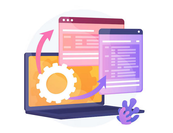
For example, if one part of the page contains an attractive image and another part contains important text, the visitor's eye will subtly focus on the information, despite the presence of a visual element. This helps present important content in the right way and improves the user experience.
I can confidently say that screen splitting is an effective way to attract attention and increase conversions on your e-commerce site. I personally used this technique in a project for a client of mine who sells online home goods. Split screens made it possible to draw visitors' attention to discounts and promotional offers, thereby increasing the number of purchases made.
However, as with any trend, it's important to use screen division wisely and in a way that suits your business. Only break pages into two parts when it is really necessary to achieve the goal. Use contrasting colors and strategically place visual and text elements for maximum impact.
Thus, split screen is one of the key technological trends in web design for e-commerce in 2024. By using this approach, you can increase the efficiency of communication with your website visitors, draw their attention to important events and increase purchase conversion.
Trend No. 6. Emphasis on Typography
Until now, fonts have been used primarily for reading and conveying information. But with the emergence of a new web design trend in 2024, they have become a graphic unit that actively attracts the attention of visitors and conveys the values and ideas of the brand.
But what is the importance of fonts in web design for e-commerce? I believe this type of focus on typography is one of the key factors to the success of your online business.
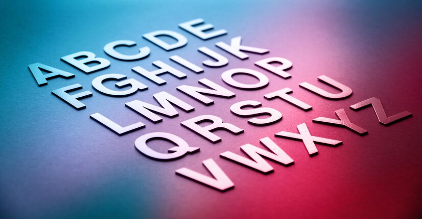
Personally, I have conducted a number of experiments in my practice as a web designer and found that choosing the right font can significantly improve the impression of a website and attract more visitors.
Pay attention to the typography of leading brands such as Apple, Nike or Google. They use unique fonts that differ from the standard options, which makes their brand recognizable and attractive.
When choosing typography for your online store, you should consider several factors. First, the fonts should match the overall style and image of your brand. It is important that they convey the spirit and values of the company.
In addition, fonts should be readable and easily understood by users. Don't forget that your site will be visited by different audiences, including people with different levels of vision. Therefore, choose fonts that are easy to use and readable by everyone.
To enhance the effect, you can experiment with different graphic effects, such as making the font bold, italic, or changing the size. This will allow you to highlight and draw users' attention to important elements of your site.
Above all else, don't forget to use font-based visual content. You can create unique inscriptions that visualize your products or promotions. This will help strengthen your brand in the eyes of potential customers and be remembered by them.
So, I am convinced that emphasizing typography in your web design is an integral element of a successful e-commerce business. Choosing the right fonts allows you to express your brand's personality, attracts users' attention, and improves the overall quality of your website.
I encourage you to pay attention to the 2024 font trends and choose the ones that will best suit your brand and goals. I am confident that this will help significantly improve your e-commerce and achieve success in online trading.
.jpg)
Punctuation marks are visual elements of text that can serve a variety of purposes. They allow you to organize the structure and understanding of a sentence. They also serve to highlight important information and evoke emotion in the reader.
Trend No. 7. Using Product Packaging as a Design Element
When it comes to e-commerce web design, one of the key aspects that plays an important role in the success of an online business is using product packaging as a design element . In this article, I would like to share my experience and knowledge on how this strategy can affect product recall and attract the attention of visitors.
If the packaging of a product looks aesthetically pleasing and original, you should not limit yourself to using it only on the physical level. Instead, it can be successfully integrated into the web design of your online store and create a unique experience for your visitors. When visitors develop an emotional connection with a product, they tend to remember it and return to your store again and again.
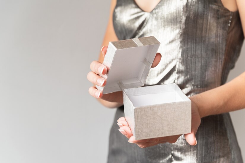
One way to use product packaging as a design element is to create an unusual page design that is radically different from the designs of competitors. This will help make your store stand out from others and attract the maximum possible attention from visitors. Additionally, you can increase product recall by using packaging in your web design.
Packaging as a design element is often successfully used to promote food products. For example, if your store specializes in selling chocolate products, you could use an image of a chocolate wrapper as the background on your product page. This will create an association for visitors with your product and allow them to better imagine it.
One example from my experience is working with a company that produces natural cosmetics. We used product packaging as the basis for the page design and created a unique atmosphere that reflects the values and philosophy of the brand. The results exceeded expectations - visitors quickly recognized the brand and began making repeat purchases.
Of course, using product packaging as a design element requires careful planning and analysis. It is important to consider not only the visual impression, but also the associations it evokes among visitors. Additionally, you need to remember to coordinate the design with the overall style of your online store and brand.
In conclusion, I believe that using product packaging as a design element can significantly impact the success of your e-commerce business. This strategy will help you attract attention and be remembered by visitors, as well as create a unique experience in your store. I encourage you to consider this possibility and start experimenting with packaging in your web design.

👌 Helpful tips:
- Use original and aesthetic product packaging as the basis for your store's web design.
- Consider the associations that packaging evokes among visitors.
- Coordinate the design with the overall style of your online store and brand.
A great example of using product packaging as a design element that I would like to share with you is working with a coffee manufacturer. We used a photo of coffee packaging as the background on the store's home page. This allowed us to create an atmosphere and emphasize the uniqueness of the product. The results were impressive - attracting new customers and increasing sales.
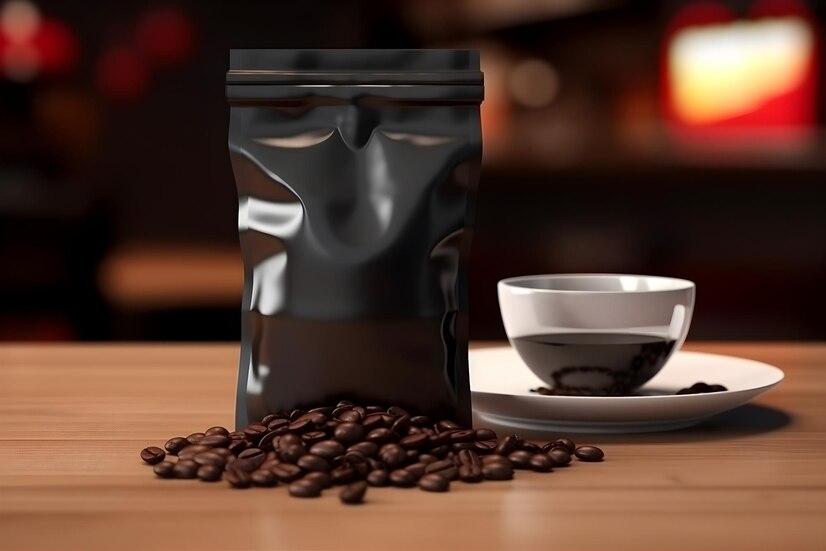
As you can see from the example, using packaging as a design element can significantly impact the success of your e-commerce business. I highly recommend that you consider this strategy when developing a web design for your store and contact experts in the field to get professional help.
👍 Best practices:
- Usage packaging as a design element can help differentiate your store from your competitors.
- Product packaging can create an emotional connection among visitors and increase product recall.
- Carefully plan and analyze the use of packaging in your web design.
My experience and knowledge allow me to say that the use of product packaging as a design element in the web design of an e-commerce store has great benefits the potential to create a memorable visitor experience and increase the success of your business. I highly encourage you to implement this strategy into your practice and see positive results.
💡 A little humor:
Did you know that product packaging is a kind of designer shell for your product? So don't neglect this important element and give your visitors an amazing aesthetic experience!

Trend No. 8. The importance of retro style for e-commerce web design
"Returning to the past with a new look at design"
Retro style in web design is gaining momentum and is being successfully used in e-commerce. More and more online store owners, marketers and web designers are paying attention to the importance of retro style to improve the user experience and increase the efficiency of their projects. And I, as an expert in this field, can confidently say that the retro style demonstrates amazing results and opens up new prospects for e-commerce web design.
Retro returns with new possibilities
Retro style attracts and holds the attention of users thanks to its nostalgic atmosphere and emotional background. Currently, this style is actively combined with modern design elements such as neon lights, grids, dark shades and pastel palettes. This allows websites to create a powerful visual experience and establish an emotional connection with visitors.
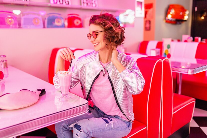
However, retro style is not limited to just appearance. It also helps visitors better perceive information and remember details that are directly related to the product. By creating a modern background design and complementing it with retro elements, you can effectively stand out in the market and attract the attention of potential buyers.
My opinion and recommendations
In my practice, I have already repeatedly used the retro style for various e-commerce projects. Having the results of the experiments in hand, I can confidently talk about the positive effects of this style. Incorporating retro elements into your design helps you stand out from your competitors, create an emotional user experience, and increase trust in your brand.
I still recommend considering retro style when developing e-commerce web design. This is a good way to attract attention and keep users on your site. However, it is worth remembering that each project is unique, and it is important to select retro elements that will harmoniously fit into the concept of your brand.
Report on the usefulness of using retro style in e-commerce web design
Using retro style in e-commerce web design allows you to:
- Stand out from competitors and increase brand awareness.
- Create an emotional connection with visitors and increase trust in the product.
- Strengthen the perception of information and help visitors remember details.
- Improve your website's performance and increase conversions.
- Give your project originality and uniqueness.
However, it is worth remembering that not all retro elements will be suitable for your project. It is important to carefully select and combine different elements to create a harmonious and attractive design.
Summary
Retro style has a significant impact on e-commerce web design. It allows you to stand out from competitors, create an emotional connection with visitors and increase conversion. However, it is important to remember that retro style must be used wisely so that it matches the goals and concept of your brand.
Figure out which retro elements will be most effective for your project and start implementing it. Don't be afraid to experiment and try new approaches, because with the help of a retro style you can create a unique and attractive web design for your e-commerce business.
.png)
Trend No. 9. The Importance of Building Blocks in E-Commerce Web Design
When it comes to developing an e-commerce web design, one of the key aspects to pay attention to is the use of building blocks. Not all entrepreneurs are chasing complex and trendy websites. Some people prefer elegant simplicity and clear structure. This design also has its place.
I confidently say that the correct use of building blocks can significantly impact the success of your e-commerce business. In this section, I will discuss their importance and provide you with some specific recommendations.
Why are building blocks needed?
Building blocks help organize information on your site, making it clearer and more user-friendly for visitors. When site elements are designed in the form of blocks or resemble a table, this is not bad. This design helps visitors quickly and easily find the information they need.

Moreover, building blocks make it easier for users to navigate your site. Properly designed blocks help create a logical sequence in which visitors can navigate a page. This improves the usability of the site and minimizes the number of steps required to achieve the goal.
Trends for 2024: return of realism and harmonious color palette
In 2024, there is a tendency to return realism to the visual. Therefore, there are more visible boundaries. This gives the site elegance and attractiveness in the eyes of visitors.
In addition, it is important to choose the right colors and combine them into an overall harmonious palette in order to create a discreet, laconic, stylish and aesthetic website. I believe that the right approach to color scheme will help attract the attention of visitors and make your business more memorable.
How to use building blocks in e-commerce web design?
First of all, the site structure should be logical and consistent. Divide the information into small blocks, each of which corresponds to a different functional element of your business. For example, important sections of the site, such as “About Us,” “Product Catalog,” and “Contacts,” should be separate blocks with clearly defined boundaries.
Additionally, use visual elements such as colors, fonts, and illustrations to make each block more attractive to your visitors. Pay attention to the balance of the color scheme and create a harmonious palette that matches your brand identity and creates a pleasant perception.
Summary
Web design plays a key role in the success of an e-commerce business. Proper use of building blocks will help organize your website and make it more attractive and user-friendly for visitors. The return of realism and a harmonious color palette are the main web design trends for 2024.
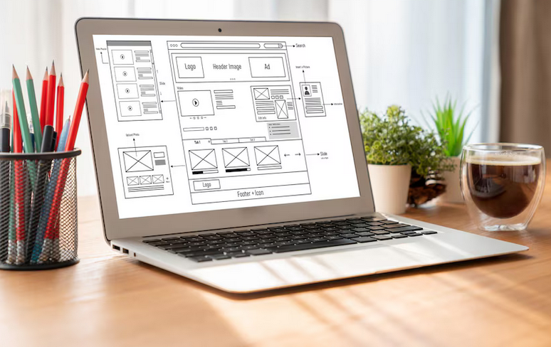
I hope these guidelines help you create a stylish and effective design for your e-commerce business. I am convinced that a well-organized web design will attract more visitors and increase the conversion rate of your store.
Quick summary:
For best e-commerce web design results, it is important to use building blocks to organize information on the site and improve user navigation. Trends for 2024 include a return to realism and a harmonious color palette. Web design should be logical, consistent and attractive to visitors, using spatial zones, color and dividing boundaries between blocks.
Trend No. 10. Anti-Design: Breaking Web Design Patterns for Effective E-Commerce
Lately, I've noticed that most people focus too much on design, devoting too much time and attention to this aspect. The result was a kind of race of designers, each of whom strives to create something better, unique, capable of impressing and captivating users. It was in such an environment that a new trend emerged and became popular - anti-design. Its unpredictability and unusualness refreshes web design, making it more original and varied.
Anti-design is indicated by asymmetrical elements, unexpected and incompatible colors, as well as an unusual font. When visiting a site with anti-design, most visitors will be shocked and shocked by what they see. However, between you and me, there will be those who will appreciate this anti-conformist approach and whisper “This is something new!”

I've always been interested in which web design trends are temporary and may come back after a while, sometimes even after a few years. I previously thought that this might not be a valid hypothesis, but my research has led me to the conclusion that it is quite expected and logical. As they say, everything new is a pale copy of what already existed in ancient times.
The web design industry is a bit chaotic these days, but that's a big plus in my opinion. It gives you the opportunity to create and experiment with different styles and combinations. Web design trends are constantly changing, and sometimes it can be difficult to keep up with them. However, I boldly declare that the style and design of website pages are primarily aimed at increasing the potential of the resource and creating a pleasant user experience.
You, as an online store owner, marketer or web designer, have a question about what to do with the existing design of your website and how to stay on trend. Here I will provide you with some practical tips based on my experience and derived from anti-design:
Think about the scope of your business and what design will suit your target audience.
Avoid templates and similarities to other sites. Make your design original and memorable.
Use bright and unusual color combinations to attract users' attention. However, be careful with brightness so as not to overload the site.
Use fonts that highlight your brand's personality and give your site a unique style.
Be bold and experiment with asymmetrical elements and unconventional compositions. This will help your website stand out from the crowd.
Don't forget about user experience and ease of navigation. Your design should be functional and intuitive.
Follow the latest web design trends to stay up to date with new trends and opportunities.
Ultimately, the decision to use anti-design and move away from web design templates should be thoughtful and based on the needs and expectations of your target audience. I am confident that the right design can increase conversions and attract more potential buyers.
Overview table
| Do | Don't |
|---|---|
| Make your design original and memorable | Don't try to imitate other sites |
| Use bright and unusual color combinations | Don't overload your site with bright colors |
| Choose fonts that highlight your brand | Don't use fonts that are too complex |
| Experiment with asymmetrical elements | Don't create too complex a structure |
| Pay attention to user experience | Don't ignore navigation |
| Keep up to date design trends | Don't stop there |
Don't be afraid to experiment and try new approaches on the web -design. Anti-design provides a unique opportunity to create an original and attractive website that will stand out from the competition. Apply these tips and I'm sure your e-commerce business will become more successful and attract more customers.

Questions and answers on the topic "E-commerce success: Main web trends design 2024"
1. What is the role of web design in e-commerce?
2. How important is the design of a selling website?
3. What should you pay attention to when developing a web design?
4. What web design trends will be relevant in 2024?
Thank you for taking the time to read this article!
Now you have become a real expert in the field of e-commerce web design. I hope you found valuable information to help you create beautiful and functional online stores.
Your success in this field depends on many factors, and web design is one of the most important. Now, with new knowledge, you can make a real revolution in the world of online business.
Remember to follow web design trends and current trends to stay ahead of the competition. Graphics, animation, tag clouds and many other techniques will help you attract attention and retain customers.
Also, don’t forget that web design is about constant development and experimentation. Use your creativity and stay open to new ideas. And remember that you have magical tools in the form of words and automation to help your business thrive.
If you have any questions or comments about this article, please post below. I would be happy to talk with you about this topic.
Best regards, Sergey Berezin - Elbuz expert.

- Glossary
- The importance of web design in e-commerce
- On the way to the ideal website design for an effective e-commerce business
- How to choose a reliable webmaster for website development
- TOP web design trends in 2024
- Trend No. 1. Topic: Importance of web design for e-commerce
- Trend No. 2. Immersive Scrolling: How Web Design Turns Users into Lifetime Customers
- Trend No. 3. Transition to realistic visualization using 3D animation
- Trend No. 4. Geometry in web design
- Trend No. 5. Dividing the screen: how to improve the efficiency of content perception
- Trend No. 6. Emphasis on Typography
- Trend No. 7. Using Product Packaging as a Design Element
- Trend No. 8. The importance of retro style for e-commerce web design
- Trend No. 9. The Importance of Building Blocks in E-Commerce Web Design
- Trend No. 10. Anti-Design: Breaking Web Design Patterns for Effective E-Commerce
- Questions and answers on the topic "E-commerce success: Main web trends design 2024"
- Thank you for taking the time to read this article!
Article Target
Informing readers about the importance of web design for e-commerce: promising trends for 2024
Target audience
online store owners, marketers, web designers
Hashtags
Save a link to this article
Sergey Berezin
Copywriter ElbuzIn the world of virtual opportunities, I am the mastermind behind the success of online stores. Words are my tools and automation is my magic recipe. Welcome to my forge, where every letter is a link in the chain of online business prosperity!
Discussion of the topic – E-commerce success: Main web design trends 2024
Write about the importance of web design for e-commerce and the key trends that will be relevant in 2024.
Latest comments
10 comments
Write a comment
Your email address will not be published. Required fields are checked *









John Smith
Interesting article! I agree that web design plays an important role in e-commerce. But what do you think will be the biggest trends in 2024?
Maria Garcia
I also think that web design is very important for e-commerce. In my opinion, artificial intelligence and personalization will be key trends in 2024. What do you think about this?
Thomas Müller
I agree, Maria! Artificial intelligence and personalization will play a big role in e-commerce web design in the future. However, I also think it is important to pay attention to the design of mobile interfaces and usability on different devices.
Léa Martin
Thank you Thomas! I believe that mobility and responsiveness will be important web design trends for e-commerce in 2024. Additionally, the use of graphic elements and animations can make the user experience more fun and engaging.
Giacomo Rossi
Indeed, Leah! Graphics and animation can create more attractive e-commerce designs. I also think it's important to focus on improving page loading speed to meet user needs.
Katarzyna Nowak
I agree, Giacomo! Fast page loading is an important requirement for e-commerce. Additionally, I think the use of video and virtual reality will also be relevant in the future. Users want a more realistic presentation of products and the ability to test it.
Oksana Petrova
Katarzyna, you are right! Video and virtual reality can significantly improve the user experience in e-commerce. However, I would also add that security and data protection will play an important role in web design to ensure customer trust.
Benjamin Dubois
Oksana, thank you for sharing! Security is truly a key factor for e-commerce. Do you think blockchain and cryptocurrencies will also have an impact on web design in the future?
Сергей Берёзин
Hi all! I am Sergei Berezin, and I have been following your discussion with great interest. Definitely all your points of view have their place. I also believe that one of the hot web design trends for e-commerce in 2024 will be the smart use of data and analytics to optimize processes and increase conversions. Thank you all for participating! 😊
Old Grump
Well, these are new trends again... I've already seen all this and there's nothing magical about them! Times change, but I will remain true to my habits. Once again I am convinced that past years were better...