Icons for an online store: a necessary element of UX design
-
Sergey Berezin
Copywriter Elbuz
Improving user experience (UX) is an important task for every online store owner. And this is where the magic of icons comes to the rescue. Some say that icons are small design details, but in the world of online business they become the real keys to success. They can attract customer attention, improve navigation, and even increase conversions. So, let's dive into the magical world and find out how icons can improve the UX of your online store. Where do icons come from? How to choose the right ones for your project? You will learn the answers to these questions and much more in this article. Get ready for some magic, because the magic of icons is just beginning!
Glossary
- UX: User Experience - the impressions and emotions that a user receives when interacting with a website or application.
- Icons: Graphic elements that are used to represent specific actions, objects, or ideas. They serve as a visual means of conveying information and improving navigation and user experience.
- Online store: A website dedicated to the trade of goods or services where customers can make purchases online.
- Information Icons: Icons that are designed to convey information or point to certain objects or functions in an online store. They may include graphic symbols, numbers or letters.
- Navigation icons: Icons that are used to facilitate navigation in an online store. They are symbols or images that help the user navigate and navigate the site.
- CTA: Call to Action - text, button, banner or other website element that calls the user to perform a specific action, for example, make a purchase or fill out a form.
- Element Rules: Recommendations and guidelines for using icons in an online store, including their size, placement, style and consistency with other design elements.
- Wix: A website creation platform that offers a wide selection of ready-made icons for use in online stores.
- Iconfinder: Icon search platform with a variety of styles and themes, offering both free and paid options for use in online stores.
- Flaticon: An icon library in website and plugin form, offering a huge variety of free icons for use in online stores.
- Noun Project: An icon collection created by a community of designers that offers simple and modern icons for use in online stores.
Why do we need icons in an online store?
Icons are graphical interface elements that can be used to represent various components of a website. They can be individual icons, as well as entire series that reflect the overall design concept of the resource. And using the right icons in online stores has its benefits, helping to improve the user experience and increase conversions.
Firstly, icons simplify site navigation and make chain elements more memorable. They can replace a text description, which is especially important in responsive design, where screen space is very limited. Icons allow you to reduce the amount of information that needs to be presented to the user, thereby improving their perception.
In addition, icons help to establish a connection with the visitor and increase brand awareness. They allow you to identify your company, product or service through a specific style and use of corporate colors. Thanks to this, the user will be able to more easily remember your brand and distinguish it from competitors.
Icons also help draw attention to the benefits of the brand. You can use them to structure lists of products or services, highlight buttons leading to a target action, and visually explain the ordering algorithm. In addition, they can highlight promotions, special offers and specific product categories, which can encourage the user to make a purchase.
If you want to improve the user experience and increase the conversion of your online store, pay attention to the use of high-quality icons. Not only will they make your website more attractive and memorable, but they will also help users interact with your products or services more effectively.
Best practices for using icons in an online store
In order to effectively use icons in an online store, it is recommended to adhere to the following practices:
Choose icons that suit your theme and style. Choosing the right icons will help create a cohesive and beautiful design for your website that will attract the attention of visitors.
Make sure icons clearly communicate their meaning. It is important that users immediately understand what each icon represents and can easily navigate your site.
Place icons in user-friendly places. They must be visible and understandable so that users can quickly respond to them.
Use icons with the correct size. Icons that are too small can be difficult to see, and icons that are too large can load the site. Choose the optimal icon size for your design.
Avoid unnecessary use of icons. They should complement the content of your site, and not replace it completely. Maintain a balance between text and icons.
Check how icons display on different devices and browsers. They should be responsive and look good on all screens.
Using high-quality icons in an online store improves the user experience and increases conversion. By following the best practices for using icons, you can create an attractive and functional design for your site that will be convenient for visitors and help them easily find the information or products they need. Remember to update your icons as your business evolves and make sure they are up to date with current design trends.

Types of icons
Icons on the site Online stores can perform different tasks. Depending on this, there are several types of icons. Let's look at each type in more detail.
Informational
This type of icon conveys the necessary information. Their task is to tell visitors about the key values of your company, the advantages of the product and other important aspects that relate to the activities of the online store.
For example, you can use a picture of a truck for delivery information, a picture of a wallet with coins for information about possible payment methods, or a set of associative pictures for each company benefit.
To do this, you need to select a suitable image and add a short description to it. It is important to come up with suitable associations and formulate a message that needs to be conveyed to the visitor in literally 2-3 sentences.
Information icons can greatly improve the customer experience by helping them understand information about your product or service faster and better.

Navigation
This type of icon complements the navigation system of an online store website. Their main task is to help users navigate and quickly find the information they need.
On some sites, navigation icons completely replace the text in the menu, which allows you to avoid page overload and make their structure simpler and more understandable for users.
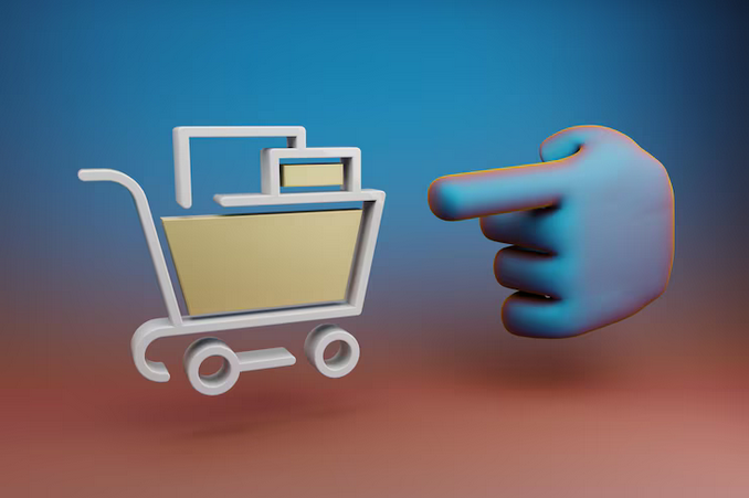
Examples of navigation icons include down, up, right, or left arrows that suggest moving to a specific part of the page. Also popular are icons such as a cart that redirects the customer to the "Cart" section, or an envelope that links to the contact page. Social media logos are also often used.
Using navigation icons helps the user navigate the site faster and improves overall navigation.

CTAs – calls to action
These icons are call-to-action buttons. They are clickable and encourage online store visitors to take certain targeted actions, such as adding a product to the cart or placing an order. They are decorated in bright colors and add a certain symbol to attract the attention of the visitor.
Examples of CTA icons include a navigation arrow or a download icon. In addition, short captions with an active verb are attached to such icons, for example, “go”, “add to cart”, “view product” and so on.
CTA icons play an important role in the conversion of an online store, so it is important to choose their design and location on the page correctly.
Depending on the goals of your online store, you can combine different types of icons to create a unique and attractive user experience.
Summary
Using quality icons in online stores is an important element of the user experience and can significantly increase conversion. A variety of icons, such as informational, navigation, and CTA icons, will help improve the visual presentation of your website and make it more understandable and attractive to visitors.
Select and place icons with taste and attention to detail to highlight your uniqueness and help users quickly get the information they need or take a desired action.
Basic table:
| Icon type | Description | Examples |
|---|---|---|
| Informational | Provide necessary information | Truck picture - delivery information. A picture of a wallet with coins - information about possible payment methods. A set of associative pictures for each company advantage. |
| Navigation | Supplement site navigation | Arrows indicating the direction to the desired part of the page. Trolley - section "Basket". Envelope or tube - contact page. Social network logos. |
| CTAs – calls to action | Encourage a specific action | Arrow - go. Download icon - download. Icons with short captions - “add to cart”, “view product”, “place an order”, etc. |
Choose icons depending on the needs and goals of your online store, and also pay attention to their design and location on the page.

How to choose icons for an online store: secrets of successful design
When it comes to designing your online store, icon selection plays a key role in creating a compelling user experience and increasing conversions. They perform important functions - conveying meaning, creating associations and attracting customer attention. To achieve these goals, there are several rules that should be followed.
Maintain a consistent style
Icons should fit harmoniously into the overall design concept of your online store. This means that they should not stand out from the visual line and should be in accordance with the chosen color scheme. Avoid variegation, which can reduce the visual effectiveness of a commercial site.
Create clear associations
Each icon on your site should clearly convey the desired meaning. It is important that the client immediately understands its meaning when looking at it. To do this, choose associative links that will be understandable to your target audience. If necessary, supplement icons with text to clarify their meaning if they are ambiguous.
Use a transparent background
Colored backgrounds can create unnecessary visual noise, making it difficult for customers to perceive information. Visitors have to peer closely to discern the images. Use transparent backgrounds to aid interpretation and provide additional clues.
Emphasize clickability
If an icon element is clickable, it is important to show this to the user. For example, you can use highlighting on hover. This will help improve user interaction with your site and enhance the user experience.
Opt for vector graphics
Vector graphics provide more space for web design and allow for animation, changing color schemes, and other features. It also maintains high quality when resizing and allows you to scale icons without losing detail.
Now you know what rules to follow when choosing icons for your online store. Remember that the right icons will make your website more attractive to customers, improve user experience and help increase conversions.

Best Resources for Getting Icons for Your Online Store
Wix
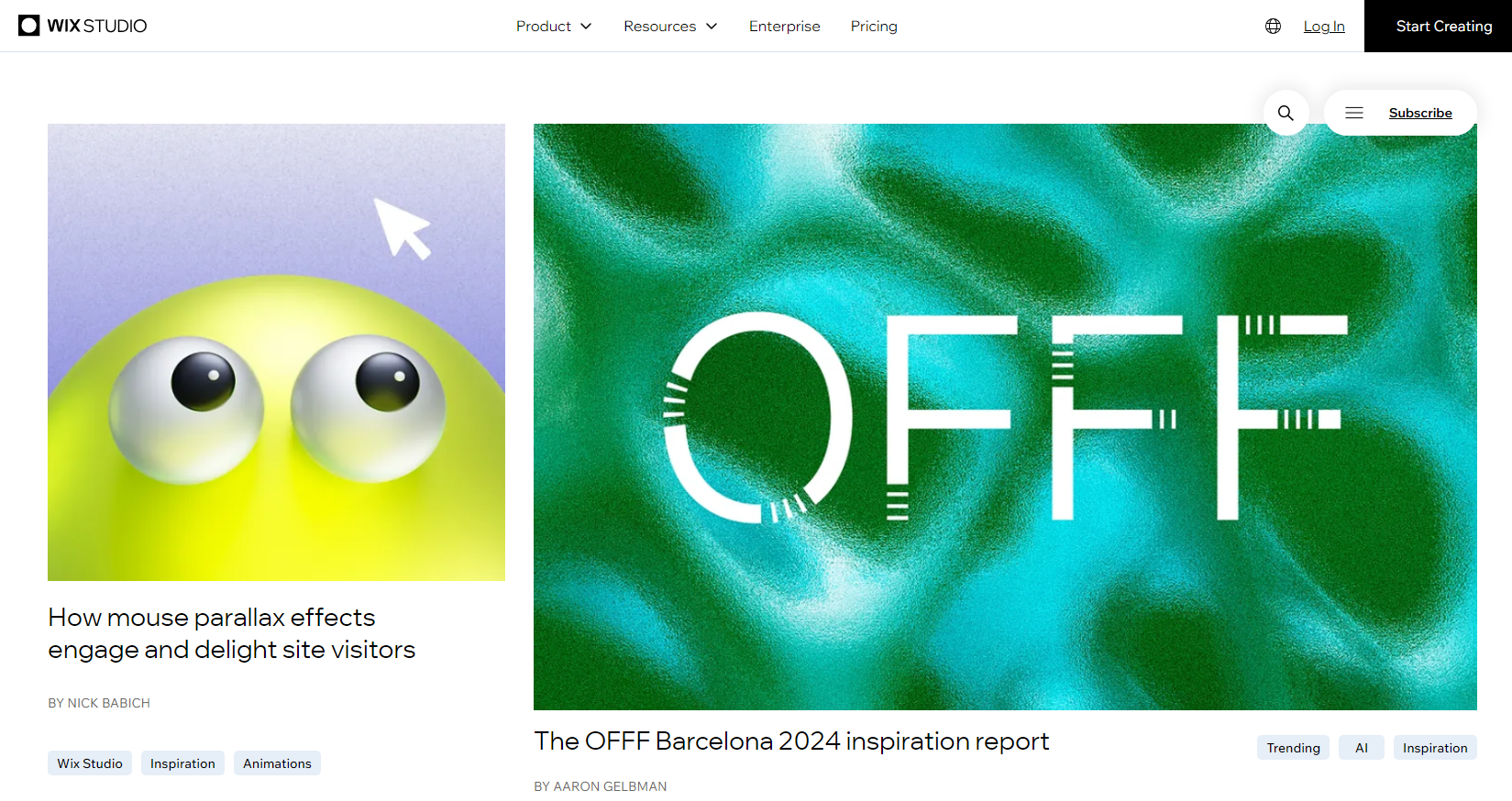
The first option I looked at was the free Wix Editor Media Library. It offers a huge number of different images for your site, including icons. You can find all kinds of arrows, shapes, boxes, pictograms and icons. I myself have used Wix icons in several of my projects, and I was pleasantly surprised by the results. I liked that they can be easily transferred to the online store “as is” or customized for yourself. You can crop the image, add visual effects, change color and shape, and add a link or animation. In my opinion, this is an excellent choice for those who want to save time and immediately start improving the user experience of their online store.
Iconfinder
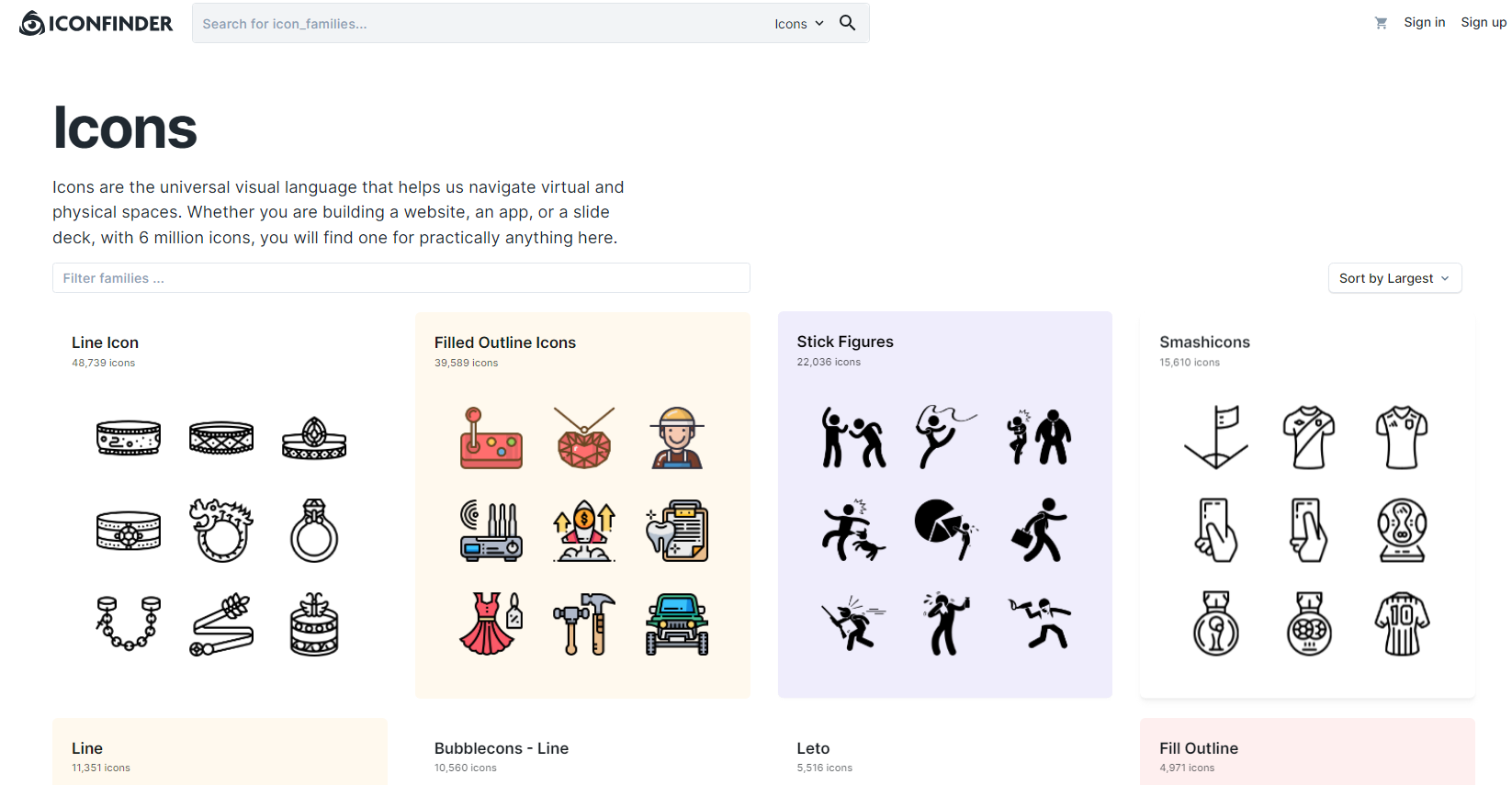
Another service the one I was introduced to was Iconfinder. This service offers a huge database of more than 5 million elements in SVG and PNG formats. About 300,000 of them are available for free, and there are also paid plans with access to premium icons. What I liked about Iconfinder is the ability to edit selected elements directly in the online editor. You can change the colors to match your store's branding, add text, and customize the size and shape of the icons. I personally used Iconfinder in one of my projects and was very pleased with the result. It really offers a large selection and convenient tools for customizing icons.
Flaticon
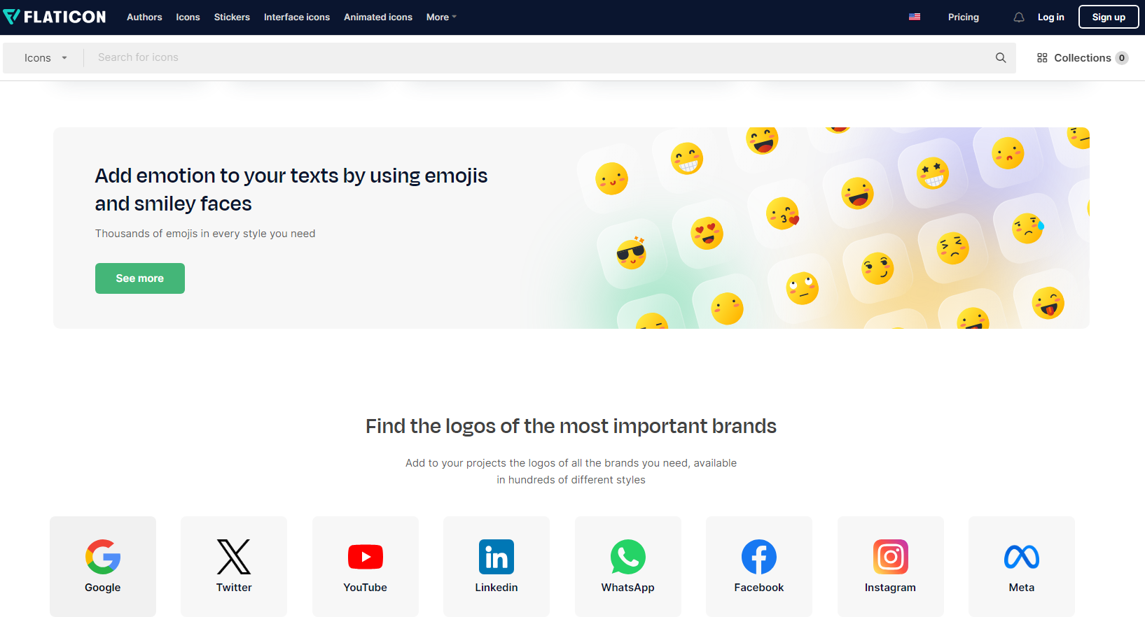
The next option was Flaticon. In their catalog you will find about 4 million vector icons in various formats, including SVG, PNG, PSD, EPS and Base64. They are conveniently divided into categories, making it easier to find the images you need. Flaticon also offers the ability to upload individual icons or entire collections, as well as create your own icons using templates. Their online editor allows you to change the color and size of icons, as well as export them to the format you need. One of the benefits of Flaticon is its detailed guidance on choosing icon styles for your project. If you wish, you can also purchase premium packs and exclusive content. I have used Flaticon on several of my projects and my team and I have been very pleased with the results.
Noun Project
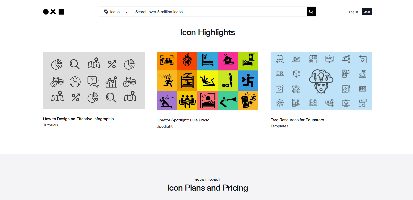
And the last option was Noun Project. This service offers more than 3 million icons on various topics. Some of them are available for free download, but editing of these icons is disabled and you are required to provide attribution when using them. To get more features, you can purchase a subscription or individual icons. What I like about Noun Project is their large selection of quality icons and user-friendly interface. I have used Noun Project many times in my practice and have always been pleased with the results.
Believe it or not, choosing the right icons can make a difference in your business. An improved user experience and attractive design can increase conversion and sales in your online store. I used to have difficulty finding high-quality, clear icons, but thanks to these resources, I was able to find exactly what I needed for my projects.
I hope that my experience and advice will help you improve the design of your online store and attract more customers. Remember that quality icons are not only a design element, but also a powerful tool for improving the user experience. Choose the resources that suit you personally and start using them in your online store today.
Need more than just attractive icons
I would like to share my experience with you and talk about the importance of icons in online store design. Icons are not only aesthetically pleasing elements, they also play an important role in improving the user experience and increasing conversions. In this section, I'll share with you some ideas and strategies to help you create quality designs using effective icons.
The meaning of clear and understandable icons
By conveying information graphically, icons greatly simplify the perception of the site. However, for them to be truly useful to users, it is important to make sure that they are in the right place, contain familiar associations and convey the right meanings.
I am convinced that selecting icons is not just choosing the first set you like. Instead, I suggest you carefully consider and select icons, taking into account the features of your site and the needs of your users. If they can instantly understand the meaning of the icons and easily find a use for them, it will definitely increase user satisfaction and build trust in your brand.

Icon Options and Their Importance
When it comes to icon variety, the market offers a variety various options. From classic icons to modern and stylized options, it's important to choose the icon set that best suits your brand and the visual style of your online store.
To find out which type of icons is most suitable for your site, I suggest familiarizing yourself with the different styles and looking at examples of their use. For example, simplistic icons may be an ideal choice for a minimalist design, while icons with details and effects will appeal to users aiming for a modern style.
Where to Find High Quality Icons
Hiring a professional designer to create your icons is one option. However, today the market offers other ways to get high-quality icons without additional costs. Good options can be found in specialized services.
I myself actively use several of these services and can recommend that you pay attention to the following popular platforms:
On these resources you can find many sets of icons of various styles and themes. They offer both free and paid options, allowing you to choose the most suitable option for your online store.
Summary
Clear and understandable icons are an integral part of attractive online store design. I hope my tips and tricks will help you choose quality icons and use them to improve your user experience and increase conversions.
Explore the different icon options, think about how to use them, and find the right service to purchase your icon set. Remember that the right icons can significantly affect the perception of your website and the effectiveness of interaction with your customers.

Caterpillar experience
Caterpillar is a world leader in construction and mining equipment. They offer a wide range of products and solutions to help clients across a variety of industries improve the efficiency and reliability of their businesses.

Caterpillar case: improving convenience and navigation
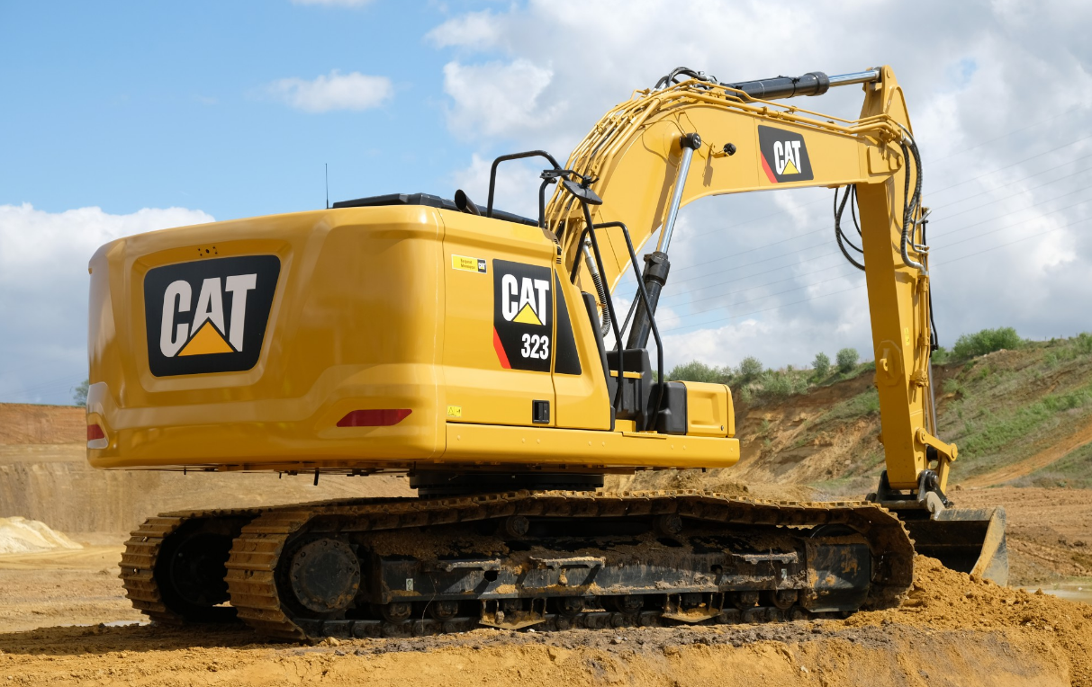
One of the main problems that Caterpillar faced was the lack of clear and convenient navigation across product categories in their online store. This led to difficulties in finding the necessary construction equipment for potential clients.
To solve this problem, a strategy was used to use information icons, bright and visual images, which helped customers quickly determine the category of product they were interested in. A new navigation menu was developed, in which each category had its own unique icon. Now users can easily and quickly find the desired category based on familiar and understandable icons.
This approach improved the usability of the Caterpillar online store and speeded up the process of selecting and purchasing products. Customers experienced a significant reduction in the time spent searching for the necessary construction equipment, and also increased the likelihood of making a purchase.
Specific results
After implementing the new navigation with information icons, the following results were achieved:
- Increased conversion on product category pages by 20%
- Reduced bounce rate on category pages by 15%
- Reducing the total time to search for products by 25%
The data obtained confirm the success of introducing new icons and improving navigation in the Caterpillar online store. This allowed the company to attract more potential customers and increase user satisfaction, which in turn contributed to increased sales and increased competitiveness in the market.
"Thanks to the new navigation with information icons, our online store has become more convenient and intuitive for customers. We have seen a significant increase in conversion and a reduction in the time spent searching for the necessary products. This has given us a significant advantage in the market and strengthened our position as an industry leader." - Jeffrey McKenzie, Caterpillar spokesman.
Frequently asked questions on the topic of icons for an online store: a necessary element of UX design
1. How can icons improve user experience (UX) in an online store? Icons help visually organize information, improve navigation, attract attention, and make the interface more attractive? for users.
Icons help visually organize information, improve navigation, attract attention, and make the interface more attractive? for users.
2. What types of icons exist and how to use them correctly?
There are informational, navigation and CTA icons. Informational icons are used to convey information, navigational icons help users navigate the site, and CTA icons call to action. }
3. Where can you find icons for your online store?
You can get icons from online platforms and libraries such as Wix, Iconfinder, Flaticon, Noun Project.
4. What rules should be followed when using icons in an online store?
It's important to make sure that your icons convey information clearly, fit the overall style of your site, and are of a high enough quality to display correctly on a variety of devices.
5. What popular online platforms offer icons for an online store?
Some popular online platforms for purchasing icons include Wix, Iconfinder, Flaticon and Noun Project.
6. What role do information icons play in an online store?
Information icons help convey important information about a product or service without loading the interface with text and making it more attractive to users.
7. What functions do navigation icons perform in an online store?
Navigation icons help users navigate the site quickly and easily, making it easier for them to find the information or product they need.
8. How to create effective CTA icons for an online store?
To create effective CTA icons, you should choose bright and attractive icons, clearly communicate the call to action, and place them prominently in your store interface.
9. What benefits does each icon purchasing platform offer?
Wix provides access to a wide range of free icons, Iconfinder and Flaticon offer huge collections of icons in different styles and themes, Noun Project specializes in theme-specific icon packs.
10. What recommendations can be given when choosing icons for an online store?
It's a good idea to choose icons that are relevant to your audience and store theme, and make sure they clearly convey the iconography and are easy to understand for users.
🌟 Thank you for becoming an expert in the magic of icons! 🌟
What an amazing journey you and I have been on, and you have just become the owner of the secret magic of icons! Now you know how to use these magical symbols to improve the user experience of your online store. You have become a true professional in this field, ready to optimize your icons, making your business prosperous and attractive like never before.
You have mastered different types of icons, learned how to use them in practice and where to purchase quality resources. Your understanding of UX has improved significantly, and you are ready to apply new knowledge with courage and confidence.
There's nothing more rewarding than seeing our articles transform your business and add new momentum to your success. I am proud that I was able to provide you with valuable information and help you reach new heights. You are our greatest asset, and I thank you for being inspired by my articles and for continuing to read them with interest.
If you have questions or would like to share your thoughts, please leave a comment below. I'm always happy to hear from our readers and discuss your achievements and successes.
Thank you for your dedication and participation in this exciting journey of icon magic! I wish you many bright and prosperous days with your online store. Get ready to unleash the magic, your clients will be delighted with you! ✨🛍️💫

- Glossary
- Why do we need icons in an online store?
- Types of icons
- How to choose icons for an online store: secrets of successful design
- Best Resources for Getting Icons for Your Online Store
- Need more than just attractive icons
- Caterpillar experience
- Frequently asked questions on the topic of icons for an online store: a necessary element of UX design
- Thank you for becoming an expert in the magic of icons!
Article Target
Educate and raise awareness about the importance of using quality icons in online stores to increase user experience and conversion.
Target audience
Owners of online stores, web designers, marketers
Hashtags
Save a link to this article
Sergey Berezin
Copywriter ElbuzIn the world of virtual opportunities, I am the mastermind behind the success of online stores. Words are my tools and automation is my magic recipe. Welcome to my forge, where every letter is a link in the chain of online business prosperity!
Discussion of the topic – Icons for an online store: a necessary element of UX design
Information about the types of icons, their practical use and places to purchase them.
Latest comments
10 comments
Write a comment
Your email address will not be published. Required fields are checked *






John Smith
This article is very interesting and useful! I'm just starting my online store and would like to learn more about how to use icons to improve the user experience. What types of icons do you recommend?
Anna Müller
I've been working in e-commerce for a long time and icons are a really important element of web design. I agree with you, John, this material is also interesting to me. I'll wait for an answer.
Sophie Dupont
I ran into a problem when choosing icons for my online store. What's the difference between free and paid icons? What should you expect from the different options?
Mario Rossi
I often buy icons for my website, but I would like to hear some tips on the practical use of icons in an online store. What methods can you recommend to improve the user experience?
Kasia Nowak
I know that many icons are available for free, but I'm not sure how high quality they are. Can you recommend reliable sources where I can purchase quality icons for my online store?
Ivan Petrov
I believe that icons can help improve navigation and highlight important interface elements. It would be great to hear some examples of the most popular and effective options.
Сергей Берёзин
Thanks everyone for your interest in the topic! Icons are a truly powerful tool for improving the user experience of an online store. To briefly answer your questions, there are different types of icons such as linear, filled, flat and many others. The choice depends on the style of your site and its theme. Free icons can be a good option for saving money, but paid icons usually have more selection and better quality. Some popular and reliable icon sources are Flaticon, Iconfinder and Freepik. I also recommend using icons to highlight important elements, tips and navigation in the interface. Hope this helps!
Grumpy Grouchy
This whole icon trend seems ridiculous and pointless. Do you really think they make a real difference in the user experience? I've been working in e-commerce for several years now and I can say that without these icons everything works great. A good website should not depend on such trifles!
Pierre Bernard
I agree with you, Grumpy Grouchy, that a good website should not only look aesthetically pleasing, but also offer functionality. However, icons can help highlight interface elements and make navigation more intuitive for users. In addition, they can serve as accents for important functions, decoration or display of information in a convenient form. I believe that web designers consider the issue of using icons from a practical point of view, taking into account increasing ease of use and saving space.
Luis Sanchez
Pierre Bernard, I fully support your point of view! Beautiful icons not only make a website more visually attractive, but also help convey information more quickly and easily. Some icons can be recognizable symbols, which creates trust among users. I have seen many studies that confirm the positive impact of icons on user experience. Therefore, I believe that the trend towards using icons only confirms their effectiveness and importance.