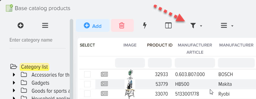
Grid display view with elements
To open the grid settings, open the menu (on the example of the "Price lists" subsystem) 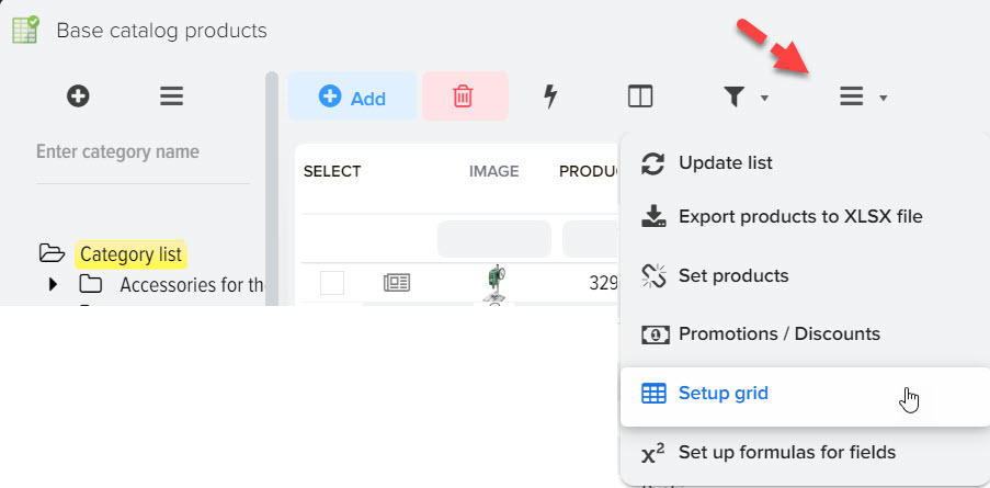
You can customize the display of the list of elements in the grid according to your needs, select the columns that you need, display other columns in the navigation bar located to the right of the selected element. 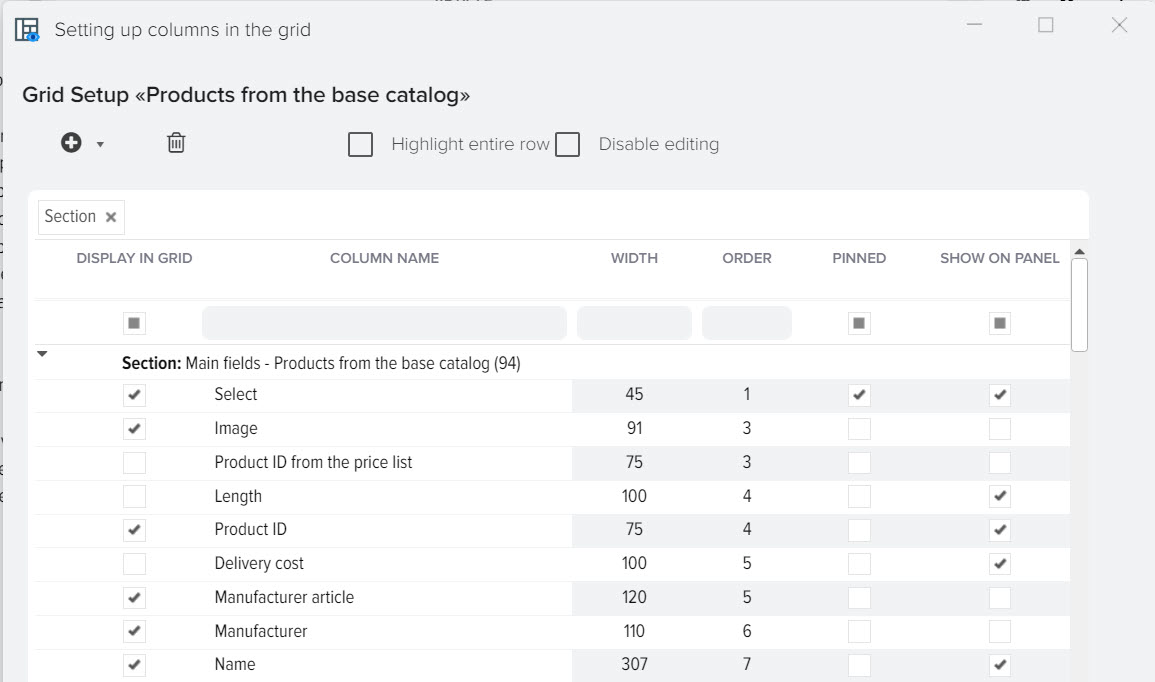
Description of fields
- Show in grid
When activated, a column will be displayed in a grid with elements - Column name
Column name to be displayed in the grid - Width
Grid column width - Order
Sequence number of the column in the grid - Pinned
When this flag is activated, the column will be fixed in the grid when scrolling horizontally - Display on panel
When this flag is activated, the column will be displayed in the navigation bar to the right of the selected item - Sort by value
When this flag is activated, the grid with elements will be sorted according to this column - macro substitution
The name of the macro substitution to use in various subsystems, for example, in formulas, data upload - field ID
The name of the field in the database, it can be used in various subsystems - Chapter
Displays where this field comes from, for example, it is possible to display sections "Basic fields", "Attributes", etc. - Title color
Display color of the column heading in the grid
Adding a new field
You can add custom fields to store the data you need. To do this, click "+" and select the data type 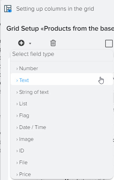
Then enter the field name 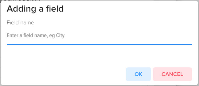
Description of field types
- Number
Storage of numeric values (except prices) - Text
Storage of large text data - Line of text
Storage of text data up to 255 characters - List
Storing text data as a list - Flag
Storage of activity status (yes/no, enabled/disabled, etc. ) - Date Time
Storing the date and time - Image
Storing a link to an image - Connection
The value is used to link to another directory (not implemented at the moment) - File
Storing a link to a file - Price
Price storage (numeric values)


